We Might as Well Dance

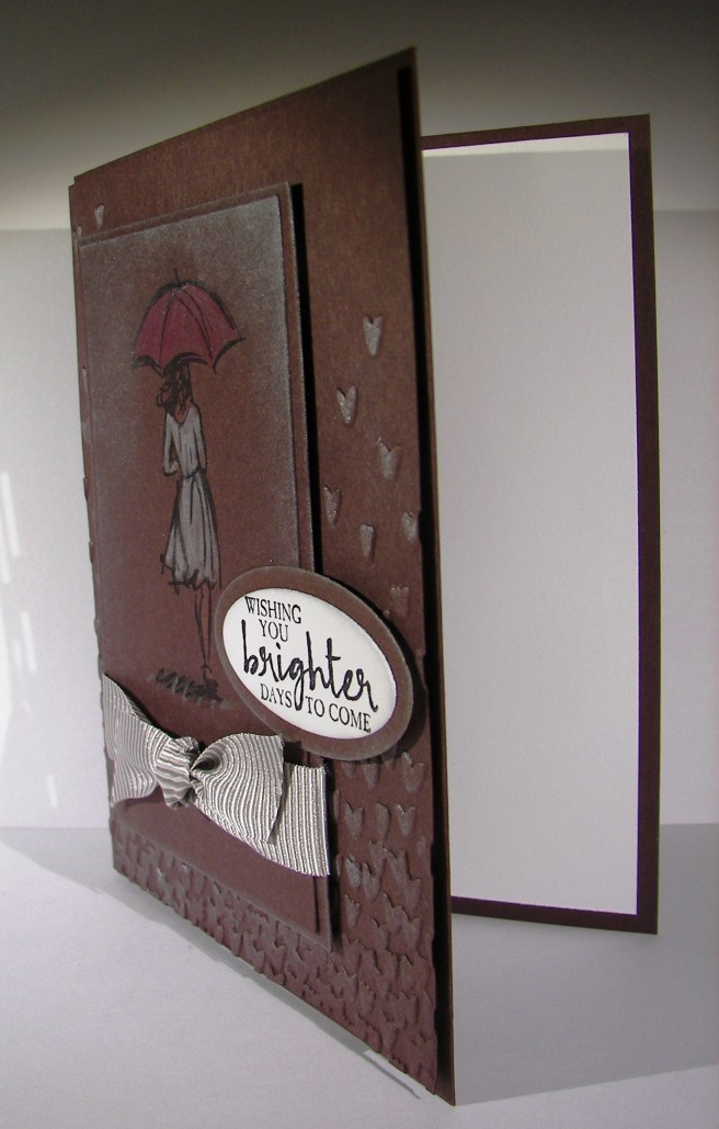
When things get crazy it always helps me to have a creative outlet. I think the theme of my projects this last weeks speaks volumes.  Good thing I have a way to share that really brings me joy as well as peace.  Just yummy.

2-9

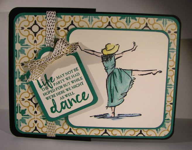
This is my kind of card.  Lots of layers, a bit of interest, a touch of water color and a lovely sentiment.  Not to mention wonderful designer series paper as a background. This one has to be a workshop project for sure.  So great!

The layers were simple and all of the corners rounded. I even found tag framelits that would also carry the rounded corner.  The card base was cut normally measuring 4 1/4 x 11″, scored at 5 1/2″.  There is an additional score to fold the front back on itself perfectly in half.  That half folded front became the base for the decorative front to be place.  A little different, but not too much.

The water color pencils don’t come in all of the classic ink colors just yet, but the colors I chose match really well.  I used bermuda bay, daffodil delight, pacific point and calypso coral.  It worked out fantastic.  Light coloring and even lighter water coloring with the aqua painter.

To complete it I wrapped some of this years Sale-a-bration free ribbon.  Metallic ribbon often is a bit stiff and not fun to work with.  Not this, I love how soft and pliable it is. I would love it if this became a regular product carried in the annual catalog.  Fingers crossed!

2-9-1

Truly a wonderful project today.  I couldn’t be more pleased, hope you enjoyed and better yet, try one out for yourself!

Have a creative day!

Moana

Wishing You Brighter Days to Come

Life isn’t always fun, often more discouraging.  Those around us need a pick me up now and again.  A special someone needs this, along with a red umbrella I think.

2-5

So many people have been stamping and coloring on craft paper giving a really unique look. I wanted to try a different tone.  Chocolate chip cardstock seemed like a challenge enough. And it was, for sure.  Silver encore ink really helped bring some diversity to the layers though. The background piece was embossed with the falling petals folder and hi-lighted with silver ink.  At first I started with just a sponge dauber but wanted more ink to show. The aqua painter did the trick.  I just sponged the ink pad onto the top of the ink lid and used that for the pallet.  Quick brushstrokes along the petals gave plenty of dimension.

I stamped the woman in black stazon then colored her with water color pencils.  I made sure I liked the look of the colors on this dark paper.  The red pencil looked more orange on the paper, so I went with melon mambo.  It definitely looked more red that way.  Her dress was done in white and yellow and brushed again with wink of stella.  That made her dress really pop.  I went back over with the black pencil to define the contour lines better, they got lost in the white.

Plenty of sponging with silver to give the clouded rain look.  I love how it turned out.  The ribbon is actually tip top taupe striped, but it looked great next to the chocolate chip and definitely took on a darker tone.  Wonderful!

2-5-1

I think my card ladies would enjoy trying this card out.  This coming Saturday is workshop, this could end up being the first project.

Have a creative day!

Moana