A simple card can look quite complicated at the same time. That is definitely the case with this project. It is all about color, and only a few for the front. That is the beauty of color blending, you always get more than you started with.
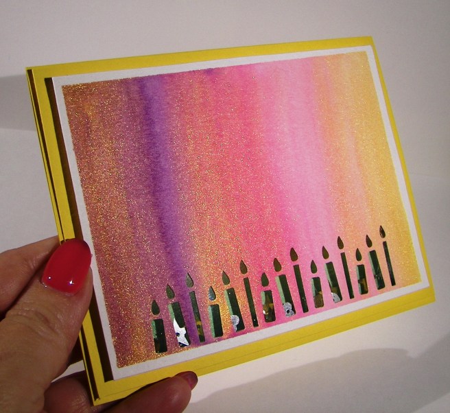
I grabbed a few distress markers from my stash that I liked together, a purple and two pinks. I just scribbled them on a pallet and used an aqua painter to start painting wet on wet. The purple was at the left, a bright pink in the middle with the lightest at the right. I kept adding layers to each colors until they were vibrant enough and then began to blend. It was so fun to watch the pretty colors come together.
I had planned this card to be a shaker card with the candle border punch as a focus. The inside color needed to contrast, so I chose green. I tried to measure my coloring to have green candles with a yellow flame. At certain angles you can see it, but not very easily. The acetate sheet distracts it, especially in the photos. I used liquid metal green and gold to give them a little extra sparkle. Since the gold looked so nice I decided to do a quick overlay to give a lot of sparkle. It worked wonderfully.
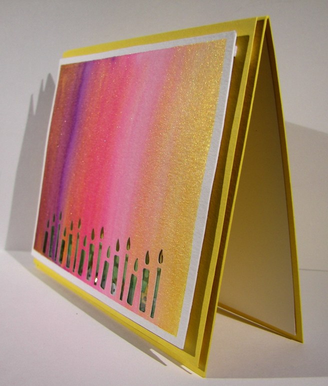
The shaker frame went just around the candle punch area and was filled with a small amount of sequins. I think it turned out great. I ended up stamping a birthday sentiment on the inside of the card because I couldn’t bring myself to add anything that would distract from the front. With the candles there, it could be any kind of celebration card, I happened to make it a birthday card.
Have a creative day!
Moana