Blooms & Wishes Gone Wild

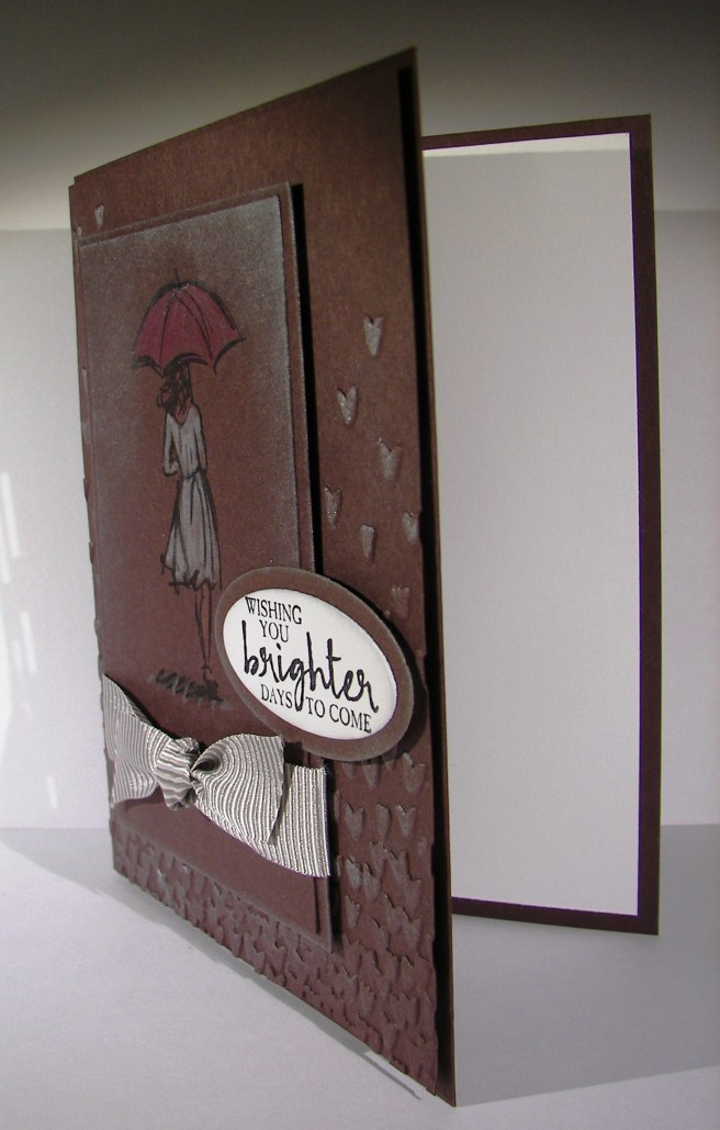
Using a stamp set different than intended can lead to some lovely results.  The main image here is a flower base and the sentiment does come from the same set.  However, when you change it up some, and maybe create a silly creature instead, that same sentiment remains tender, but also very silly.  That kind of sums me up I guess.

3-9

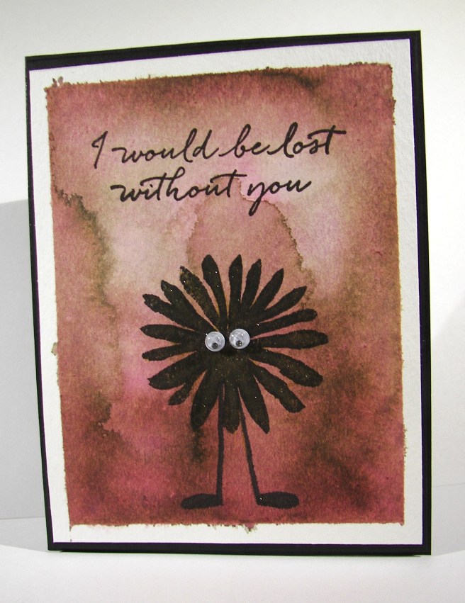
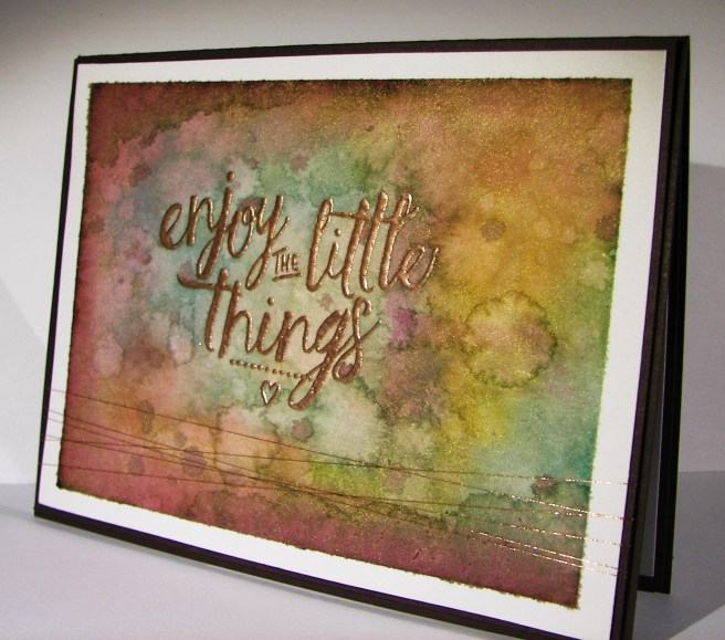
The background took some time, and I nearly tossed it when I was sure it was wrecked. Since I make myself walk away sometimes and return with a new perspective, I kept on. The colors came together nicely and I wish I could repeat it.  Sadly, I think this will be a one of a kind for sure.

The flower creature was stamped in black, leaving plenty of room for those little legs. He got a heavy brushing with gold wink of stella and a couple of google eyes.  I tried a mouth, kind of, but let it go.  It will just have to remain a mystery.

3-9 (1)

The inside got some echo stamping with a smaller flower from the same set and that was all it needed. What an adorable card if I do say so myself, and I do.

Have a creative day!

Moana

Wishing You Brighter Days to Come

Life isn’t always fun, often more discouraging.  Those around us need a pick me up now and again.  A special someone needs this, along with a red umbrella I think.

2-5

So many people have been stamping and coloring on craft paper giving a really unique look. I wanted to try a different tone.  Chocolate chip cardstock seemed like a challenge enough. And it was, for sure.  Silver encore ink really helped bring some diversity to the layers though. The background piece was embossed with the falling petals folder and hi-lighted with silver ink.  At first I started with just a sponge dauber but wanted more ink to show. The aqua painter did the trick.  I just sponged the ink pad onto the top of the ink lid and used that for the pallet.  Quick brushstrokes along the petals gave plenty of dimension.

I stamped the woman in black stazon then colored her with water color pencils.  I made sure I liked the look of the colors on this dark paper.  The red pencil looked more orange on the paper, so I went with melon mambo.  It definitely looked more red that way.  Her dress was done in white and yellow and brushed again with wink of stella.  That made her dress really pop.  I went back over with the black pencil to define the contour lines better, they got lost in the white.

Plenty of sponging with silver to give the clouded rain look.  I love how it turned out.  The ribbon is actually tip top taupe striped, but it looked great next to the chocolate chip and definitely took on a darker tone.  Wonderful!

2-5-1

I think my card ladies would enjoy trying this card out.  This coming Saturday is workshop, this could end up being the first project.

Have a creative day!

Moana

Country Basics

This particular project really made me slow down and think.  My usual haphazard color selection just didn’t work out, as you can tell from the huge collection of colors I have listed. This might be the most color I have used on one project.  It ended up kind of cool in the end, but not sure what it will end up serving as.

7-18

One single stamp was the beginning, just the guitar.  The rest of the images were at the end and quite an afterthought to be honest.  I painted the guitar with cajun craze and the color adventure began.  I had thought it would have been fun to sew metallic thread in the guitar string area, but when I spent so much time on the painting I really wanted to walk away. Maybe next time.

Even though it can be a bit frustrating, it is also quite relaxing to work like this.  It also helps a lot with patience.  I know that if I just stick with it, eventually it will come together. Then, the next project doesn’t seem so daunting, because look at what I managed to pull out of the trash bin!

7-18 (1)

I left it clean of sentiment and all other embellishments.  The images speak for themselves and that guitar, I love that guitar.

Have a creative day!

Moana

Enjoy the Little Things

Yesterday was a very thoughtful day.  I was able to enjoy a day all to myself, which is quite rare in itself.  I had grand plans, a bit too grand, but decided to change them all around and enjoy it differently. This was one of my moments spent, a very indulgent chunk of time working ink all over this lovely card.

7-9

I was given some new paper and brushes for my birthday, so of course I had to get to work using them.  I took this beautiful paper to the brink of maximum absorption.  Sometimes it just takes more time to get the colors just the way you want them.  If you were to smooth your hand over the top of this card you would feel the difference in texture.  The edges of course kept their very smooth surface, but the inked area is actually raised up.  Cool, right?

I did start with the embossed phrase first.  Then I worked around the edges and started in with all of the color mixing.  This copper embossing powder is so fantastic, I absolutely love the color.  It gives a much more masculine feel and goes better with my kind of color pallet ideas for sure.  So, I basically just embossed my sentiment and then went to town on the ink til I was happy.  And I am so happy, so very happy with this one.  I tend to do my best work when I am creating for someone in particular, especially when that someone is my husband.  What more can I say?

7-9 (1)

Have a creative day!

Moana

Country Livin’ Rocks!

Living in the country has its perks, and wouldn’t this be just one of them?  I unfortunately do not have an adorable old truck like this, but it sure would be wonderful!  I will have to settle for the stamp and my imagination.

7-2

This image was stamped with black stazon ink on water color paper and then adorned with a whole bunch of ink colors.  I started with a pallet of six colors, but it didn’t stay there.  I ended up with ten, but it called for it.  That doesn’t include the colors that emerged from simple blending and colors flowing together.  This kind of work is my favorite.  No real rules, just lots of distressing.

The perfect companion to the card is the new copper metallic thread.  It almost reminded me of barbed wire or old fence wire.  I like a little of embellishment, but don’t want any distractions when I water color.  The thread works for me.  There was a touch of stamping on the inside panel.  The splat image from the perpetual calendar set with cherry cobbler stamped off once.  Yummy!   I do think it would be interesting to try and paint this stamp with flames and metallic chrome.  I will have to see on that.

7-2 (1)

Have a creative day!

Moana

Beautiful Ride for Newlyweds

It may be hard to tell, but there are an absolute ton of colors going on here.  I had a blast working on this set.  When I finally finished I was a bit surprised to see how late it got, but it was worth it for sure.  I love making wedding cards just for special people in your life. This one is no different.

4-21

I worked the colors to create a sunrise look and I think it turned out really nice.  I was having a chocolate craving last night, so I settled for chocolate chip paper.  Not quite delicious, but it still worked out.  That led me to marina mist for the car color. From there everything else just came together.

4-21 (2)

I wanted a gift bag to go along with the card to give the gift card something to go in.  I think I will put a tiny selection of rich chocolates around it, wouldn’t you like to get a treat too? Opening gifts can be exhausting for a newlywed couple, so they deserve a sugar boost along the way.

The details in this set are really busy and probably hard to notice.  I think a project like this should look simple even if you know better.  Not everyone knows how much work goes into a tiny work of art like this, but that doesn’t stop me from sharing them.  Just a few more weeks and this card will find its way to the deserving adorable couple.

4-21 (1)

Have a creative day!

Moana

Sending Good Thoughts with Perfect Pennants

Everyone loves a fun surprise, especially me.  Last night my husband brought home some items from the store I asked for, and a few others to boot.  Several basic t-shirts, always need those, and this adorable top with my favorite colors.  Classic me, after my thank you’s were shared, my brain went straight to a card idea.  And that would be this little number.

2-17

It also works out that I am trying to build a small arsenal of birthday cards for my mother-in-law.  She is so diligent in her efforts to send cards to all of her family, all the way down to great-grandchildren.  So, she keeps me pretty busy sometimes.

2-17 (2)

This card was fairly simple by design and pretty easy to put together.  Only one stamp on a piece of very vanilla, punched and layered on some calypso coral which was punched as well.  Love that triple banner punch for fun like this.  The card front is made from very vanilla and layered with a strip of chocolate chip.  I put them together and ran them both through with an embossing folder so the pattern would be continuous.  Love that look.  I chose the boho chic embossing folder because it is nearly the same pattern as the coordinating scarf for my new top.  A reason for everything.  The banner tag was layered on the card front with dimensionals and I called it done.  I didn’t sponge anything or even stamp inside.  Don’t worry, I lived.

2-17 (3)

Have a creative day!

Moana

Guy Greetings


Can this set get any more masculine?  I didn’t think so.  I have to admit, I bought this stamp set entirely for these three stamps.  Which is a bit excessive, but I loved them so much it didn’t matter.  The rest of the set is super as well, but these are my favorites.

Guy Greetings

I know this has a Father’s Day look to it, but that isn’t who I had in mind when I made them.  Actually, it was my husband.  I did learn a lot from my dad, but when it comes to working with tools, that would be my husband.  He has taught me so much and is endlessly patient with my questions.  So fun.

Guy Greetings

I kept these pretty darn simple.  I did like how when I put the sentiment on point they reminded me of caution signs.  I wanted the tangerine tango more narrow to match the narrow background boarder, so I tried something out.  After I cut out the tangerine tango square, I put it back on the cutting plate, and put the framelit on again but shifted it up at a diagonal.  So I was cutting an L shape away.  It worked out the first time.  I could have done more to match the 1/8th” boarder, but went with it.

Guy Greetings

I used some dimensionals on the almost artichoke one and left the tangerine tango flat.  Just some variety there.  Of course I had to stamp on the inside and distress it all the way around.  Tools aren’t tidy after all.

Have a creative day!

Moana