Beautiful Banners

Well, I certainly got distracted today.  Here it is nearly evening and I forgot I had this half way done.  Suppose I could finish it after all.  I was tempted to just skip today and save this for tomorrow, but let’s just share it.

7-20

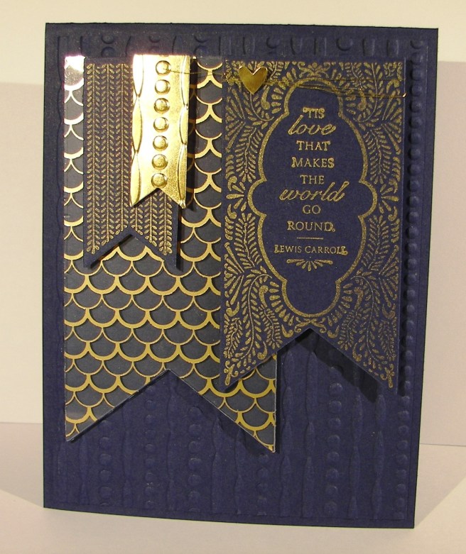
This project was all about the foil designer acetate that came out in this years catalog.  Not until I gave in to use it did I discover it was gold foil on one side and silver foil on the other. I was pretty darn pleased if I say so myself.  I do think I will try this project again with silver, because I do think I prefer blue and silver after all.  But this certainly is lovely.

I used four different banner thinlits and two of the banner stamps.  The layering was simple, just a little patience while I sorted out the positioning.  Both the silver and gold encore inks are so beautiful stamped on dark card stock.  I do tend to prefer the look of embossing powder when it comes to metallic ink, but it did just fine.  Such a beautiful sentiment.

7-20 (1)

I started with the small banner cut in gold foil, but it was too smooth and shiny so I put it through the same embossing folder I used for the background paper.  And, it tied it together as well.

Such a lovely day of distractions, hope you had one too!

Moana

You Are Awesome

The other day my daughter was wearing a fun pair of pants that were so colorful and had a bunch of fun patterns.  Every time I looked at them I thought I should make a card.  So, I literally went digging through her laundry to find them and give it a go.  Inspiration comes from a lot of different places, but the laundry bin was a first for me.

7-12 (1)

I went through my paper files pulling scraps of the different colors I wanted.  Most of the strips were fine, but some needed to be trimmed to give some diversity.  Once I had the color strips ready I cut a base from printer paper to adhere them too.  It was pretty easy to do because they were just stripes, nothing too tricky.

7-12

I used one of the elements from the butterfly basics set to put a few black stripes down as well.  The piece was then trimmed to 4″ x 5 1/4″ and put through an embossing treatment.  I was able to slide the piece around a bit lining up the patterns inside the stripes and along borders.  I liked that part quite a bit.

The sentiments were stamped and layered with more basic black, but something still wasn’t quite right.  The stripes were too stark.  So, I got my trusty sponges out and went at the whole card front with smokey slate ink.  It hi-lighted the embossed areas more and gave a bit of a distressed look.  That is what I needed and I called it done.

7-12 (3)

Have a creative day!

Moana

Fiesta Like There’s No Manana

Here is one of the projects I made with my club ladies last Saturday.  Such a fun and interesting birthday card.  Plenty of color and who doesn’t just love an adorable llama?  Finally though, a project where I love the brightness of cucumber crush.  It is just one gregarious green there.

6-21 (1)

Framelit cutting made pretty darn quick work of the elements for this project.  A little stamping before and after doing the cutting.  The llama was really fun, but I felt he was a little on the whimsy side to worry about painting and making him look too real.  Besides, his teeth really aren’t accurate, they come from the bottom not the top like a bunny.  Still totally adorable though.  The banners were stamped afterwards though.  Since you can see through the photopolymer stamps there is not a worry to be found.  Fun and easy to do.

Everything was put on tipped one way or the other to add to the silly look.  Nothing about this card says slow down, just have a bunch of fun!  And my club ladies sure did.

6-21 (2)

Have a creative day!

Moana