Just Keep Swimming!

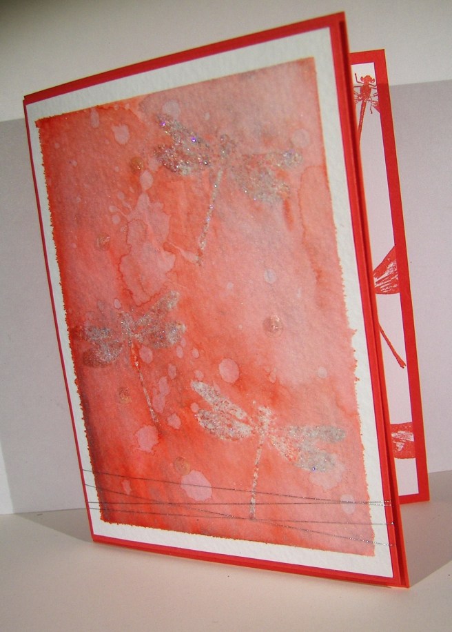
I don’t know, these fish look cool, elegant and creepy all at the same time. The color choices have created a neat look, but almost skeletal.  Well, you get the idea, right?

3-28a

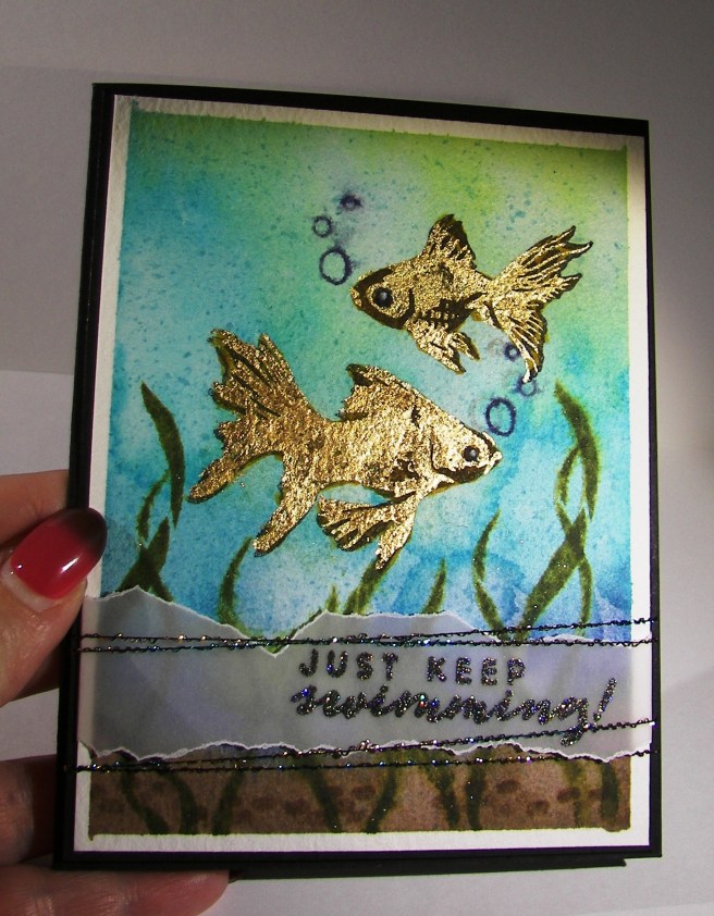
To get the water color I simply pulled open my drawer of distress inks and grabbed four colors making sure they were dark to light.  I did a wet on wet water color technique to blend the ink together putting dark at the bottom and going up to the lightest color.  I came back in with a brown for the sandy bottom and stamped the stones in the same color.  Having some sunshine at the top peeking in was a great idea, but with my blue choice I got more of an algae look, but it looks good too.

The fish were stamped in black stazon to allow me to water color all around without ruining the image.  I knew I was going to go back with gold, so I didn’t worry about how dark they looked.  Guess I should have.  The sea weed or plant guys were stamped in green tones all around the fish and spritzed with water to soften the images.  The stamp set also came with these cute little bubbles, for the fishies of course.  So they were stamped in the darkest blue I used for the water.  I also used a splatter image from the Touch of Texture stamp set to give the water some dimension.  Even with all the color it looked kind of flat.

Then it was time for the gold guilding flakes.  The second layer of the fish set was stamped in glue and the flakes were pressed over that.  I let it set for just a moment before I started rubbing around with my finger then a bristle brush to remove the excess.  The gold sure does shine.  Different than embossing, but still exciting.  I tried to glue on some googly eyes, but it made the card look too silly, another time for those.  So I just drew some little dot eyes with a white gel pen.  Maybe a bit too creepy, but I left it.

3-28 (1)

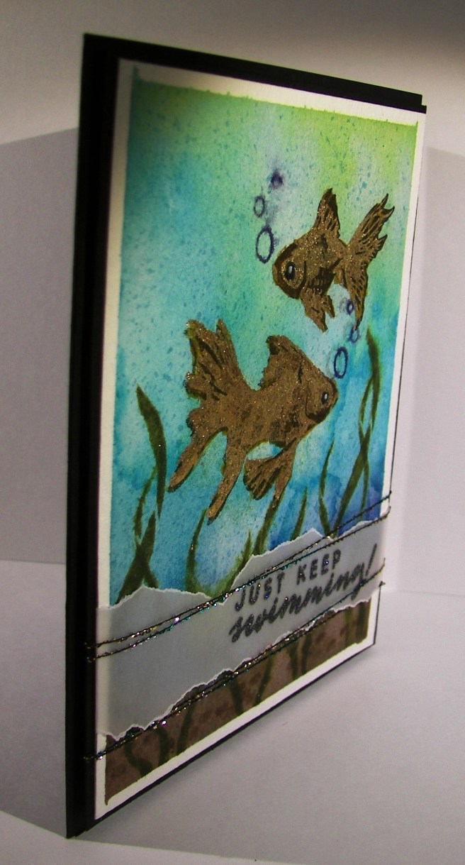
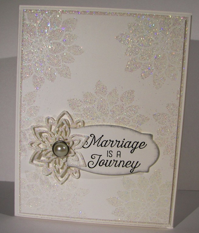
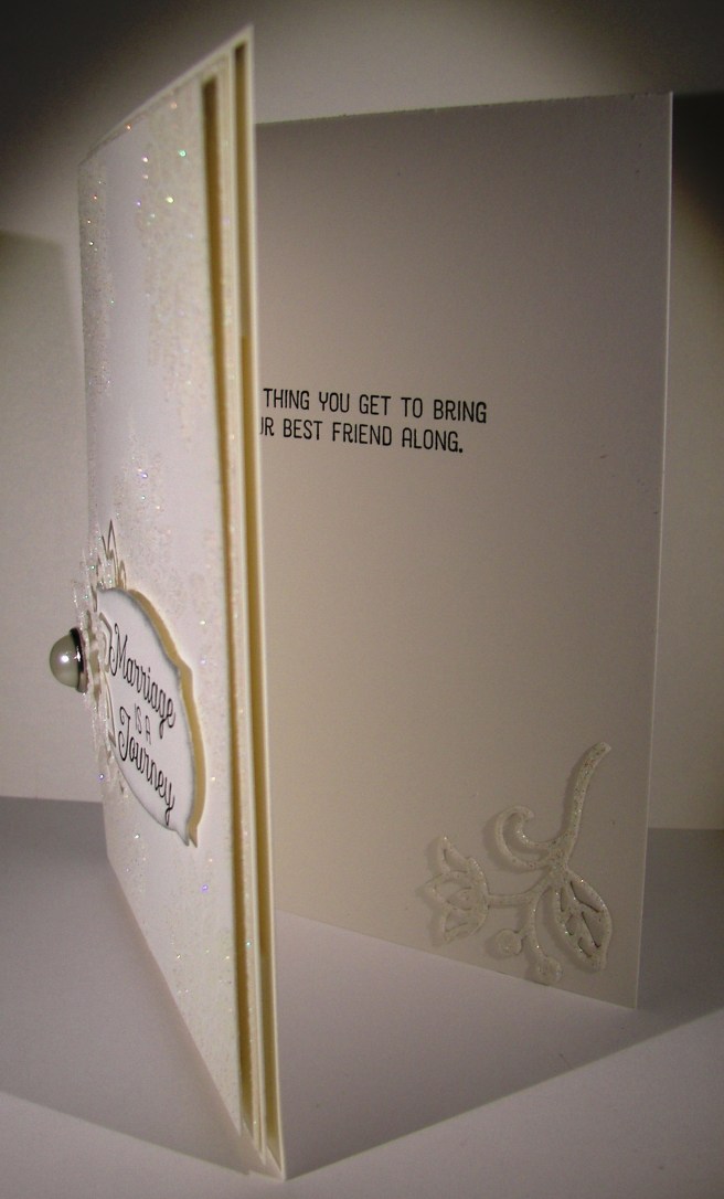
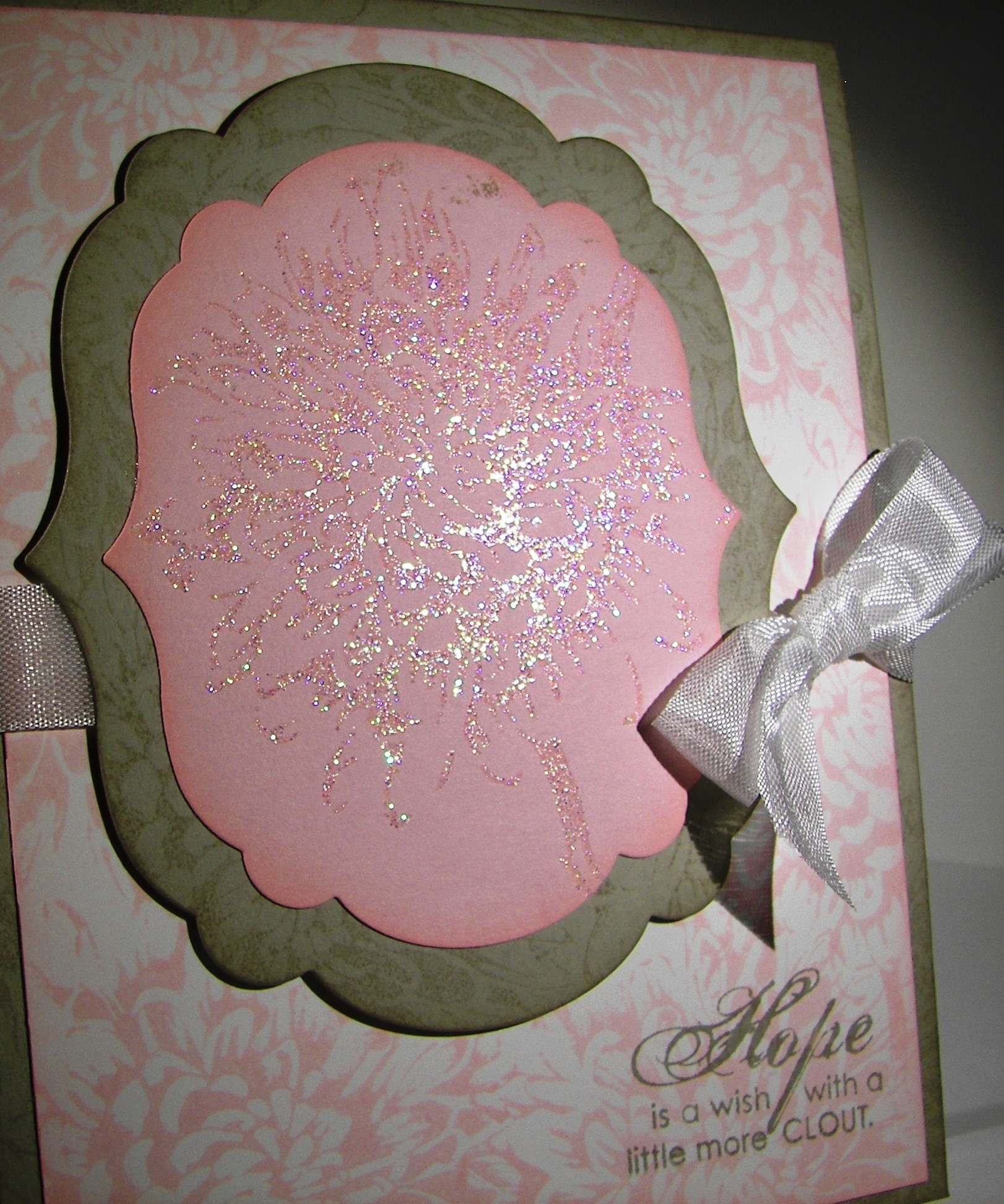
The sentiment was stamped in versafine black ink on velum cardstock.  While it was still moist I sprinkled iridescent ice powder over the top and heated it in place.  So sparkley and pretty.  I had some fun threads that matched and down they went.  A fun, but interestingly elegant card.  I sure had fun making it though.

Have a creative day!

Moana

Marriage is a Journey

Time for something wonderful, like a wedding.  A white on white card with this much sparkle says wedding like nothing else.  It almost feels like a wedding gown.  So lovely.

7-16

The entire card was made from one sheet of heavy weight card stock, plus a piece of dazzeling diamond glimmer paper.  That stuff is so fantastic to work with, but I am a bit stingy sometimes.  This time, I put it to really good use.

The layers were simple, with just a 1/8″ border added along to each one.  I used the center of the glimmer paper to die cut the floral images I used to decorate the front and the inside. Since it was covered by the other layers, you can’t even see the holes.  Great use of paper.  I also stamped and die cut my sentiment from another layer of the white card stock that was covered as well.  Even with a card this glamorous you can still be practical.

I stamped the card front with versa mark ink, sprinkled with heat n stick powder and heated until it was ready to receive something more.  It was actually pretty by itself, but I did cover the freshly sticky flowers with iridescent ice powder and then heated again.  You can see how beautiful it looks.  Capturing sparkle on camera can be tricky, but not with this technique.  It is that much more in person, really beautiful.

7-16 (1)

Isn’t this sentiment set just so adorable for a wedding card?  I am looking forward to my 26th anniversary next month with my best friend, just fantastic!

Have a creative day!

Moana

Awesomely Artistic with Watermelon Wonder

The weekends seem to get busier all of the time.  I guess that is what happens when you have a child getting married soon.  Errands and then some.  I wouldn’t have it any other way though.  I enjoyed some relaxing time yesterday afternoon finishing this gift set I actually started Friday night.  Talk about being busy.

5-9 (4)

With my love of water color, you would have thought the card came first.  Not this time.  I started with this awesome designer series paper and made an adorable gift bag.  You would think I had tons of gifts to give all of the time with the amount of bags I make, not true though.  I just love to make them.  I do share them with others though, usually as a gift to use for others.  They all find happy homes, I promise.

5-9 (2)

I did try something new with the card though.  The dragonflies were stamped in versamark on the water color paper, not new there.  I used iridescent ice on them, also not new. However, using them together as a resist for water coloring is new.  As color was applied the resist was pretty neat, not as clean as embossing powder, but still holding up.  I decided to add silver ink as well and then it changed even more.  The silver ink clung to the images more than the watermelon wonder ink did.  The look is fantastic, don’t you think? I added a little bit of silver metallic thread and five clear sequins to finish off the look.  Just divine.

5-9 (1)

Have a creative day!

Moana

Sparkly Seasons Pumpkin Patch

It may not look very busy, but these little pumpkins almost did me in.  I nearly got to the point of just showing you how frustrated I was and that there was not much to show for it.  Then I thought about iridescent ice, and the world came together.

Sparkly Seasons Pumpkin Patch

I love that stuff.  It can make the most simple things look almost magical.  I used three different framelits for my pumpkins and got to work.  I used a large stylus to create grooves and texture to the surface, but from the back side.  It really broke down the fibers a lot.  Then I began to water color streaks to give dimension.  That didn’t do a whole lot.  Then I spritzed water and swiped ink on with my finger.  It got better.  Then I sponged with pumpkin pie and added early espresso too.  At that point they looked okay, but still kind of sad.

Sparkly Seasons Pumpkin Patch

That is when I tried the iridescent ice.  I daubed the whole surface with versamark and sprinkled on the powder.  I only used one coating and thought that would be enough.  It was just right.  I did sponge a bit more with early espresso afterwards.  I layered the pumpkins together using dimensionals, with the stems too, and wrapped them all in linen thread.  I wanted to leave it then, but decided on a simple word phrase.  And there you go!

Sparkly Seasons Pumpkin Patch

Have a creative day!

Moana

Just For You

Sometimes I feel like there are one too many butterflies flying around my craft area.  But then I remember, you can never have too many butterflies!  Especially when Stampin’Up! keeps coming out with even more exciting stamps to use.  This set is just one of those types.  I could just put these everywhere.

Just For You

The color scheme is very simple, blushing bride and whisper white with tiny 1/8″ boarders.  I do love those.  Only one butterfly on this card front.  The base image is done in blushing bride.  The next layer, the detailed image, was stamped in versamark ink.  That alone looked wonderful with the darker tone.  A quick sprinkle of iridescent ice went over the versamark while it was still sticky and took a trip to the heat gun to melt it in place.

Just For You

I tried to angle the photo to show you the almost purple glimmer that comes from the powder.  You can kind of see it.  Absolutely lovely stuff.  The body and antennae are separate stamps that make the body.  And yes, this is a photopolymer set.  You just have to see through these stamps to get images just where you want them.

A quick sentiment from the same set and a tiny cotton ribbon bow, and it was done.  I did stamp a few dots on the inside panel, of course.

Have a creative day!

Moana

Blooming With Kindness Trio

This set started with an experiment, had some problems, then turned the corner and gave me something beautiful.  Pretty fun experiment there.

Blooming With Kindness

I started out wanting to use pink pirouette, saraha sand and very vanilla.  The papers looked lovely together, however, the way they looked on the very vanilla compared to whisper white made all the difference.

The pink looked so different on the vanilla that it made it look like my card stock was the wrong color.  That was odd for sure.  But I loved the paper I had created using the huge flower from the blooming with kindness set, so I had to get creative.

Blooming With Kindness

I made other cards using the front and inside bits I had stamped on the very vanilla.  Then I made another background piece on whisper white and the pinks were much more friendly.  And I ended up loving the secondary cards more than my original.  How about that?

Blooming With Kindness

Even though my results went a bit off, I do love the look I made.  I stamped the flower with versamark ink onto the card stock and quickly sprinkled iridescent ice powder on the wet ink.  I heat set it and while it was still tacky I hit it again with the powder and heat set it again.  You can kind of see how shiny and sparkly it is.

Blooming With Kindness

Each card got a different sentiment, and they are all so beautiful.  My daughter is the one that said we had to have the set.  She was so right, my creative buddy.

Remember, there are no mistakes in art, only opportunities.

Have a creative day!

Moana