Blooms & Wishes

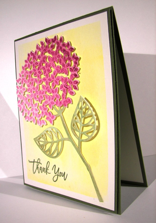
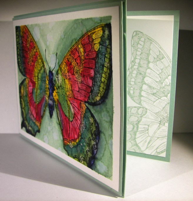
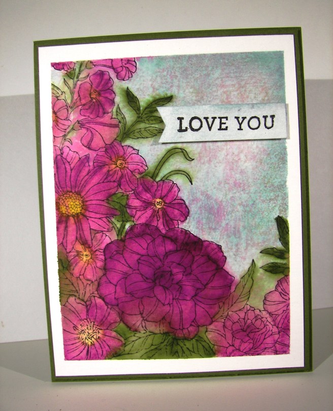
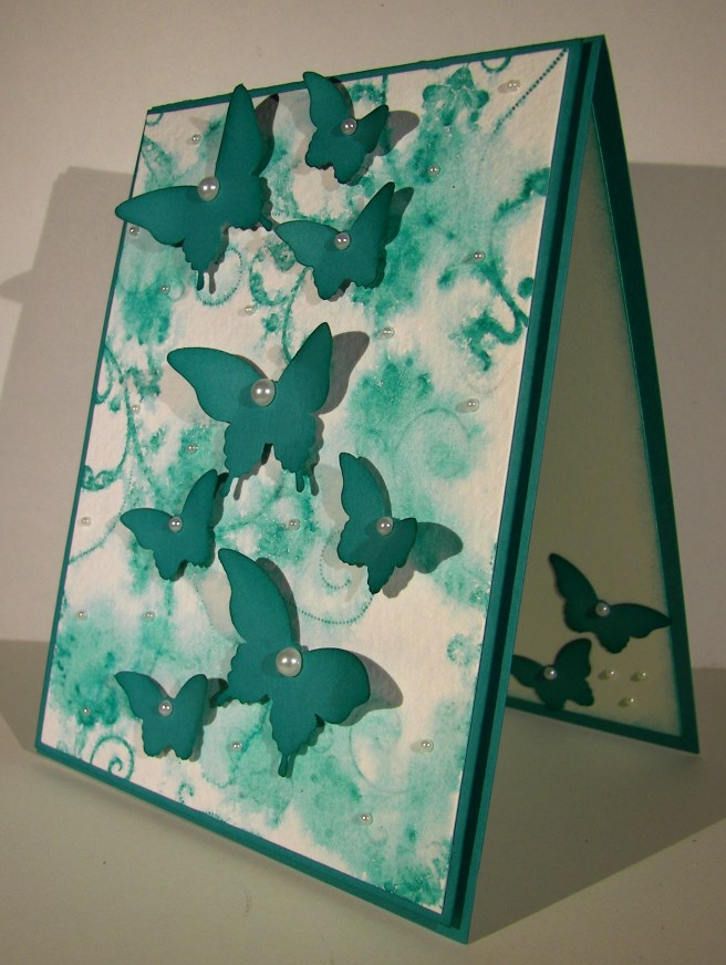
This stamp set sat in the annual catalog and teased me often.  I would try to pass by it saying that I surely did not need yet another floral stamp set.  Well, I broke down and bought it.  So very glad I did.  What a beautiful watercolor piece, right?  Great stamps make all of the difference.

1-15

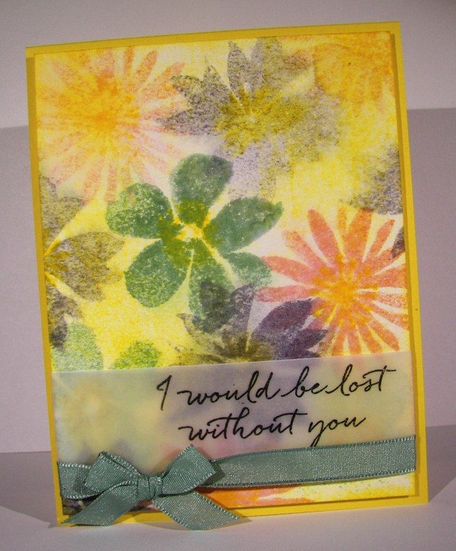
I chose a few spring colors to work with, focusing on daffodil delight.  With all of the rainy, cloudy days we have had I wanted something bright and cheery. Mission accomplished for sure!  I stamped the large flowers from the set in different colors, stamping off as I went along.  The centers were all daffodil delight and more of an idea than a detailed center.  I sponged more yellow ink all around the flowers filling in most of the white areas before moving on to spritzing with water.  It was just a matter of managing the water spritzing to allow some ink movement, but not blurring too much.  It didn’t take long before I was satisfied.  A quick drying moment or two with my heat tool and it was ready for the sentiment.

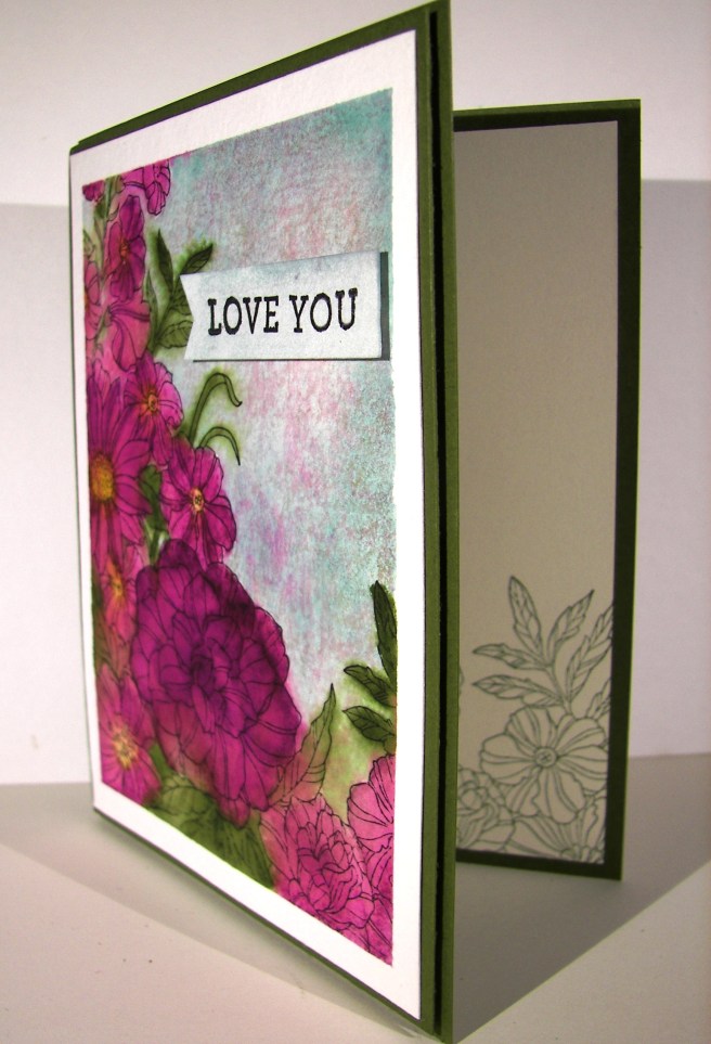
That was stamped on a strip of velum cardstock and then wrapped around the bottom of the card front.  I used a lovely mint macaron satin ribbon to accent the bottom and layered it up with dimensionals.  Such a lovely spring card.  Of course I had to stamp a bit inside with a few yellow daisy images and one for the back too.

1-15-1

Have a creative day!

Moana

For You

This was the third project we created at workshop last weekend.  I know this stamp and framelit set are about a whole lot more, but as yet I still haven’t gotten past the hydrangea. I think with fall and the holiday seasons coming I will enjoy more of the trees, but not yet.

8-26

I used the heavy weight whisper white card stock for the background.  I handles the deep impressions of the embossing folders much better.  Also, I had plans for spritzing some color and that would have made some warping sadness otherwise.  It isn’t easy to see, but there is a light tan speckling going on there.  Such an easy technique to employ.

I stamped on wisteria wonder with elegant eggplant for the different tones and accented with more elegant eggplant.  The ink, thick bakers twine, and border piece were all done in elegant eggplant.  It is a dark color, so I kept it under control.  I didn’t sponge anything, that was a challenge to be honest.  The die cutting was simple and then layered in place. The stamping was done last. It did give a bit of a crease line in the sentiment, but worth it.  I worried if I stamped and then spritzed the wording would bleed and I wanted it crisp.  Done.

8-26 (1)

Have a creative day!

Moana

Fear Not My Friend…

When I am wanting to convey more emotion in a card, I go directly to water coloring.  The softness it creates is perfect.  And with this card, I literally poured my heart into it.

8-20

I wanted more space to work with so I created a larger card than normal.  This one measures 5″ x 6.5″.  Big, but not too big.  I also created my inside writing panel at the same time.  This card wasn’t going to just get a blank insert, or even a nicely stamped one. Besides, I love writing on water color paper, so very satisfying.

I stamped my floral image and sentiment first so I could control the strength of color where they were.  Then I brushed the papers with clean water to allow plenty of color movement. I kept the background light and tried to keep mixing to a minimum.  The colors I choose don’t always blend nicely, but that doesn’t stop me.  I dried, distressed a bit, and dried until I was happy.

I painted the flowers with strong color, allowed them to dry clean.  Then worked them over properly.  This included adding, dobbing, and adding color on the flower petals for a bit.  I centered the flowers with a strong yellow, but kept the color from the edge of the flower center.  Then I hit that area with a water spritzer and watched the flower bloom all over again.  The color moved nicely and then was dobbed some more.  Gold wink of stella was brushed into the petals and blended with water again.  The overall effect was lovely.

A special card for a very special friend.  She is far more brave than I can imagine.

8-20 (1)

Have a creative day!

Moana

Touches of Texture

Where has the time gone?  Always rushing away, but I managed to sneak a few extra minutes to play with some water coloring.  During the summer I thought nothing of spending a good hour or so creating a project.  Well…maybe that will have to be a weekend thing now that school is back in session and schedules have changed.  It still felt good, even if it was a quick one.

8-19

I masked my paper around the edges and applied a wash of clean water.  From there I just started to make stripes.  First with the blue and then the pink.  However, I applied the blue in stripes tipping the project so the ink could flow down a bit.  Then I flipped it around and applied the pink, also tipping the project, this time so the pink could flow into the blue. There was hardly any blending on my part.

The stamps were all from the same set, Touch of Texture.  That is a big set.  Definitely wants time to sit down and really play with the layering options.  I stuck with basic black with a little stamping off too.  Then I distressed with water droplets and called it.  I wasn’t sure if I wanted it to be done or not, but the clock said yes.  So there it is!

8-19 (1)

Have a creative day!

Moana

Thoughtful Branches Thankyou

This card comes from a limited time stamp and framelit bundle.  There are many options within, all kinds of trees and fun things, but this is why I bought mine.  I love hydrangeas so much.  I am so going to enjoy this set.

8-9

I put a new stamp pad to use.  Stampin’Up! has produced a few ombre pads, this one in particular is rich razzleberry.  I am usually a bit more traditional, wanting more self control over the colors I use.  But this was pretty darn fun.  I like how it turned out and I am glad I bought them.  I wanted the color to bleed some, so I spritzed the flower with water after it was die cut.  It softened the color without compromising the ombre effect.

I painted another piece of water color paper with almost artichoke and used the stem die cut.  I didn’t have to add any color afterwards, it turned out nice.  I knew I would be working in water color paper, so I made both flower parts and the card front from the same paper. That way the ink would react the same and have a uniform look.  The background was done with a light wash in crushed curry.  No distressing, just painting.

I stamped the sentiment directly to the card front and called it good.  I did layer it up on another piece of almost artichoke paper for a bit of interest and to help control curling of the card front.

8-9 (1)

Have a creative day!

Moana

Layering Love with Dapper Denim

When I got done complaining that they were changing out the square framelit set with another one I was pleasantly surprised.  Coordinating scalloped squares, how very thoughtful!  This also helped me not be so sassy about the wonderful scallop circle punches being retired.  There are always adjustments when it comes to new catalogs, products and plenty of favorites retiring.

101_1418

The card front was stamped with the Brushstrokes background stamp using the new dapper denim in-color.  I then spritzed it with water until the ink started to move around, let it sit for a bit, dabbed it with a paper towel and then dried it with my heat tool.  All done!

A quick stamp, but a lovely one, cut out with a new framelit, echoed with some more dapper denim in a scalloped framelit and layered up on dimensionals.  Of course I had to use more of that new wonderful ruched ribbon.  Dangerous stuff there.  I can usually control my ribbon purchasing for me and my club ladies, but I don’t know about this time.

The inside was stamped with a bunch of tiny little anchors to fill opposing corners.  It is also part of the same stamp set, which has several fabulous sentiments to be enjoyed.  I think today is a wonderful stamping day.

101_1419

Have a creative day!

Moana

Farewell Swallowtail

I have loved this stamp for so long.  It is sad to say that it will retire at the end of this month.  However, there is a stash of stash of retired stamps that I cannot part with.  This is definitely going to join those.  Other retired ones I sell off, but ones that are just too wonderful get to stay out with the current product.  Kind of like a wise old tree.

5-25

The butterfly was stamped on a piece of masked water color paper in black stazon.  The color pallet was different, but intentional.  I picked colors that would create interesting blends with the idea that none of the original painting would  stay to true color.  A lot of blending went on here.  I painted coordinating sections first without blending.  After I added crushed curry I kept with that color and used it to begin blending the edges the color sections.  I just did that until I was happy.

The background was painted in mint macaron, darker to one side trying to create a bit of a shadow.  Distressing had to happen here and boy did it.  I flicked water, dabbed it up, and repeated that process again until I was satisfied.  Then the gold wink of stella pen went to work in a few areas.  Again, hard to see, but it is there.  Use your imagination, where would you have painted light lines of gold glitter?

5-25 (1)

Have a creative day!

Moana

Corner Garden Bliss

As another catalog year comes to a close I have to be brave and say goodbye to the things that I have loved so much.  This card has so much of that in it.  The stamp, and three of the colors.  A very sad farewell indeed.

5-5

I masked a piece of water color paper and stamped the floral image in black stazon ink.  I have loved this stamp so much.  I do think it will stay with me even when it isn’t available to purchase.  The only color I wanted for the flower petals was blackberry bliss.  So, that meant some had more color than others and they all got special treatment to make them look unique but coordinated.

Before I painted the leafs and stems I applied the soft sky background.  I knew that mossy meadow would cover easily and I still wanted to allow it to blend out a bit.  It worked like a charm.  The flower centers were painted in hello honey and allowed to blend out a bit into the flower.  After the painting was done I  just stared at it wondering how I wanted to distress it.  I didn’t want splatters or spots, but didn’t want to leave it either.

I decided to use a spritzer and water.  Several sprays later I started to like what I was seeing. I did some sponging with a paper towel to lift off some color, then a neat thing happened. I took my damp, inky paper towel and sponged from the bottom to the top which brought a very light amount of blackberry bliss with it.  It looked pretty great so I went with it.  I bet I couldn’t recreate it though, but I will most certainly try.

5-5 (1)

Have a creative day!

Moana

Bermuda Bay Flourishes

I was wondering how it would look to stamp on water color paper with one of my favorite stamps and then spritz it with some water.  Would I like the effect?  Would it keep enough of the images to be recognizable, or just turn into swirls of color.  It turned out somewhere in between and I like it.

5-2 (2)

I stamped a few times with the largest flourish from the set and then a few more with the smallest one.  Then, I just spritzed about four times and watched the ink swirl a bit then dried it the rest of the way with my heat tool.  I think it will be a fun go to technique for background paper.

The butterfly punches were used to make a bunch of decorative elements for the card front and a couple for the inside.  All of the butterflies were raised up on dimensionals, sponged and curled some with a bone folder.  Pearls were used on all of the butterflies and the smallest pearls were placed all over the card front.  Those tiny details make the difference.

5-2 (1)

Have a creative day!

Moana

Thoughts & Prayers Raining Down

This is the lovely view I have had all this past week.  It has been so wonderful to enjoy the cool cloudy days filled with light rain.  It makes everything look bright and clean, and the smell is wonderful.

Thoughts & Prayers Raining Down

I stamped my image first and washed the paper with plain water.  I then proceeded to layer on my ink until it was dark on the top and the right layer of light on the bottom.  I continued dabbing my brush along the top pointing down for ink to kind of fall down.  It started to look more and more like rain.  I finished it off with spritzing water, allowing it to dry some and doing it again. The last time I spritzed heavier allowing for some drops to form, and then controlled them down the piece.  It worked wonderfully.  How simple is that?

Thoughts & Prayers Raining Down

Have a creative day.

Moana