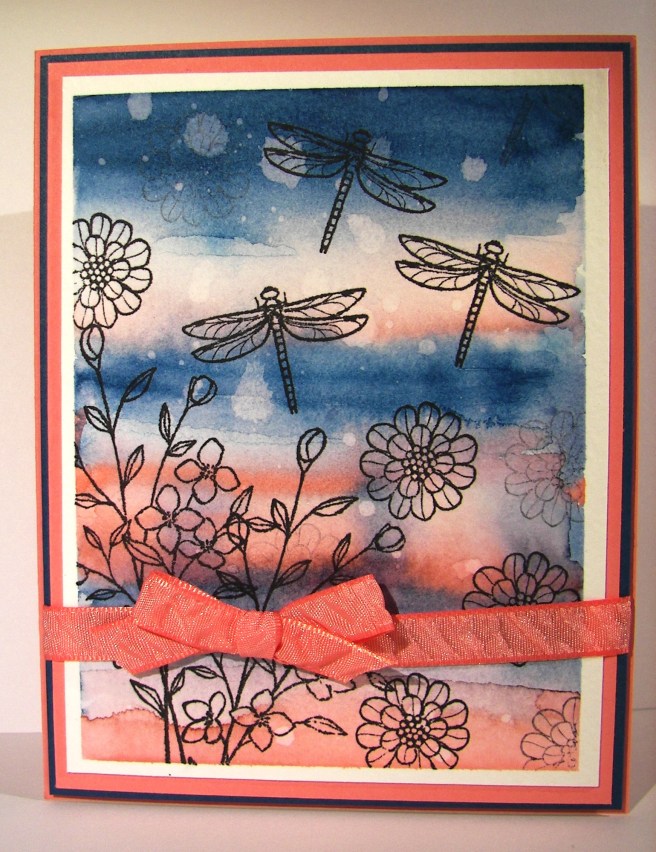
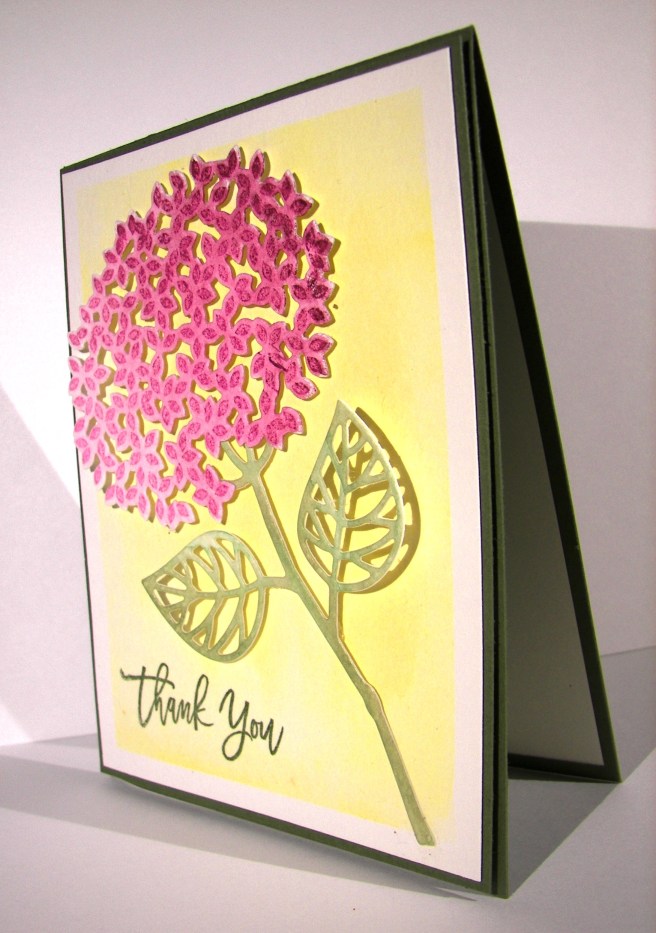
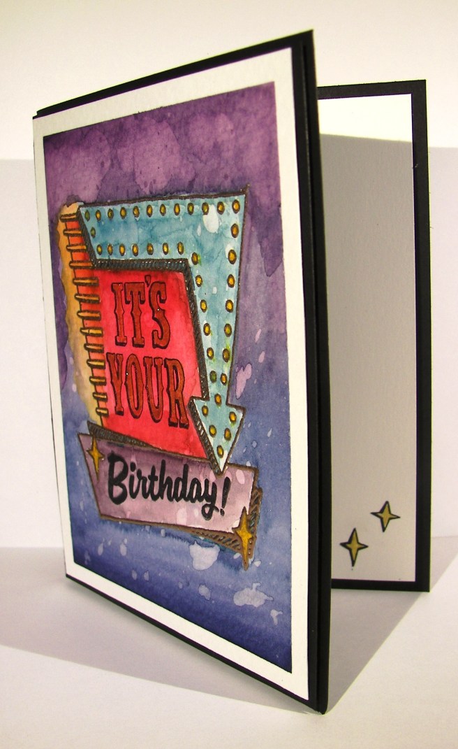
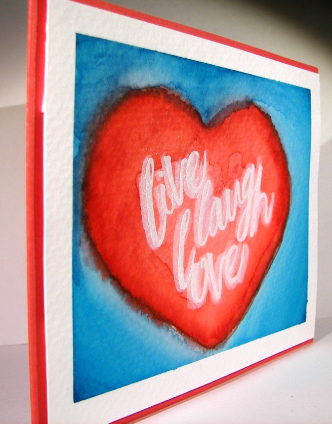
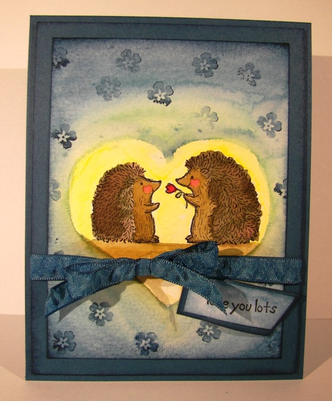
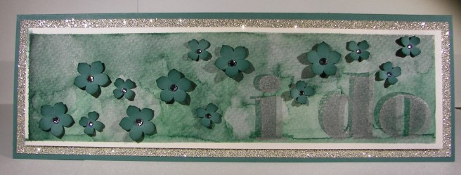
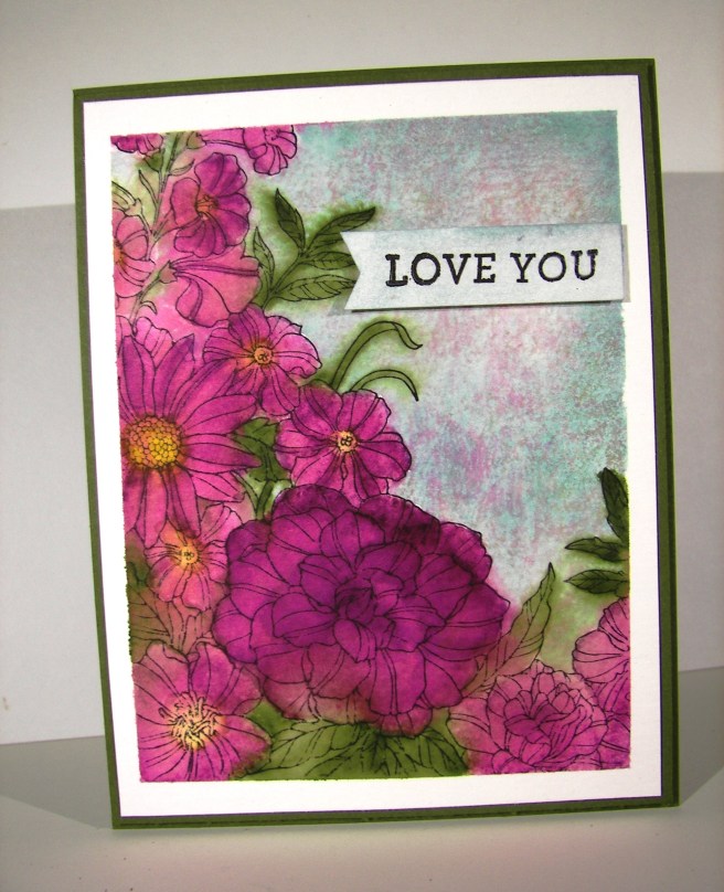
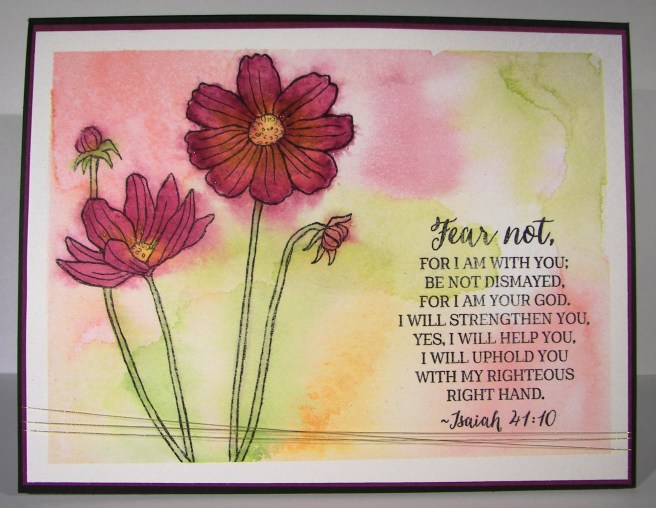
When I am wanting to convey more emotion in a card, I go directly to water coloring. The softness it creates is perfect. And with this card, I literally poured my heart into it.
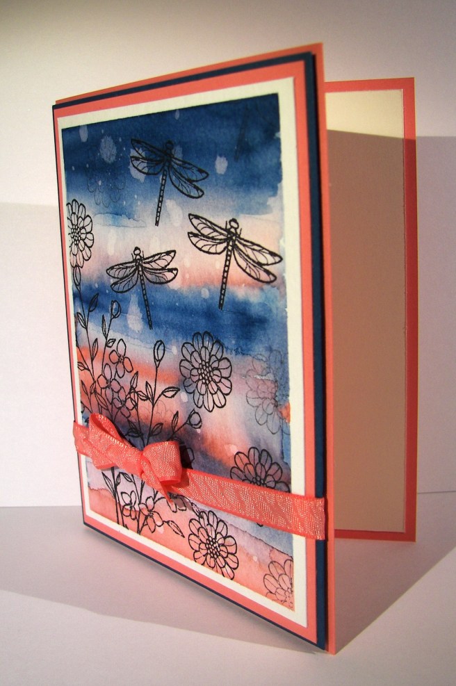
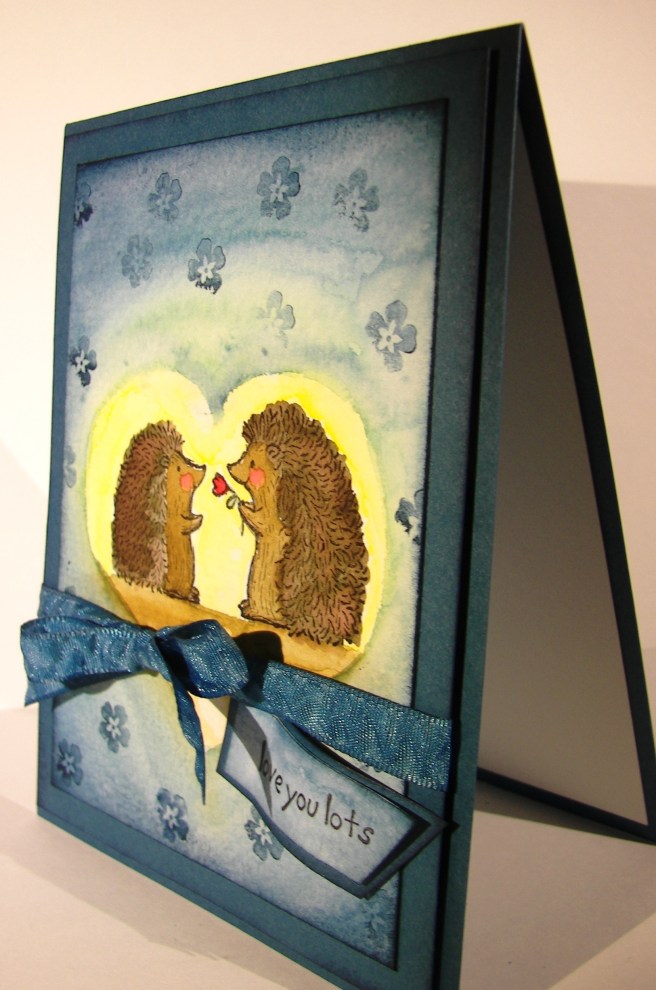
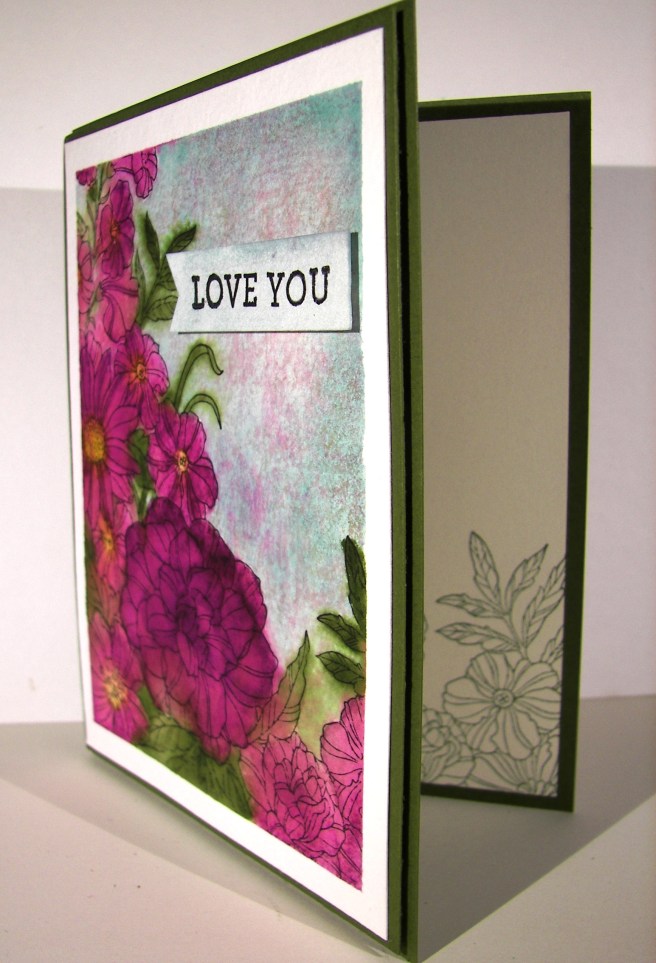
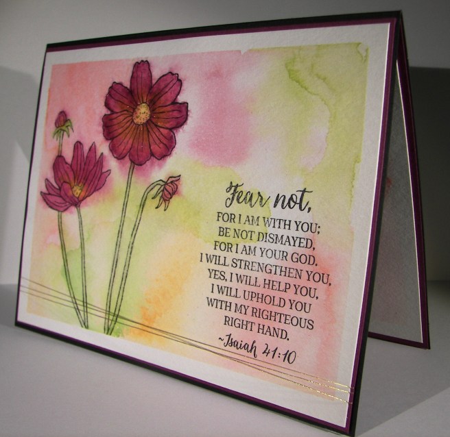
I wanted more space to work with so I created a larger card than normal. This one measures 5″ x 6.5″. Big, but not too big. I also created my inside writing panel at the same time. This card wasn’t going to just get a blank insert, or even a nicely stamped one. Besides, I love writing on water color paper, so very satisfying.
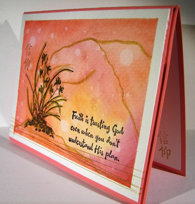
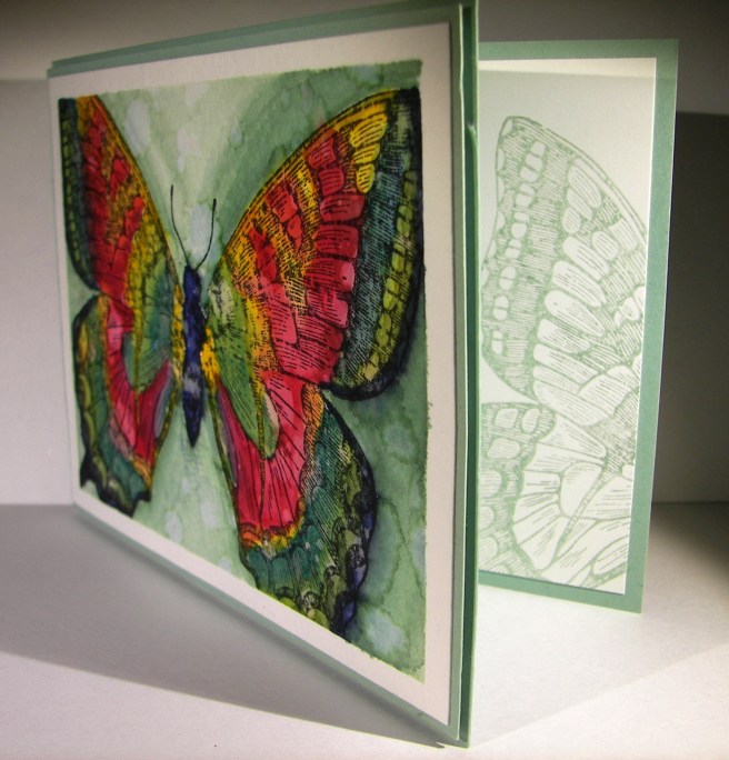
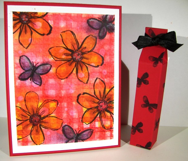
I stamped my floral image and sentiment first so I could control the strength of color where they were. Then I brushed the papers with clean water to allow plenty of color movement. I kept the background light and tried to keep mixing to a minimum. The colors I choose don’t always blend nicely, but that doesn’t stop me. I dried, distressed a bit, and dried until I was happy.
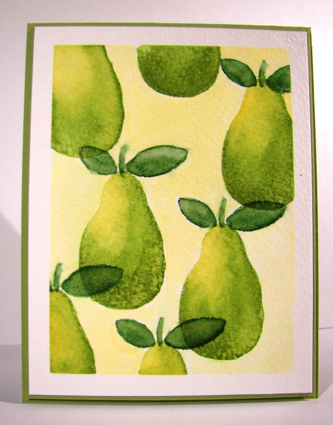
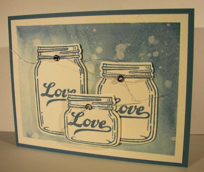
I painted the flowers with strong color, allowed them to dry clean. Then worked them over properly. This included adding, dobbing, and adding color on the flower petals for a bit. I centered the flowers with a strong yellow, but kept the color from the edge of the flower center. Then I hit that area with a water spritzer and watched the flower bloom all over again. The color moved nicely and then was dobbed some more. Gold wink of stella was brushed into the petals and blended with water again. The overall effect was lovely.
A special card for a very special friend. She is far more brave than I can imagine.
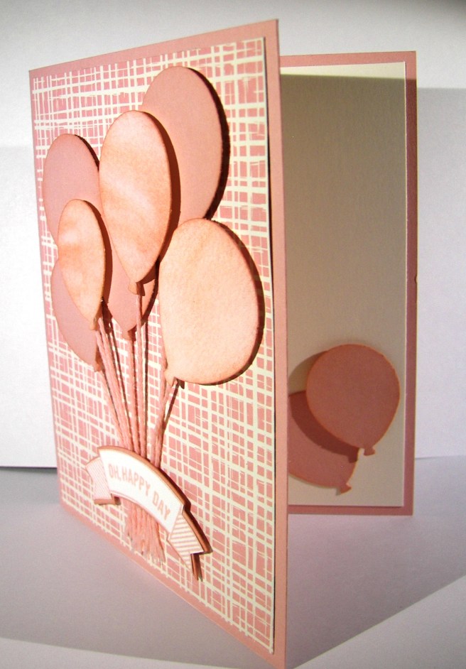
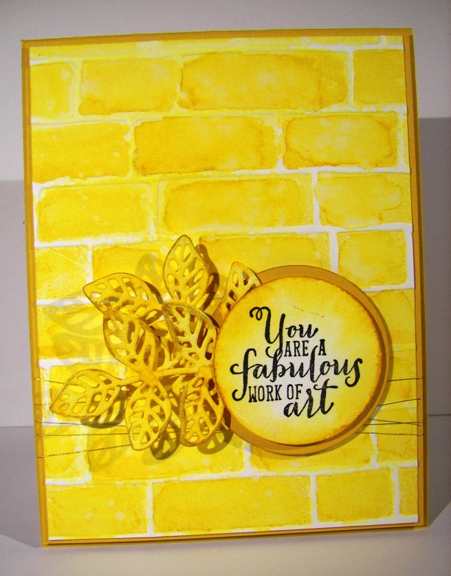
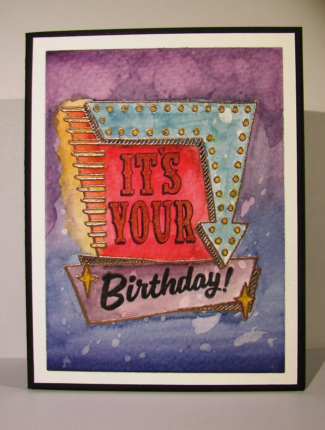
Have a creative day!
Moana