Artistically Asian

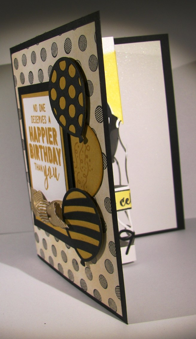
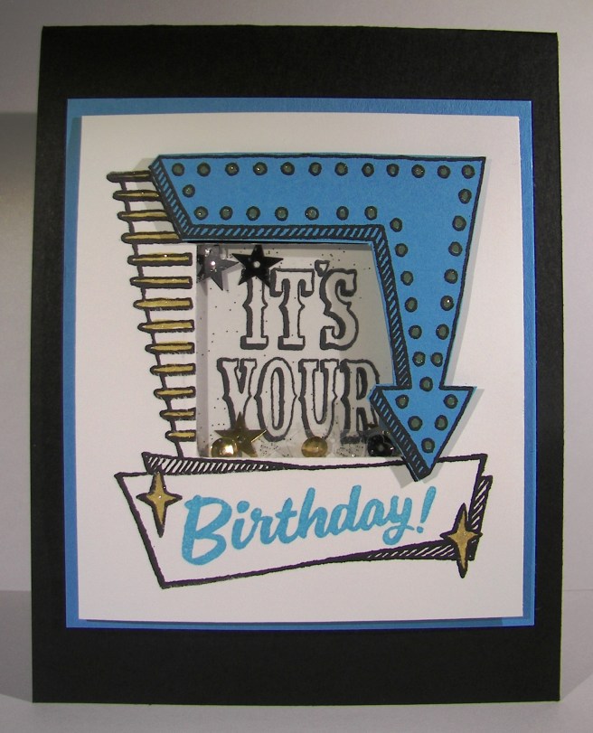
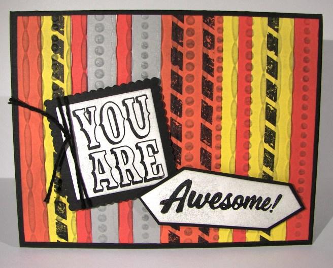
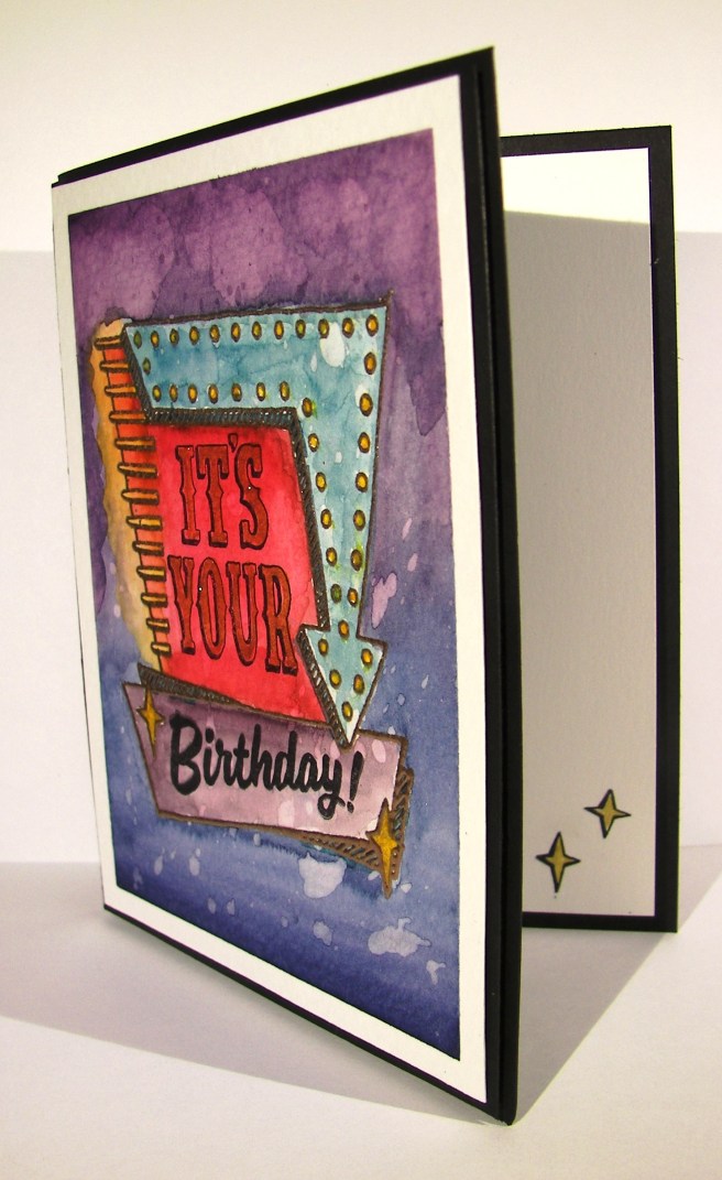
Here we are at day four of this little series and I loved the challenge.   Although the original card was one of my favorites, this one sure does bring a smile to my face.  I have really enjoyed playing with these left over kits.  I might even make a habit of making some every so often just to play with like this.

4-1

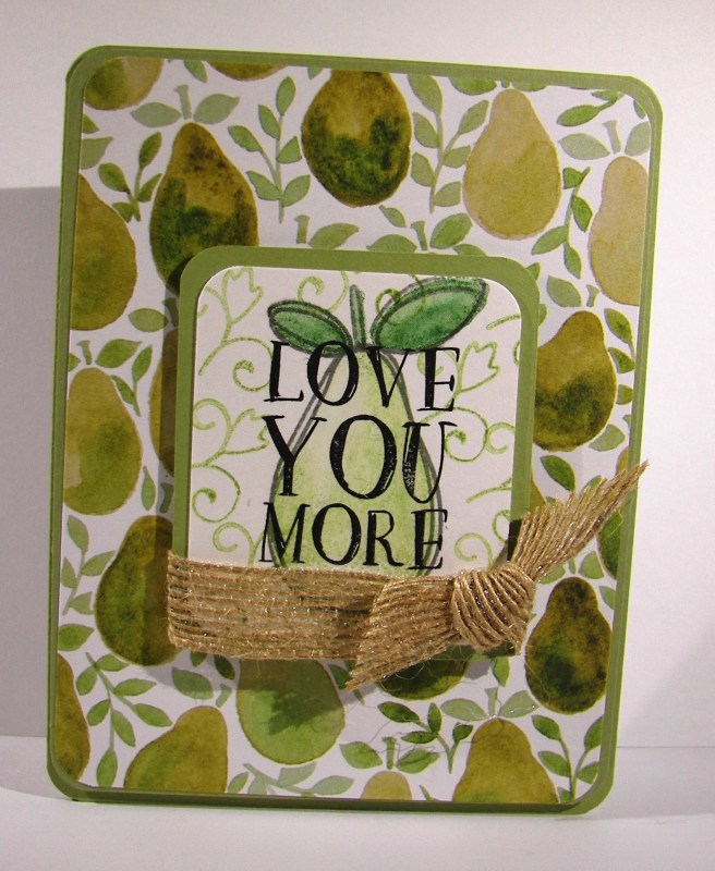
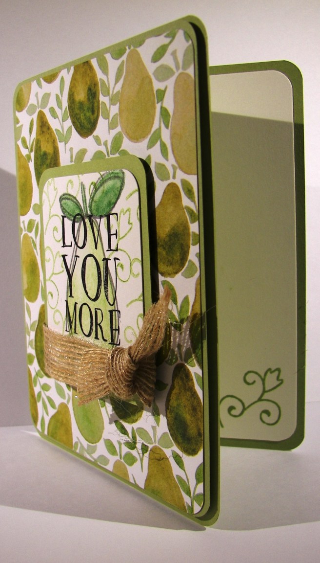
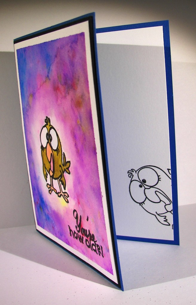
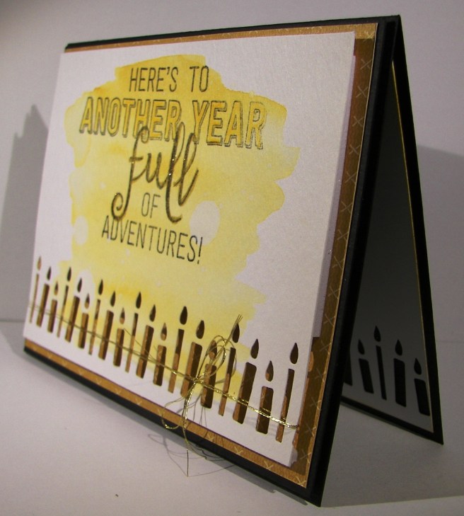
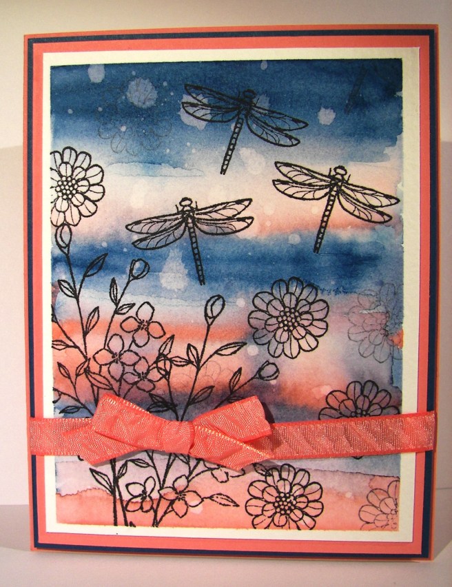
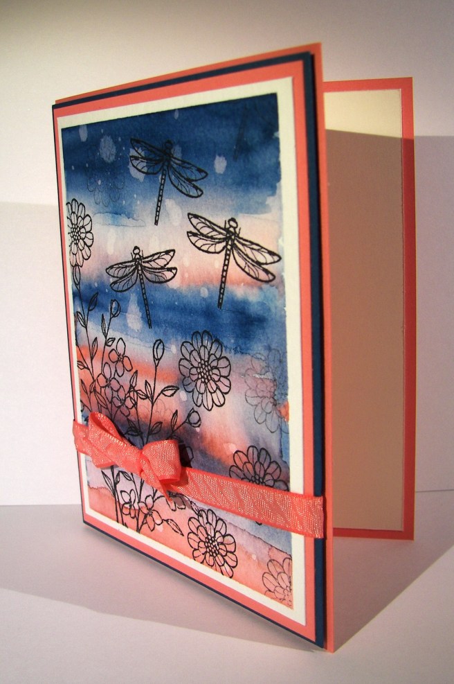
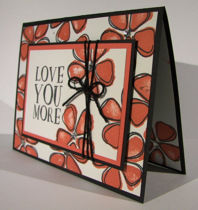
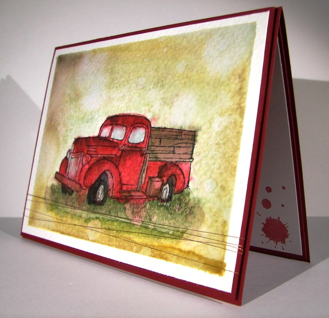
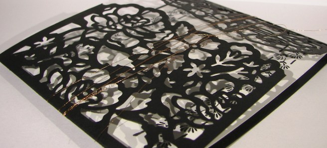
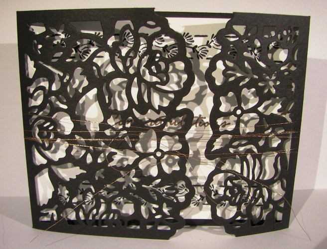
The photo may look like part of the card is missing, but it is actually kind of a z-fold.  I had to modify it some to cover some damaged areas of cardstock.  Not all of the kits come back home from workshop is good working order.  That is okay, no mistakes, only opportunities.

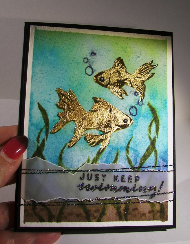
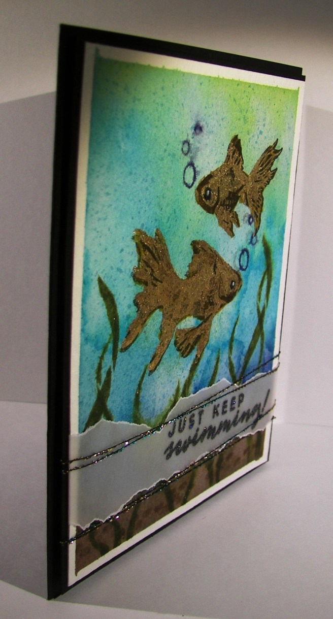
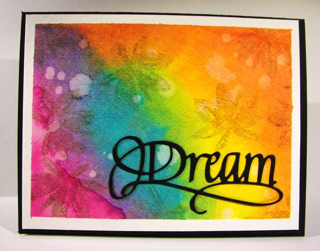
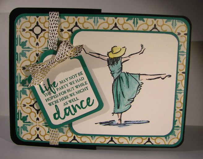
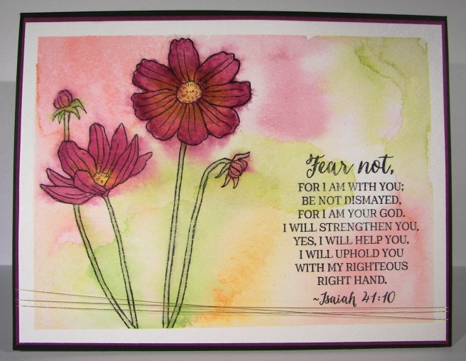
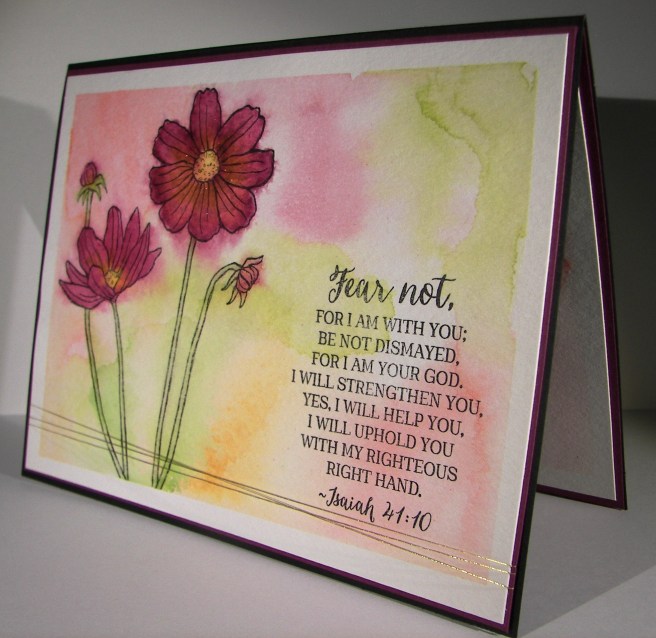
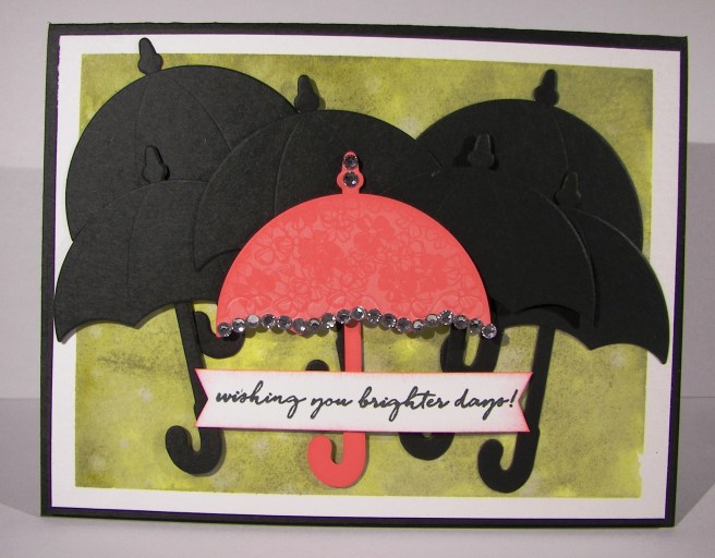
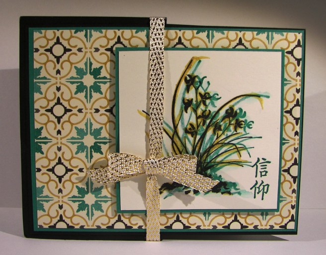
The stamping kind of looks 3-D instead of a shadow.  I should have stamped the second time closer, but I was distracted I guess.  No mistakes though, right?  On I went.  I tried to soften the green image some and connect the two by brushing the area with an aqua brush to push the color around.  It worked for me.  The best part of this is the lovely stamp in the right lower corner.  I believe it is a phrase that talks about having faith in God.  So beautiful, the concept and the stamp.  I would love to be able to write like that.

4-1 (2)

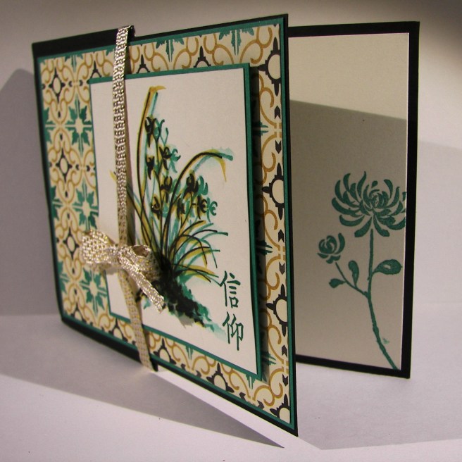
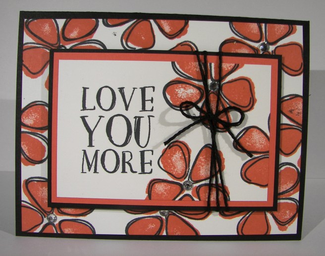
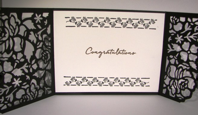
I put the layers together, raised the floral sentiment area up some, and wrapped it in some beautiful from the recent Sale-a-bration catalog.  I hope you got some of that, I have absolutely loved it.  A second floral stamp was placed on the inside to tie it together.  I really do love inside stamping.  I like being able to use more of the stamps in a set and having access to the inside is like another canvas to work with.  Good stuff.

Have a creative day!

Moana

Love You More

You know when you plan, prepare and get all ready?  And then suddenly everything gets in the way and it seems your work was in vain?  That was this morning.  However, I am trying to get it sorted out and keep my commitment to myself and have fun doing it.  How do you do that? Just keep smiling and pushing forward.  Twelve hours later, here is the blog project I had all ready.  Technology isn’t always my friend, but I want it to be.

3-29

I gave myself a challenge to create seven projects from my leftover workshop project kits.  The goal is to use the materials provided and make it look different than the original.  This one was hard to reinvent because of the designer series paper.  Kind of had to stick to the pear thing, but I still managed a bit of a twist.  The stamping is definitely different as well as this fun and funky burlap ribbon.  I like it, but it is kind of hard to work with.

3-29 (2)

This project was relatively simple, and even more lovely.   Creating something new out of something old can be very rewarding.  Cleaning up my desk has actually been kind of fun. Enjoy the next several days as I share more of my tidying up.

Hope you had a creative day!  Mind was more frustrating than creative, but still satisfying.

Moana

Just Keep Swimming!

I don’t know, these fish look cool, elegant and creepy all at the same time. The color choices have created a neat look, but almost skeletal.  Well, you get the idea, right?

3-28a

To get the water color I simply pulled open my drawer of distress inks and grabbed four colors making sure they were dark to light.  I did a wet on wet water color technique to blend the ink together putting dark at the bottom and going up to the lightest color.  I came back in with a brown for the sandy bottom and stamped the stones in the same color.  Having some sunshine at the top peeking in was a great idea, but with my blue choice I got more of an algae look, but it looks good too.

The fish were stamped in black stazon to allow me to water color all around without ruining the image.  I knew I was going to go back with gold, so I didn’t worry about how dark they looked.  Guess I should have.  The sea weed or plant guys were stamped in green tones all around the fish and spritzed with water to soften the images.  The stamp set also came with these cute little bubbles, for the fishies of course.  So they were stamped in the darkest blue I used for the water.  I also used a splatter image from the Touch of Texture stamp set to give the water some dimension.  Even with all the color it looked kind of flat.

Then it was time for the gold guilding flakes.  The second layer of the fish set was stamped in glue and the flakes were pressed over that.  I let it set for just a moment before I started rubbing around with my finger then a bristle brush to remove the excess.  The gold sure does shine.  Different than embossing, but still exciting.  I tried to glue on some googly eyes, but it made the card look too silly, another time for those.  So I just drew some little dot eyes with a white gel pen.  Maybe a bit too creepy, but I left it.

3-28 (1)

The sentiment was stamped in versafine black ink on velum cardstock.  While it was still moist I sprinkled iridescent ice powder over the top and heated it in place.  So sparkley and pretty.  I had some fun threads that matched and down they went.  A fun, but interestingly elegant card.  I sure had fun making it though.

Have a creative day!

Moana

Dream

Blending colors can be just too much fun.  What a great set of vibrant colors here, right? I started with four and ended up with eight.  I literally had to tell myself to stop, before the colors went too far, leaving me with a brown mud card.  This project is so alive, I love it!

3-10

The ink was applied to a lightly wet surface.  I wanted the color to flow, but not all over the place.  I left intentional gaps in between colors to allow for blending, trying not to make too specific a pattern.  My projects often lean toward stripes, and why not, they are great!

The vision for the die cut was different to begin with, but it did not work out as planned.  No problem, I love it in black as well.  It makes the card look a bit more elegant.  My original thought was to die cut a wide section of adhesive tape and brush it with black glitter. The release paper cut fine, but the adhesive did not want to work with all the detail pieces.  I ended up having to totally clean the die of sticky adhesive before I could use it again.  Live and learn I guess.  But I still want to to make that happen somehow.  Maybe just glitter paper next time?

3-10 (1)

I wanted a bit of interest on the colors, so I opted to add a light flower stamp.  The color is a light neutral, sahara sand.  I thought that would not distract too much from the colors and keep the tone well.  It worked nicely.  I added some droplets of water to distress the background somewhat and called it done.  Such a fun card.

Have a creative day!

Moana

Blooms & Wishes Gone Wild

Using a stamp set different than intended can lead to some lovely results.  The main image here is a flower base and the sentiment does come from the same set.  However, when you change it up some, and maybe create a silly creature instead, that same sentiment remains tender, but also very silly.  That kind of sums me up I guess.

3-9

The background took some time, and I nearly tossed it when I was sure it was wrecked. Since I make myself walk away sometimes and return with a new perspective, I kept on. The colors came together nicely and I wish I could repeat it.  Sadly, I think this will be a one of a kind for sure.

The flower creature was stamped in black, leaving plenty of room for those little legs. He got a heavy brushing with gold wink of stella and a couple of google eyes.  I tried a mouth, kind of, but let it go.  It will just have to remain a mystery.

3-9 (1)

The inside got some echo stamping with a smaller flower from the same set and that was all it needed. What an adorable card if I do say so myself, and I do.

Have a creative day!

Moana

You’re How Old?!

This was an experiment all the way around.  The only thing I hadn’t used yet was the paper. The color burst powder is some crazy cool stuff, but new to me.  That was an adventure. Well, the brushing of color, adding and removing, stamping, spritzing and general mess making left me with this. I wasn’t quite happy with it, but let it be shared anyway. It is so silly after all.

2-22

I began the adventure with some of the color powder on a pallet, added water and began to apply to the background area.  It was actually very dark purple to start with. The blue came second, and then both were lightened tremendously.  Then I tried tapping bits of powder here and there on the piece and spritzing with water.  A cool, and very different look happened then.  That is where it looks like sprinkles of color.

It ended up making my wording look very muddled and hard to read.  I had to outline the stamping with a pen and chose a brush tip just too wide.  That is why it looks so very wonky. Like I said, I stuck with it.  I painted the adorable little bird and was getting pleased again.  Then I went too far and applied wink of stella to that bird.  The gold wasn’t a problem, it was the white area.  It got onto the stamp lines and instead of stamping over again, because I would have had to use my stamp-a-majig, and I didn’t feel that adventurous.  My mistake, because my pen drawing over the goofed edges really didn’t do the stamp justice at all.  Like I said, mistakes were made, products were experimented with, and I still thought I wouldn’t get judged too much on the final product.

My card base was made with pacific point card stock and layered with basic black. Nothing was layered up, just adhered heavily with fast fuse to keep that paper under control. It really got a proper working over. I do want to try again though.

2-22-1

Have a creative day!

Moana

Enjoy Your Special Day

With all of the crazy flood problems and evacuation orders in our area (Northern California), writing this blog almost seemed silly.  But, instead of constantly worrying, I thought I would try to do something a bit more productive.  This project was actually for Saturday, but I never seem to be able to get a blog in on workshop day.  Just a bit much for a Saturday morning I think.  So here you go!

2-13-4

The ladies sure did love making these.  I was kind and did the die cutting for them, but that was just so the big shot would be available for the hot air balloon birthday card.  That was blogged the other day, and they loved it too!  I know how to challenge them, make them a bit crazy, and help them have a wonderful creative time.

This project idea came from another Stampin’Up! demonstrator, who got it from one of her friends.  Either way, Dawn’s Stamping Thoughts is the inspiration behind this project.  She used different colors and the white wink of stella covering the entire dragonfly, so only a tiny touch different. I added a bit of inside stamping.

2-13-1

It looks so much more complicated than in really is.  The back piece of the dragonfly was die cut from whisper white and the detailed overlay from basic black.  They were glued together and the sections were colored in with the brush end of the marker.  I then went over all of the sections with gold wink of stella.  How easy is that!  It is so beautiful in person. I tried to get an angled photo just right to show off the shimmer, but it is so hard to capture those tiny little glimmers.  You really have to try it out.

2-13-3

Have a creative day!

Moana

We Might as Well Dance

When things get crazy it always helps me to have a creative outlet. I think the theme of my projects this last weeks speaks volumes.  Good thing I have a way to share that really brings me joy as well as peace.  Just yummy.

2-9

This is my kind of card.  Lots of layers, a bit of interest, a touch of water color and a lovely sentiment.  Not to mention wonderful designer series paper as a background. This one has to be a workshop project for sure.  So great!

The layers were simple and all of the corners rounded. I even found tag framelits that would also carry the rounded corner.  The card base was cut normally measuring 4 1/4 x 11″, scored at 5 1/2″.  There is an additional score to fold the front back on itself perfectly in half.  That half folded front became the base for the decorative front to be place.  A little different, but not too much.

The water color pencils don’t come in all of the classic ink colors just yet, but the colors I chose match really well.  I used bermuda bay, daffodil delight, pacific point and calypso coral.  It worked out fantastic.  Light coloring and even lighter water coloring with the aqua painter.

To complete it I wrapped some of this years Sale-a-bration free ribbon.  Metallic ribbon often is a bit stiff and not fun to work with.  Not this, I love how soft and pliable it is. I would love it if this became a regular product carried in the annual catalog.  Fingers crossed!

2-9-1

Truly a wonderful project today.  I couldn’t be more pleased, hope you enjoyed and better yet, try one out for yourself!

Have a creative day!

Moana

Here’s to Another Year Full of Adventures!

That sounds like a perfect theme for the year, doesn’t it?  Well, it also makes one great statement for a birthday card.  I made this card along with yesterday’s project so they definitely go together.

1-21

I wanted to use both sides of the designer series paper just to see the differences.  The polka dots were a bit more whimsy with this side definitely leaning towards the masculine side. This new candle border punch could keep me busy for days!  Doesn’t it give such a great look both inside and out?  I had to restrain myself from keeping all of the punched pieces to build little candles on other things.  Another time perhaps.

I kept the stamping light as well as the water coloring.  Just one color here, delightful dijon, and I love the simplicity of it.  I did have to tie some metallic thread though, it needed it.  When I looked at the stamping I wanted a bit more with some of the words, so I had a couple of ideas.  I colored in the ‘another year’ portion with the daffodil delight water color pencil, it matched great!  I also went over the ‘full’ portion with the gold wink of stella brush pen and loved it.

I did distress the water coloring a bit with water drops, just can’t help myself sometimes.  I do what I love and I love what I do.  Can’t wait to try this one again.

1-21-1

Have a creative day!

Moana

No One Deserves a Happier Birthday

No one deserves a happier birthday than you.  Wouldn’t you feel special getting a birthday card that said that?  Absolutely!  I tend to make a bigger deal out of other people’s birthday than my own, but don’t we all?  I am trying to build up my birthday card stash, it has seriously been neglected.

1-20

What a great way to get going again though, right?  This stamp and thinlit bundle is just the best.  I love how it also coordinates with the balloon bouquet punch, perfectly.  It is awesome to have new product work with old, especially punches.  I didn’t mind my inside work very well and had a couple of learning opportunities, several actually.  I made creative decisions after I had adhered the pop-up to the card base.  Not my best idea, but I wanted to make changes.  I also didn’t get the thinlit totally straight on the paper, so my card doesn’t fold as flat as I would like, but I don’t think I will get judged for it.

1-20-1

All kinds of layers here and a touch of painting.  The background paper is from a designer series paper pack that is quite masculine.  I love using product as intended, and then trying it out totally different.  These lovely dots work either way.  It made a fun card with the ability to be for a man or woman, even a really cool teenager would like it.  Win win!

1-20-2

I couldn’t get this blog done this morning, I just ran out of time before work!  No biggie, afternoons are a great time to share too, right?

Have a creative day!

Moana

It’s Your Birthday!

Shaker cards are so much fun, and they really are quite trendy in card making.  I finally broke down and had my card ladies make one for one of our workshop projects this last weekend.  They did great!

8-23

Of course it helps when you have a great stamp set to work with.  This set has a few fun combinations that fit perfectly with this style.  Cutting out the window was made super easy with the layering squares framelits.  I don’t mind fussy cutting things out, but I would rather not.  It also kept the edges nice an clean.  Now we have a card that is neutral enough for anyone, yet fun for most ages.  Great project!

8-23 (1)

Have a creative day!

Moana

Fear Not My Friend…

When I am wanting to convey more emotion in a card, I go directly to water coloring.  The softness it creates is perfect.  And with this card, I literally poured my heart into it.

8-20

I wanted more space to work with so I created a larger card than normal.  This one measures 5″ x 6.5″.  Big, but not too big.  I also created my inside writing panel at the same time.  This card wasn’t going to just get a blank insert, or even a nicely stamped one. Besides, I love writing on water color paper, so very satisfying.

I stamped my floral image and sentiment first so I could control the strength of color where they were.  Then I brushed the papers with clean water to allow plenty of color movement. I kept the background light and tried to keep mixing to a minimum.  The colors I choose don’t always blend nicely, but that doesn’t stop me.  I dried, distressed a bit, and dried until I was happy.

I painted the flowers with strong color, allowed them to dry clean.  Then worked them over properly.  This included adding, dobbing, and adding color on the flower petals for a bit.  I centered the flowers with a strong yellow, but kept the color from the edge of the flower center.  Then I hit that area with a water spritzer and watched the flower bloom all over again.  The color moved nicely and then was dobbed some more.  Gold wink of stella was brushed into the petals and blended with water again.  The overall effect was lovely.

A special card for a very special friend.  She is far more brave than I can imagine.

8-20 (1)

Have a creative day!

Moana

Touches of Texture

Where has the time gone?  Always rushing away, but I managed to sneak a few extra minutes to play with some water coloring.  During the summer I thought nothing of spending a good hour or so creating a project.  Well…maybe that will have to be a weekend thing now that school is back in session and schedules have changed.  It still felt good, even if it was a quick one.

8-19

I masked my paper around the edges and applied a wash of clean water.  From there I just started to make stripes.  First with the blue and then the pink.  However, I applied the blue in stripes tipping the project so the ink could flow down a bit.  Then I flipped it around and applied the pink, also tipping the project, this time so the pink could flow into the blue. There was hardly any blending on my part.

The stamps were all from the same set, Touch of Texture.  That is a big set.  Definitely wants time to sit down and really play with the layering options.  I stuck with basic black with a little stamping off too.  Then I distressed with water droplets and called it.  I wasn’t sure if I wanted it to be done or not, but the clock said yes.  So there it is!

8-19 (1)

Have a creative day!

Moana

Thinking of You

What an impact some pretty paper and a lovely stamp can make.  I tried to think of other things to add to embellish this project and kept coming up empty.  So, I left it as is and was quite happy with the simplicity of it.

8-18

The designer paper stack is measured 6 x 6 and I used every bit.  The card front was measured out first which left me a wide strip.  Yup, I made a tiny gift bag to go with.  What can I put inside?  I thought of several that would work and I can’t wait to give it a try.  It was a tricky little bag to put into place.  Any piece of leftover paper seems to find its way to a gift bag or box with me, I do hate wasting!

8-18 (2)

Have a creative day!

Moana

Love You More

Smudges and all, I love this card.  Leave it to me to use a stamp set that is filled with two step fruit images to use the flowers instead.  Like I said, I love flowers.  The fruits are great though, and I do plan on making fun projects with them too.  I actually used an old kit from nearly a year ago.  I love putting old kits to use.

8-12

The prior kit had patterned paper in these colors, but has been retired, so I thought I would make my own.  Making background images is so much fun to me.  It takes me back to the roots of my stamping, using quality tools for endless creativity.  This stamp set is made for just that thing.  You will be seeing it a lot I think.

The flowers were stamped first in calypso coral and then outlined with the coordinating stamp.  They match, but don’t have to be exact.  It goes with the artsy look it is designed with.  Works even better for me.  And the sentiment, how perfect is that.  I opted to center the flowers with large basic rhinestones instead of the stamped center.  Either would have been nice, but I wanted sparkle.  A finishing touch of solid bakers twine with a sweet bow. It actually came together pretty quick, it helps to have leftover kits to work with.  That makes me fuss less when I have last minute class cancellations because I know I will put the pre-cut kits to good use eventually.

8-12 (1)

Have a creative day!

Moana

Wishing You Brighter Days…

Some days can be filled more struggles than others and it can be difficult to find the bright spots.  Being creative each day certainly does bring a lovely balance into my life.  It allows me to grow, share kindness and even teach a few people along the way.  Very nice indeed.

7-22

I tried a different product.  If I am honest, I have had it on my shelf for some time, but hesitated to use it.  I typically am Stampin’Up! exclusive, but was given a gift from my oldest daughter.  Some Ranger distress inks.  So, they are very lovely to water color with. Luckily I have a few to play with, otherwise I might be tempted to get into those.  They react differently than the inks I work with.

These umbrellas though, how adorable!  I have seen images like these for so long, often with the one umbrella being red.  Flirty flamingo works nicely here as a nice contrast to the black.  I created six black umbrellas and a fancy one for the front.  The basic rhinestones come in a few sizes as well as three strings that are connected by adhesive.  One string was just long enough to travel along the bottom of the umbrella leaving two left over that I placed on the top.  The umbrella framelits have so many fun options to make one creative look after another.  It was kind of tricky to choose, but I managed.

7-22 (1)

I layered these guys around for a while before I committed to their positioning.  The back ones were adhered directly to the water color paper with the front umbrellas being raised up on dimensionals.  What a lovely card to share with someone needing a little lift.

Have a creative day!

Moana

You Are Awesome

The other day my daughter was wearing a fun pair of pants that were so colorful and had a bunch of fun patterns.  Every time I looked at them I thought I should make a card.  So, I literally went digging through her laundry to find them and give it a go.  Inspiration comes from a lot of different places, but the laundry bin was a first for me.

7-12 (1)

I went through my paper files pulling scraps of the different colors I wanted.  Most of the strips were fine, but some needed to be trimmed to give some diversity.  Once I had the color strips ready I cut a base from printer paper to adhere them too.  It was pretty easy to do because they were just stripes, nothing too tricky.

7-12

I used one of the elements from the butterfly basics set to put a few black stripes down as well.  The piece was then trimmed to 4″ x 5 1/4″ and put through an embossing treatment.  I was able to slide the piece around a bit lining up the patterns inside the stripes and along borders.  I liked that part quite a bit.

The sentiments were stamped and layered with more basic black, but something still wasn’t quite right.  The stripes were too stark.  So, I got my trusty sponges out and went at the whole card front with smokey slate ink.  It hi-lighted the embossed areas more and gave a bit of a distressed look.  That is what I needed and I called it done.

7-12 (3)

Have a creative day!

Moana

Country Livin’ Rocks!

Living in the country has its perks, and wouldn’t this be just one of them?  I unfortunately do not have an adorable old truck like this, but it sure would be wonderful!  I will have to settle for the stamp and my imagination.

7-2

This image was stamped with black stazon ink on water color paper and then adorned with a whole bunch of ink colors.  I started with a pallet of six colors, but it didn’t stay there.  I ended up with ten, but it called for it.  That doesn’t include the colors that emerged from simple blending and colors flowing together.  This kind of work is my favorite.  No real rules, just lots of distressing.

The perfect companion to the card is the new copper metallic thread.  It almost reminded me of barbed wire or old fence wire.  I like a little of embellishment, but don’t want any distractions when I water color.  The thread works for me.  There was a touch of stamping on the inside panel.  The splat image from the perpetual calendar set with cherry cobbler stamped off once.  Yummy!   I do think it would be interesting to try and paint this stamp with flames and metallic chrome.  I will have to see on that.

7-2 (1)

Have a creative day!

Moana

It’s Your Birthday

Do you broadcast your birthday or not?  Well, I think birthdays should always be celebrated, even if you like it small, celebrate.  This is the kind of card that can certainly draw attention and that is totally what I had in mind.

7-1

The stamp set has the marquee image by itself and has different sentiments you can put inside the middle as well as the bottom arrow box.  It doesn’t have to be about a birthday, but that is how I chose to use it for the first time.  I kind of muddled through this project since I only knew I wanted to use embossing powder and a black card base.  Leaves a lot of steps to be followed, even if a bit off.

Most if the projects I have seen with this particular stamp set include stamping the image on different colored card stock papers, cutting the different parts out and then layering them to give a little diversity.  I wasn’t in the mood for that, so I went with my trusty water coloring.  I am not used to coloring around an image so specifically, but it all worked out pretty good in the end.

7-1 (1)

Touches of wink of stella helped make it the rest of the way, even though it is hard to see in the photo here.  Projects always look better in real life rather than photos, but what else can you do, right?

Have a creative day!

Moana

A Special Congratulations

When your daughter gets engaged it is a whole different feeling.  I don’t know how else to explain it, but it just is.  However, planning takes on a whole new level of excitement that is more than difficult to control.  Having two wedding receptions within seven months does slow you down though.  Creativity, don’t fail me now!

6-30 (3)

I finally broke out this bundle to see just what all the chatter is about.  Well, it is really that amazing.  I am going to have a ton of fun working this set.  So many bloggers have really done some amazing work so far, I am going to need to get to work to catch up.  I bet when my daughter sees this she might just get some shifty ideas about wedding invitations. Some things just aren’t fun when you have to make them by the hundreds though.  Perhaps the wedding invite and not the general reception invitation though, definitely manageable.

6-30 (2)

I went with metallic thread as to not distract from the detail of the die cut, but that won’t last long.  I see lots of different types and sizes of ribbon being wonderful here.  It makes me want to change this out right away, but I will leave it.  It matches the copper metallic embossing powder I used on the congratulations sentiment.  Simple and elegant.  Yummy.

6-30 (1)

Have a creative day!

Moana