Nailed It!

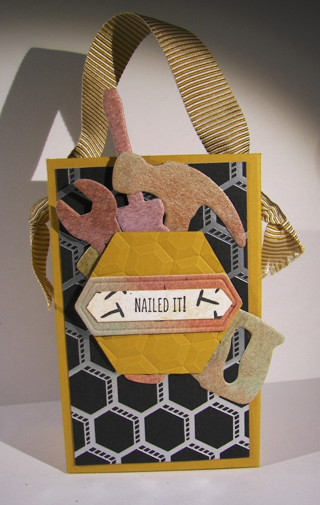
How about a tiny tool kit for a gift bag?  These tool framelits are so fantastic, they really just make me giggle. This set is a little more elegant than others, but I still found myself playing with them before I put them in place.  I realized this photo makes it look like it could be a card, but it is a gift bag made from half a sheet of cardstock.  The tools were die cut from a piece of water color paper that had been painted with several ink colors and some liquid metal colors as well.  Love that look!
3-2

I tried to keep the whole hexagon theme going on here and it turned out nice. The paper is so great it speaks for itself.  What a great set of paper, really.  This piece is foiled and heavier than the others.  After I die cut the large hexagon piece, using a die from the same set, I embossed it for another layer of dimension.  The sentiment background was cut from another piece from the same set.  The classic label punch worked pretty great for the actual sentiment and kind of nestled as well.

A bit of ribbon for the handle was all it took.  I was trying to give it the look of a bucket handle.  Not sure if that happened, but it looked pretty good. The large hexagon was placed before the tools, raised up on a couple of dimensionals.  Then I just started wedging the tools in place and squished some tombo glue underneath to keep them in place.  Fun!

Have a creative day!

Moana

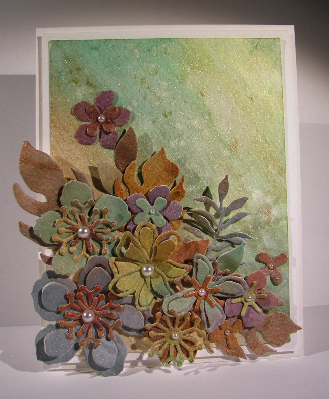
Elegant Botanicals

I started this lovely project yesterday, but got distracted by a shopping adventure with my mother-in-law and two sister-in-laws.  The weather was terrible, but the company was great, and who doesn’t need a shopping adventure once in a while!  This was waiting for me though, and I couldn’t wait to finish it.

2-21

On Sunday I created some favor handouts for a church lesson I taught and they were so cool. Nothing like this card, but the paper I painted for the die cuts had left overs I knew I could use again.  That is where all of these flowers came from.  Yes, a scrap pile.  You never know what those scraps could turn into.

I created a simple background with three liquid metal colors wet on dry.  They were too stark, so I gave a water wash over the top and was much happier.  I had some accidental splotches happen, so I gave a bunch more to disguise them and called it good.  Then the placement of all of these flowers.  Phew, it took some time.

I first layered the flowers together with different sized floral pieces and began my arrangement.  After I was done I began to adhere them down.  Since they were die cut from water color paper they were more pliable, even kind of molded.  The leaves really looked great with some curling and bending.  Little by little the arrangement came together.  Some pieces were adhered with dimensional foam, some with glue dots and several with tombo liquid glue.  Again, no worries because of the weight of the paper.  So very liberating!

I layered the front on another piece of water color paper and repeated the choice again for the card base itself.  It looks so clean and elegant.  It isn’t always easy to capture the different elements on camera, but this didn’t turn out too bad.  Just look at all of that metallic shine.  It took a bit of time, but was absolutely worth it!

2-21-1

Have a creative day!

Moana

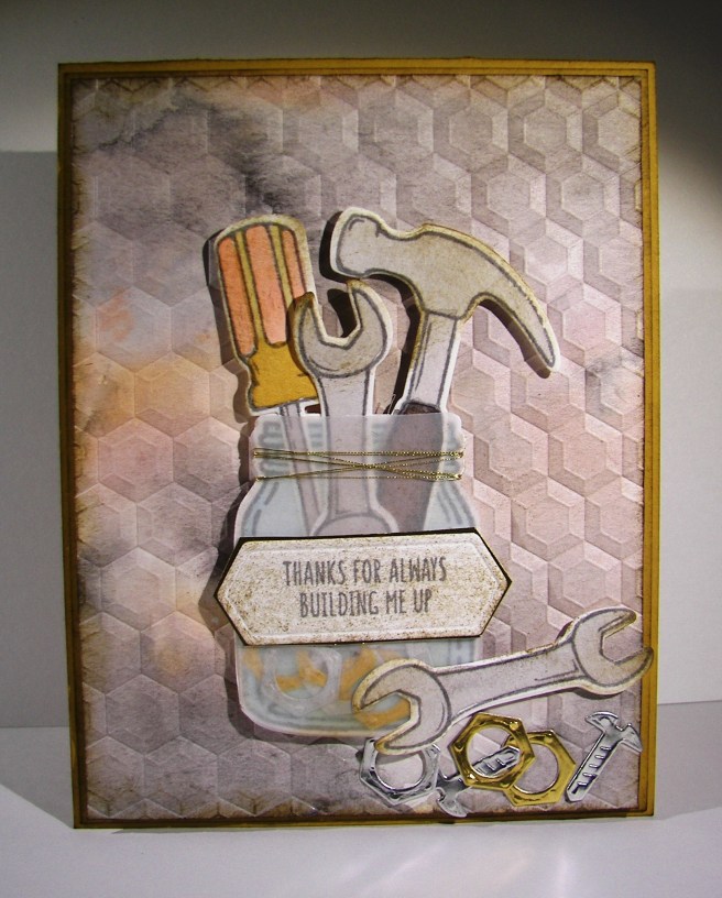
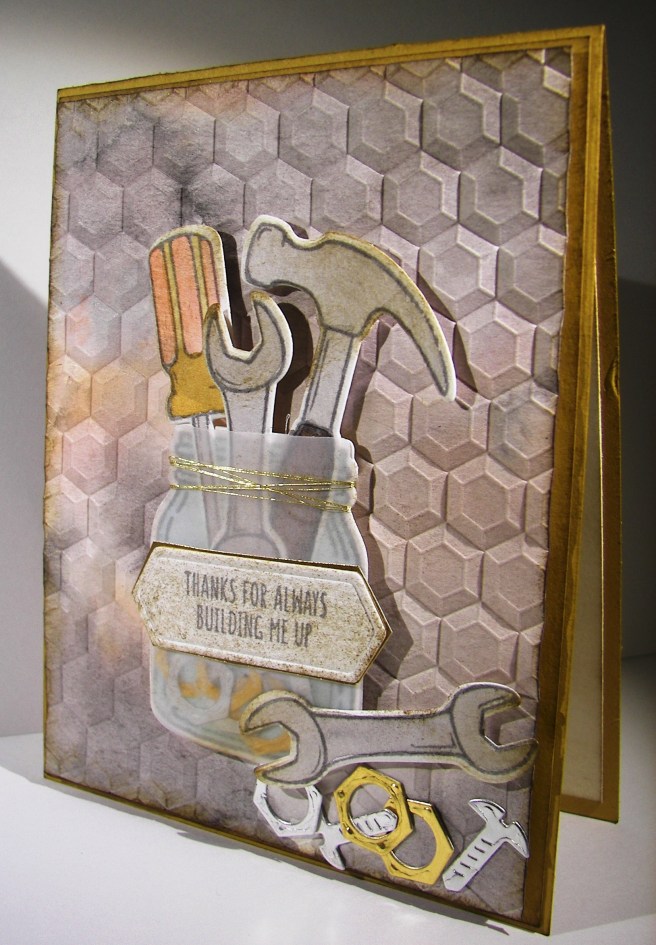
Thanks For Always Building Me Up

I love tiny things, also terribly over sized things, but tiny things are my favorite.  Die cutting these tiny tools, painting them, and placing them in a tiny jar really made me giggle. Making a masculine card usually doesn’t elicit giggles, but this one sure did.

2-19

The tools were stamped on water color paper, painted and then die cut.  I tried to keep the tools in color scheme similar to real ones which was really kind of boring.  The screwdriver is my favorite. The tiny screws and nuts are so adorable though.  I used foil paper for those and thought they looked great. They all got a bit of sponging with soft suede to kind of grunge them up a bit.

The background paper got a light water coloring with the same colors I painted the tools with, sponged as well and then I ran it through the big shot using the hexagon dynamic texture embossing folder.  So very cool, love that folder.

The jar was stamped on water color paper and lightly painted with a very light blue.  I then die cut it as well as a piece of velum card stock.  Some of the screws and nuts were glued to the bottom and the tools placed on as well.  I glued the velum jar over the top to make the glass look happen.  I hid some adhesive under the tag, allowed some to show on the screws at the bottom, then reinforced the top wrapping it in gold metallic thread. Good deal!

2-19-1

Have a creative day!

Moana

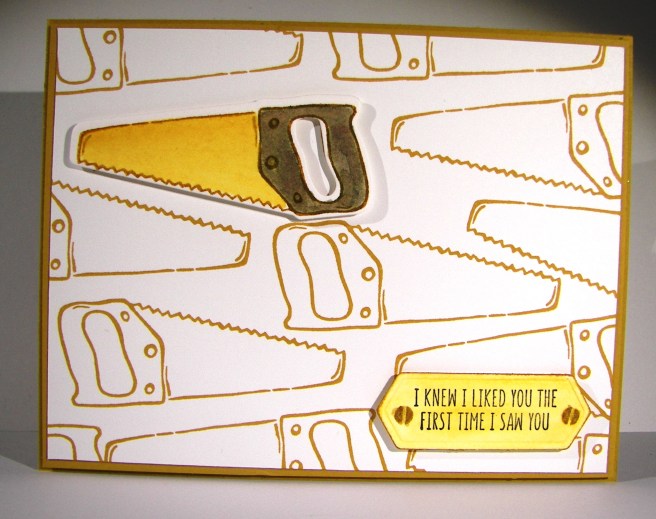
First Time I Saw You

Too adorable for words.  How can you make a masculine card adorable?  Just like this.  The catalog shows this product more in line with Father’s Day, but I seriously couldn’t wait.  I felt like making the die cut pieces and just playing with them, how silly.

1-27

The background paper was stamped with the saw image in delightful dijon in a random but still kind of organized way.  I then layered that piece on a slightly larger piece of coordinating card stock.

The saw and sentiment were stamped on water color paper so I could paint on them without warping.  I used the same delightful dijon on the saw blade and went with a wash of early espresso for the handle.  I did go over the screws on both the saw and the sentiment with gold wink of stella.  Subtle, yet just enough.  You can’t do too much on a masculine card, kind of defeats the purpose.

1-27-1

I touched each side of the sentiment tag in the ink to give a strong edge and still washed the rest of it in yellow.  It worked out nicely.  I tried to stamp the sentiment in early espresso, but my water coloring over made it too light.  I went back to my standby of black stazon. That is just my favorite!

Have a creative day!

Moana
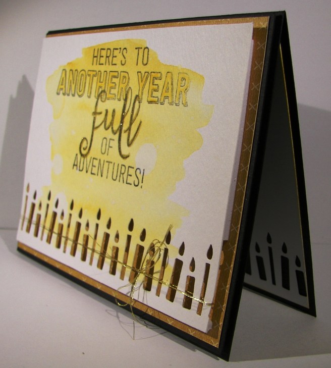
Here’s to Another Year Full of Adventures!

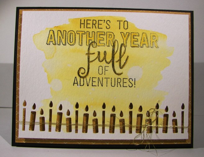
That sounds like a perfect theme for the year, doesn’t it?  Well, it also makes one great statement for a birthday card.  I made this card along with yesterday’s project so they definitely go together.

1-21

I wanted to use both sides of the designer series paper just to see the differences.  The polka dots were a bit more whimsy with this side definitely leaning towards the masculine side. This new candle border punch could keep me busy for days!  Doesn’t it give such a great look both inside and out?  I had to restrain myself from keeping all of the punched pieces to build little candles on other things.  Another time perhaps.

I kept the stamping light as well as the water coloring.  Just one color here, delightful dijon, and I love the simplicity of it.  I did have to tie some metallic thread though, it needed it.  When I looked at the stamping I wanted a bit more with some of the words, so I had a couple of ideas.  I colored in the ‘another year’ portion with the daffodil delight water color pencil, it matched great!  I also went over the ‘full’ portion with the gold wink of stella brush pen and loved it.

I did distress the water coloring a bit with water drops, just can’t help myself sometimes.  I do what I love and I love what I do.  Can’t wait to try this one again.

1-21-1

Have a creative day!

Moana
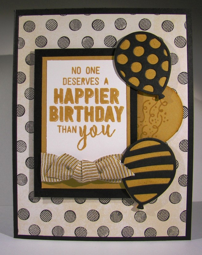
No One Deserves a Happier Birthday

No one deserves a happier birthday than you.  Wouldn’t you feel special getting a birthday card that said that?  Absolutely!  I tend to make a bigger deal out of other people’s birthday than my own, but don’t we all?  I am trying to build up my birthday card stash, it has seriously been neglected.

1-20

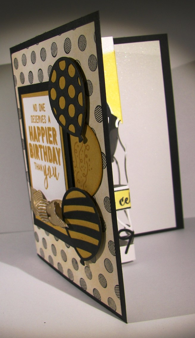
What a great way to get going again though, right?  This stamp and thinlit bundle is just the best.  I love how it also coordinates with the balloon bouquet punch, perfectly.  It is awesome to have new product work with old, especially punches.  I didn’t mind my inside work very well and had a couple of learning opportunities, several actually.  I made creative decisions after I had adhered the pop-up to the card base.  Not my best idea, but I wanted to make changes.  I also didn’t get the thinlit totally straight on the paper, so my card doesn’t fold as flat as I would like, but I don’t think I will get judged for it.

1-20-1

All kinds of layers here and a touch of painting.  The background paper is from a designer series paper pack that is quite masculine.  I love using product as intended, and then trying it out totally different.  These lovely dots work either way.  It made a fun card with the ability to be for a man or woman, even a really cool teenager would like it.  Win win!

1-20-2

I couldn’t get this blog done this morning, I just ran out of time before work!  No biggie, afternoons are a great time to share too, right?

Have a creative day!

Moana

Delightful Garden in Bloom

This project is a companion to yesterdays post.  Both card fronts were made with the same combination of distress inks, just in different sequences.  This one was actually done first which is why the colors are more distinct.  I certainly am enjoying this kind of painting.

7-31 (2)

As I placed the water color paper into the smeared and spritzed inks I made sure to allow white spaces to remain.  I had to make myself stop adding color before some of that effect was lost.  I can’t wait to try it some more.

When I finished drying the piece it felt like something more was needed to tie it together. I found a great stamp from the Garden in Bloom set and did some random stamping. The ink was too dark full strength, so these flowers were stamped off once before being applied. Then a fun ribbon for a bit of interest to finish the front.  A little echo stamping was applied to the inside and the card was done.

7-31 (1)

Have a creative day!

Moana
Country Basics

This particular project really made me slow down and think.  My usual haphazard color selection just didn’t work out, as you can tell from the huge collection of colors I have listed. This might be the most color I have used on one project.  It ended up kind of cool in the end, but not sure what it will end up serving as.

7-18

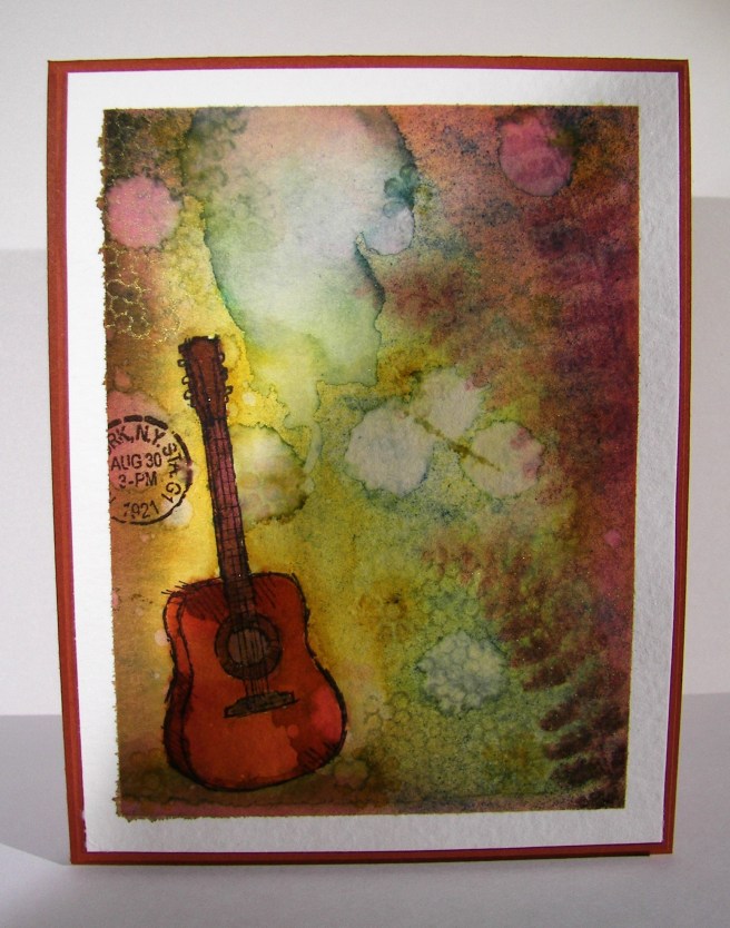
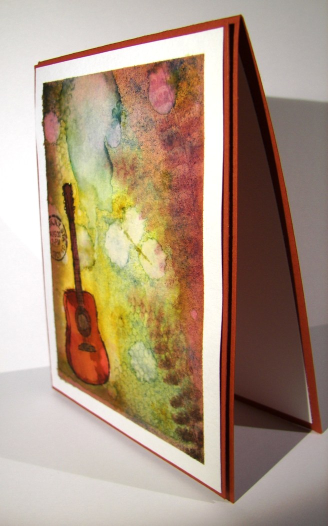
One single stamp was the beginning, just the guitar.  The rest of the images were at the end and quite an afterthought to be honest.  I painted the guitar with cajun craze and the color adventure began.  I had thought it would have been fun to sew metallic thread in the guitar string area, but when I spent so much time on the painting I really wanted to walk away. Maybe next time.

Even though it can be a bit frustrating, it is also quite relaxing to work like this.  It also helps a lot with patience.  I know that if I just stick with it, eventually it will come together. Then, the next project doesn’t seem so daunting, because look at what I managed to pull out of the trash bin!

7-18 (1)

I left it clean of sentiment and all other embellishments.  The images speak for themselves and that guitar, I love that guitar.

Have a creative day!

Moana

Enjoy the Little Things

Yesterday was a very thoughtful day.  I was able to enjoy a day all to myself, which is quite rare in itself.  I had grand plans, a bit too grand, but decided to change them all around and enjoy it differently. This was one of my moments spent, a very indulgent chunk of time working ink all over this lovely card.

7-9

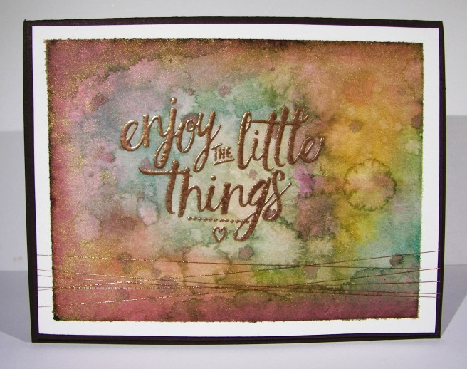
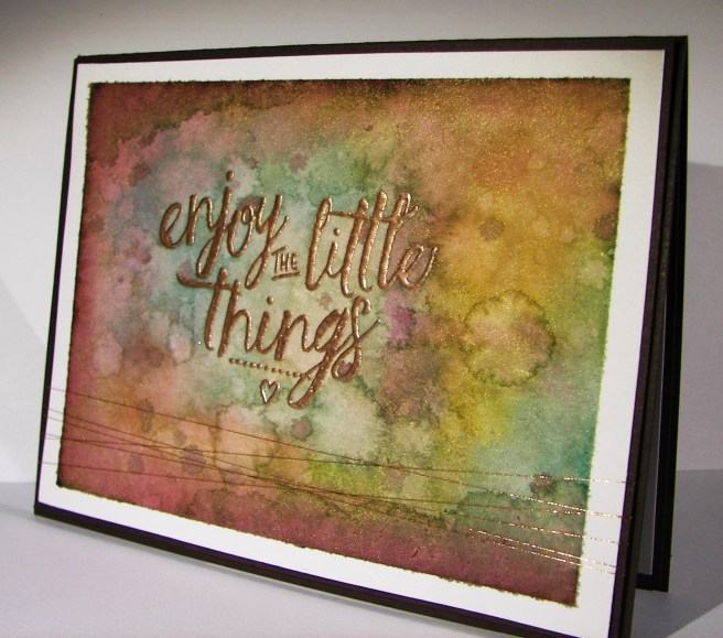
I was given some new paper and brushes for my birthday, so of course I had to get to work using them.  I took this beautiful paper to the brink of maximum absorption.  Sometimes it just takes more time to get the colors just the way you want them.  If you were to smooth your hand over the top of this card you would feel the difference in texture.  The edges of course kept their very smooth surface, but the inked area is actually raised up.  Cool, right?

I did start with the embossed phrase first.  Then I worked around the edges and started in with all of the color mixing.  This copper embossing powder is so fantastic, I absolutely love the color.  It gives a much more masculine feel and goes better with my kind of color pallet ideas for sure.  So, I basically just embossed my sentiment and then went to town on the ink til I was happy.  And I am so happy, so very happy with this one.  I tend to do my best work when I am creating for someone in particular, especially when that someone is my husband.  What more can I say?

7-9 (1)

Have a creative day!

Moana
Country Livin’ Rocks!

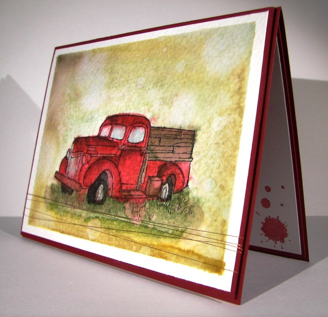
Living in the country has its perks, and wouldn’t this be just one of them?  I unfortunately do not have an adorable old truck like this, but it sure would be wonderful!  I will have to settle for the stamp and my imagination.

7-2

This image was stamped with black stazon ink on water color paper and then adorned with a whole bunch of ink colors.  I started with a pallet of six colors, but it didn’t stay there.  I ended up with ten, but it called for it.  That doesn’t include the colors that emerged from simple blending and colors flowing together.  This kind of work is my favorite.  No real rules, just lots of distressing.

The perfect companion to the card is the new copper metallic thread.  It almost reminded me of barbed wire or old fence wire.  I like a little of embellishment, but don’t want any distractions when I water color.  The thread works for me.  There was a touch of stamping on the inside panel.  The splat image from the perpetual calendar set with cherry cobbler stamped off once.  Yummy!   I do think it would be interesting to try and paint this stamp with flames and metallic chrome.  I will have to see on that.

7-2 (1)

Have a creative day!

Moana

Tap Tap Tap into Retirement

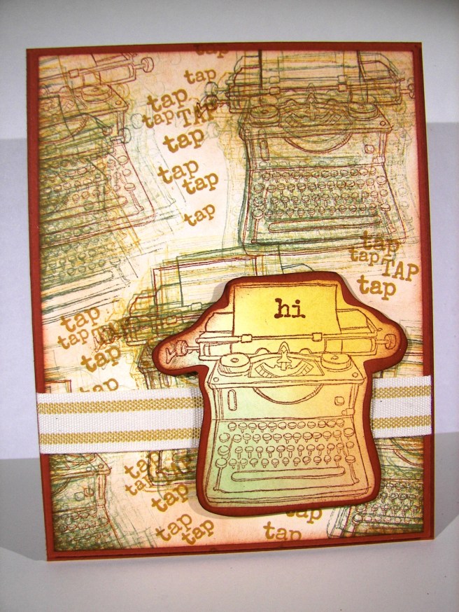
Well, it has begun.  The retirement list has been published and I can start getting sad over some of my favorites.  This has been one of them.  I love the images, but really love the little tap tap tap tap stamp.  It is so adorable.  Some stamp sets I just keep because they make me smile, and I love to smile almost as much as making someone else smile.

4-20

This project was created with a few techniques.  I stamped my little typewriter  in cajun craze first, then did a bunch of stamping all around the base image with almost artichoke first and then moved on to delightful dijon.

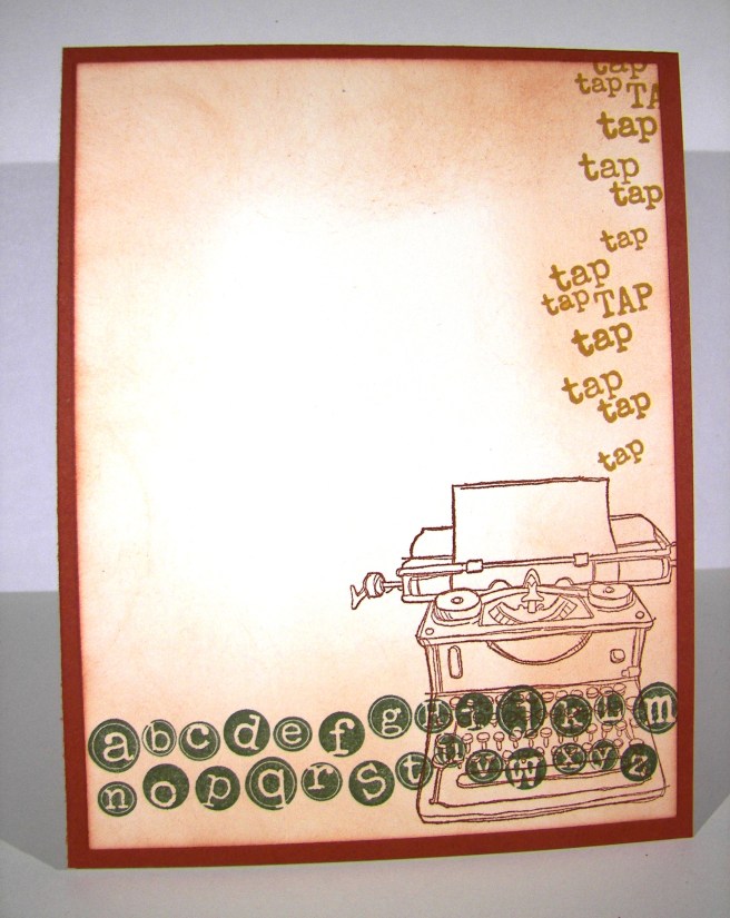
When that was done I got out my sponge and went at the edges.  I aged the entire background by swirling around and around focusing on the edges to make them darker.  I added a little extra sponging around the edge to really darken it up.  I did the same on the inside, but left the center light for easy writing.

4-20 (2)

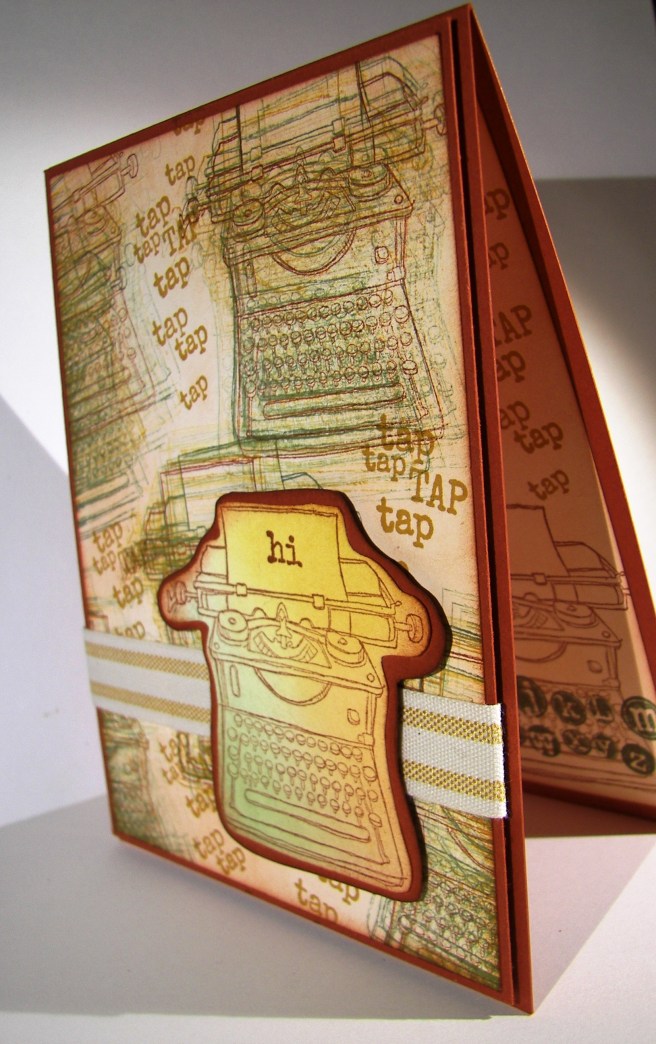
I stamped my front piece with cajun craze and then sponged in three different areas to keep the colors blended, but still very separate.  I fussy cut it, layered it to some more card stock, sponged that too and put it up on dimensionals.  I did a single wrap of striped cotton ribbon sticking it down with glue dots on the front and back.  The background piece was placed on another sheet of card stock with a tiny border and then layered it up again on even more dimensionals.  Love those guys, they make me so happy.

I don’t normally show the entire inside of a card, but it turned out so awesome that I had to. I thought it was nice enough it could be a card front all by itself.  Not today, but I gave an extra peek just for fun.

4-20 (1)

Have a creative day!

Moana
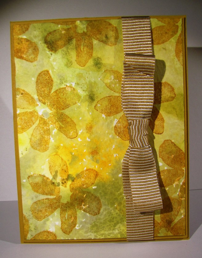
Floral Tone on Tone

Pretty, pretty, and just so pretty.  That is what comes to mind here.  My husband thought it looked a little tropical with the white outline, I am really loving this card.  While driving back from an ice cream run last night the idea came to me.  There is no inspiration connection here, just a great idea.

4-14

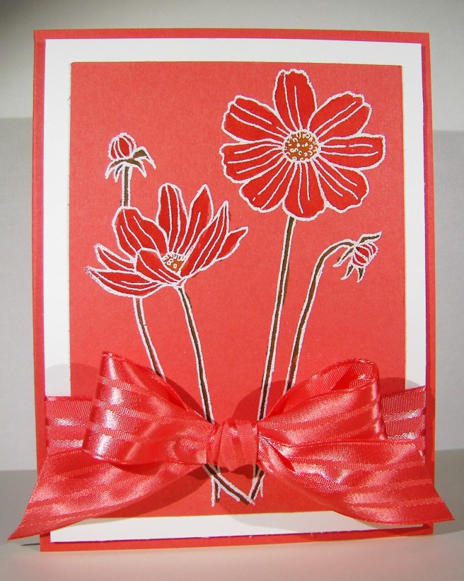
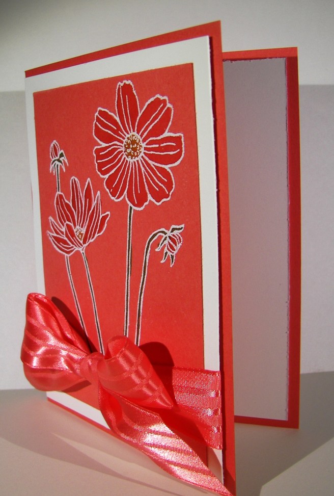
The image was stamped in versa mark ink on watermelon wonder cardstock instead of white or water color paper.  Different for me, but it worked out well.  I embossed with white embossing powder and water colored in the flowers.  Pretty easy and such a nice effect.  I layered it in white to bring out the outline and wrapped it in some of the most beautiful ribbon I have.  Yummy!

4-14 (1)

Have a creative day!

Moana

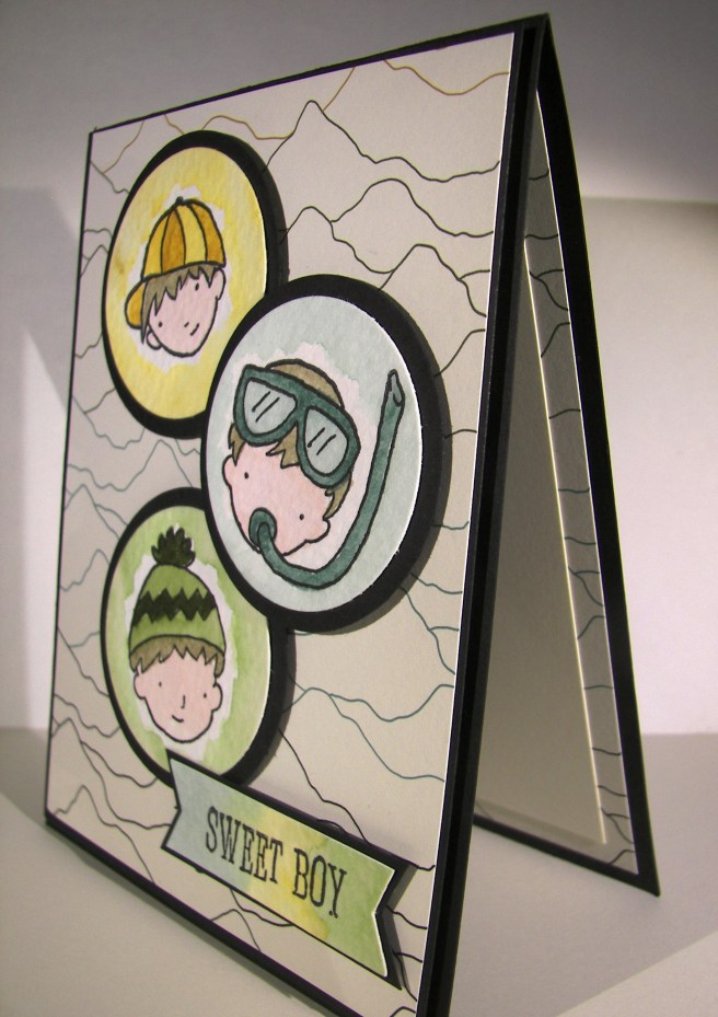
Dear Heart, Sweet Boy

This project was all about giving myself a challenge.  I grabbed a piece of dsp, decided on three colors, picked a stamp set I hadn’t used a long time and went for it.  This was definitely not my usual style, but it felt good.

3-20

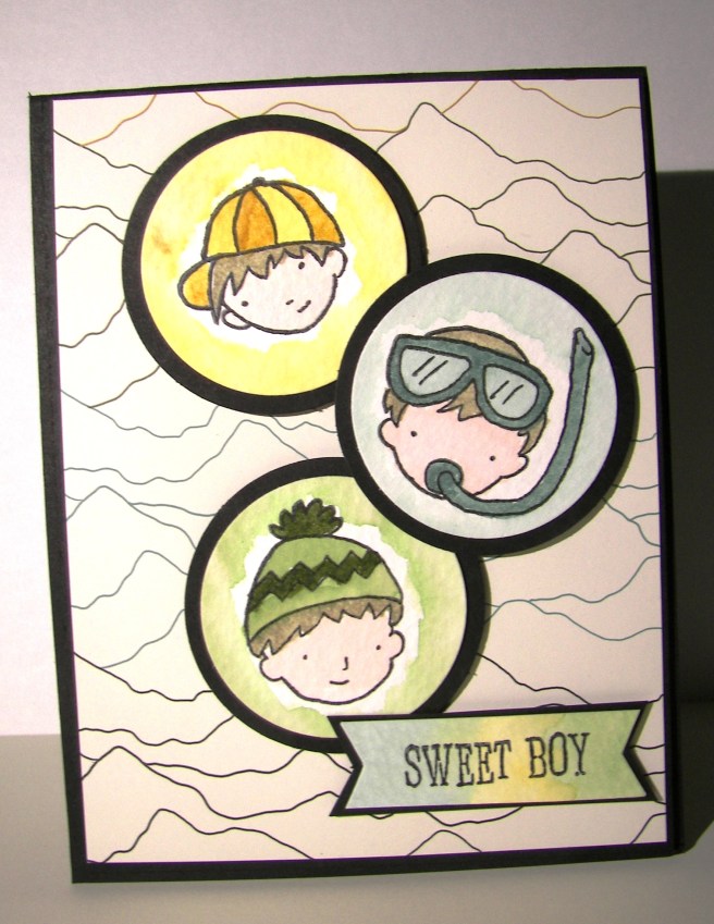
The card itself wasn’t too complicated, just one layer for the background.  I stamped my little boys on water color paper with black stazon and opened the ink pads.  Their faces were done with a very diluted wash of pink pirouette with the hair in tip top taupe.  I wanted them to look like the same boy just doing different things.

Each boy face was accented with one color only.  For the darker areas I kept the ink fairly strong.  When I accented I diluted it a bit more and even more for the outlined areas in the background.  I left it simple because I wasn’t really going for perfection, just soft coloring. I punched their faces out with the 1 3/4″ circle punch and a background of black with the 2″ circle punch.  They were arranged on the front and layered with a bit of dimensionals.

The banner was stamped from the same set and a light wash of each color was put on its own section.  Then each end was punched with the bitty banner punch.  I also put that up on dimensionals.  I repeated the pattern of paper inside with more dsp and a smaller piece of very vanilla to write my message on.  Such a sweet card, for a very sweet boy indeed.

3-20 (1)

Have a creative day!

Moana

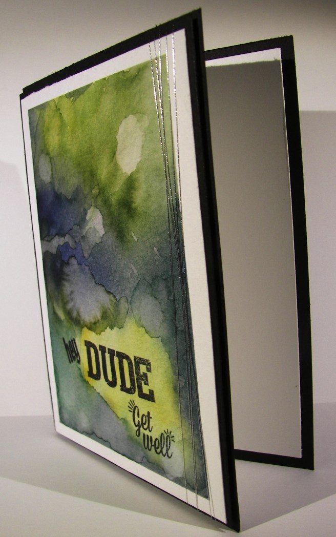
Hey Dude, Get Well

Making a custom card can be fun, difficult and frustrating all at the same time.  Masculine cards are an interesting creature to say the least.  It doesn’t have to be covered in metal, fire or tools to have the masculine touch you are looking for, but flowers will just not work obviously.

3-1

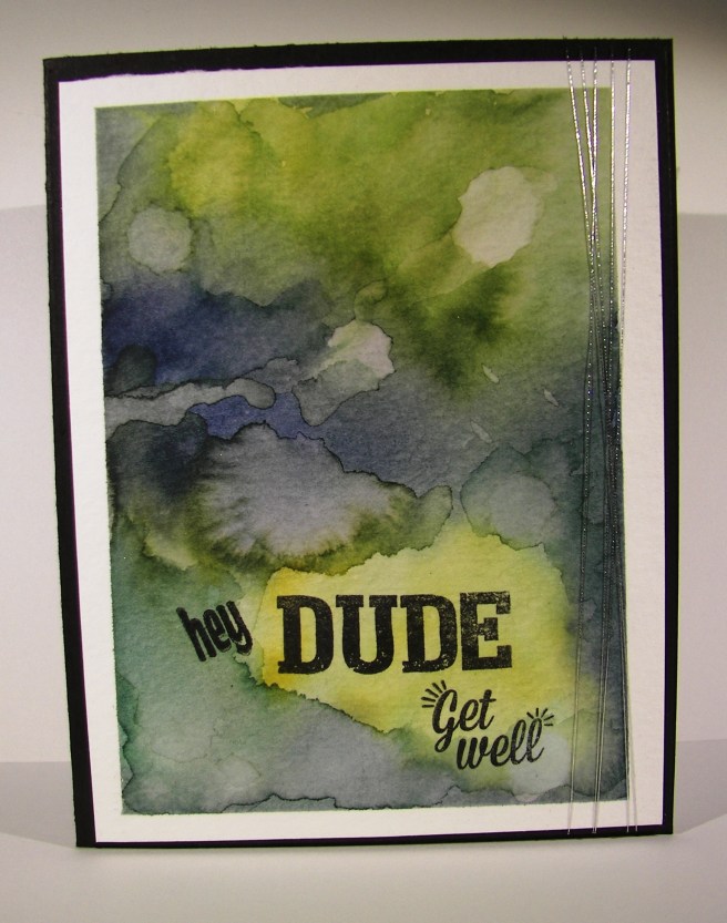
I used some stamps from two different Paper Pumpkin sets to give me the phrase combination I wanted.  How perfect is the word ‘Dude’.  It works equally well for both depending on the recipient, but is fantastic for a masculine theme.

I decided to create a grungy water color look instead of searching through paper, background stamps, or anything else.  That way I had control of the look and feel and could stop when it looked just right.  I spent quite a bit of time adding, sponging away, adding, drying and repeating it all.  Now I love it so much I don’t want to give it away.  It was a special request though, so it will get to be signed by a school staff and delivered this afternoon.  Good thing I have photos, because this one is going to get created again.

3-1 (1)

Have a creative day!

Moana
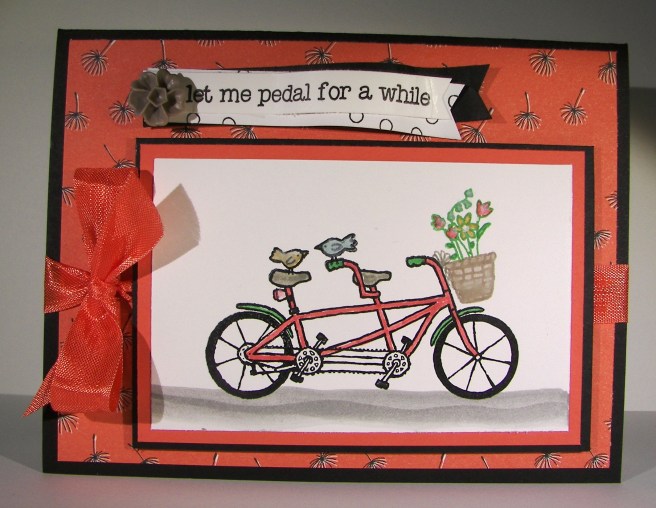
Pedal Pusher Through Wildflower Fields

I was so excited for this stamp set to show up I could hardly stand it!  Last year during Sale-a-bration Stampin’Up! added some new freebies half way during the sale to perk things up. It went so well they did the same thing this time.  This little set is one of them and it is the best!  It even made my husband grin.

2-26

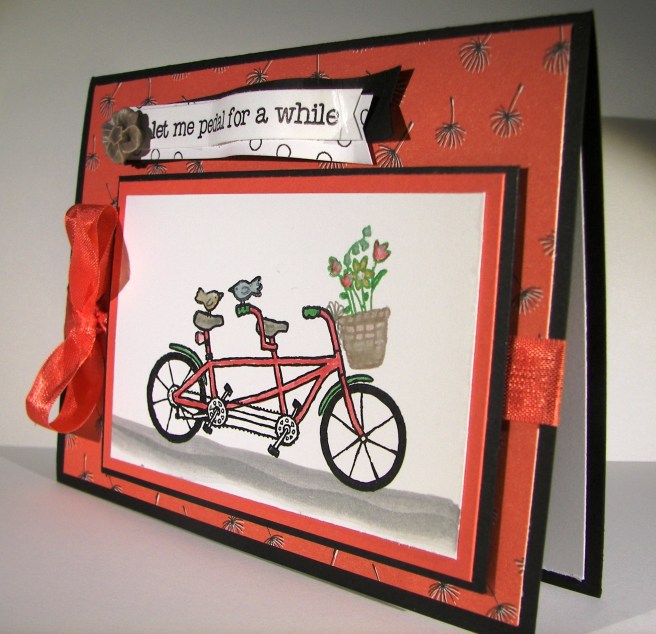
There are other sentiments, but this one is my favorite.  There are several different items that could be stamped in the basket, but I chose flowers to coordinate with my background paper choice.  Talk about riding through a spring meadow, wish I really could though. Having a tandem bicycle is something my husband and I can’t wait to have.  Maybe that is why I love this set so much.

I also broke out some markers to do my coloring.  I tend to prefer my aqua painter, but it is good to use other things too.  They worked great, of course!  I did water color the basket, the bike seats, and my country road.  What a fun time I had creating this project.  Like I said, I just got it yesterday.  The rest of my box is still on the kitchen table, not gone through, not inventoried or anything.  I just dug through it, got this set out and made something right away.  The sign of a great stamp set for sure.  This could also be a workshop project I think.

2-26 (1)

Have a creative day!

Moana
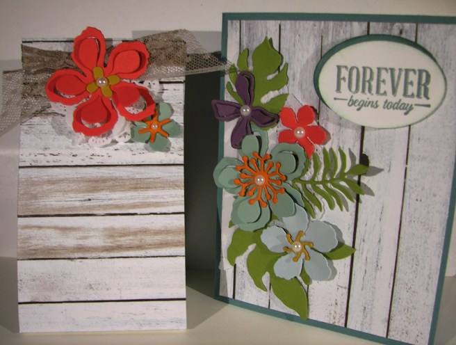
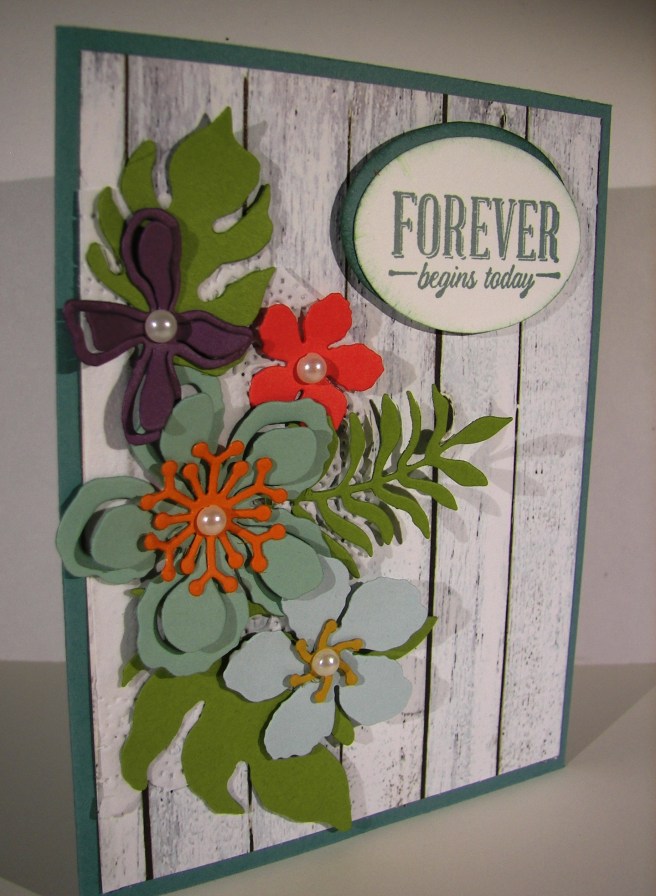
Forever Begins Today

This was for yesterday, however, yesterday was for my family and there wasn’t time to share this with you.  I am sure it was worth the wait though.  Aren’t these flowers just the best thing ever?

1-21

One framelit set gives you all of these pieces, plus a couple more.  And they coordinate with velum, designer series paper just to name a couple. I have been planning this one for a while now, with a very specific goal in mind.  I am fortunate enough to have my son getting engaged and this is how I am going to approach the second reception.  What else could I possibly use for my inspiration piece, right?

1-21 (1)

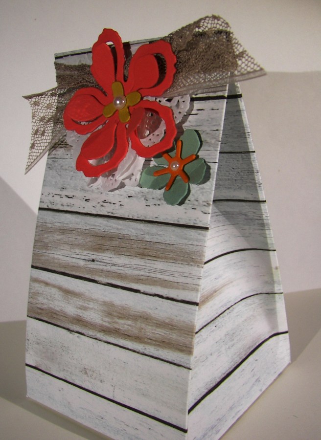
I do admit that once I cut into a piece of designer series paper for a card front, I look to the remainder of the sheet and immediately think of a bag or box I can make to coordinate.  I have a hard time stopping myself to be honest.  I also have a bit of a problem filing back my scraps of cardstock when I work.  All of these colors were available to me in my stack of put me away papers.  I put them to good use for sure.

1-21 (2)

Have a creative day!

Moana

Hello Little Sunshine

It is so wonderful to have stamp sets that speak to you.  I literally would say this phrase over and over to my children when they were little.  Now that they are much older, it still manages to sneak in for a tender moment or two.

Hello Little Sunshine

When I started making the background for the card by just stamping off as I went along, I knew I needed to make a coordinating gift bag.  That little sunshine stamp is so adorable.  I could see myself sneaking it in lots of places.  And to top it off, the Hello stamp set is a free one during Sale-a-bration!  Free is nice, but free and adorable is not a common thing.

Hello Little Sunshine

A tall slender gift bag was in order today.  I was feeling like a different gift option, but of course I could totally see a big yummy candy bar going inside.  How about a fat quarter of fabric instead?  Yes, my quilting friends would totally agree with that one.  Maybe I could find some sunshine paper too?  Or stamp some to match?  A project and a gift, sounds great!

Hello Little Sunshine

Have a creative day!

Moana
Joyful Season

This little red cardinal has eluded me a few times over, but today was my lucky day.  I wasn’t sure just which bird I wanted to create, but decided to stick with the cardinal.  Call it Christmas whimsy.

Joyful Season

The red inside was stamped first and then I added the outline in black.  It was easier for me that way.  I tried to do the outline first and then the inside, but wasn’t happy with my efforts.  I managed to get the extra front stamp pretty good giving the darker black around the face and I even got the beak color in the right spot.  Woo hoo!

 Joyful Season

The oval framelits worked nicely to frame the image.  I decided to frame it in early espresso to match the branch.  Again, nice results for sure.  These were layered up with dimensionals over another layer of real red.  That layer was put through the softly falling snow embossing folder and sanded a bit to add interest to the flakes.  A simple bow with a snowflake embellishment and the card was done.  How nice is that?

Joyful Season

Have a creative day!

Moana
Vintage Leaves, All Through My Yard

The weather has finally changed and I love the color change that follows.  Looking out my window I can see trees with leaves in all of these colors.  Just so lovely this time of year.

Vintage Leaves, All Through My Yard

This stamp set lets you create leaf images that have so much texture and the play of light across them.  How fun and validating is that.  Becoming the artist without knowing how to be.

Vintage Leaves, All Through My Yard

I stamped the leaves in different colors starting from light colors to darkest.  I had started with a different intention, but it didn’t work out.  I stuck with my background as the focal point and just enjoyed water coloring it.  It went together rather quickly.  A few simple layers, very light sponging, and a gentle wrap of gold metallic thread for an accent.  I love this kind of creative fun.

Vintage Leaves, All Through My Yard

Have a creative day!

Moana

Moonrise Wonderland

This is the kind of thing I get to see all of the time.  The moon isn’t quite that large of course, but you get the idea.  I absolutely love it when you can see so much detail in nature.

10-29

I started with the moon.  The punched image and the negative sheet were both used.  The moon was sponged inside the mask with So Saffron and detailed some with Delightful Dijon.  The beautiful trees from Wonderland were stamped in versamark ink, after a hefty rubbing with the embossing buddy, and then covered in black embossing powder.  I had to be patient with the heat gun to get all of that powder melted, but it is so lovely.
10-29 (1)

I only used a few colors to create the background.  An aqua painter was  used along the bottom with Mossy Meadow to give me a bit of a hill and the ground.  Then Elegant Eggplant and Night of Navy were used to sponge in the sky.  I used the punched circle to mask the moon and it worked so nice.  Instead of using masking paper which is thin, I just used cardstock.  The ink has a hard time getting right up the to edge of the image and gives it a bit of a halo effect.  If yo don’t like it that way and want more exact detail, use something thinner.  This made me very happy.

It was layered up once on another piece of Elegant Eggplant cardstock and given a bit of height with dimensionals all the way around.  The inside cardstock was sponged lightly with more Elegant Eggplant just to tie it together a bit more.  All done!

10-29 (2)

Have a creative day!

Moana