Fear Not My Friend…

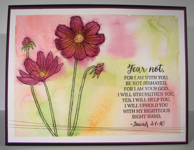
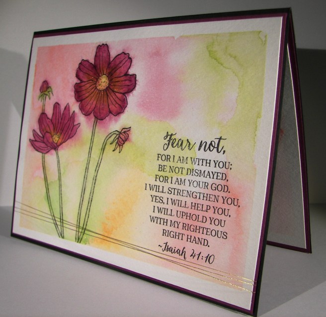
When I am wanting to convey more emotion in a card, I go directly to water coloring.  The softness it creates is perfect.  And with this card, I literally poured my heart into it.
8-20

I wanted more space to work with so I created a larger card than normal.  This one measures 5″ x 6.5″.  Big, but not too big.  I also created my inside writing panel at the same time.  This card wasn’t going to just get a blank insert, or even a nicely stamped one. Besides, I love writing on water color paper, so very satisfying.

I stamped my floral image and sentiment first so I could control the strength of color where they were.  Then I brushed the papers with clean water to allow plenty of color movement. I kept the background light and tried to keep mixing to a minimum.  The colors I choose don’t always blend nicely, but that doesn’t stop me.  I dried, distressed a bit, and dried until I was happy.

I painted the flowers with strong color, allowed them to dry clean.  Then worked them over properly.  This included adding, dobbing, and adding color on the flower petals for a bit.  I centered the flowers with a strong yellow, but kept the color from the edge of the flower center.  Then I hit that area with a water spritzer and watched the flower bloom all over again.  The color moved nicely and then was dobbed some more.  Gold wink of stella was brushed into the petals and blended with water again.  The overall effect was lovely.

A special card for a very special friend.  She is far more brave than I can imagine.
8-20 (1)

Have a creative day!

Moana

Artistically Asian

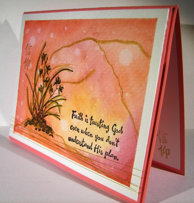
New stamps, new stamps, new stamps!  I love having new stamps!  This particular one caught my eye right away on my first browse through this seasons catalog.  I could easily get lost exploring the possibilities, there are so many.

6-17

But, I am totally in the mood for water coloring, so what else would I turn to just now?  I thought some of the new in-colors combined with gold would compliment the Asian feel of the stamp set.  And, I absolutely agree with myself.  Good thing too…

Flirty flamingo is the card base and the main color I painted with.  These colors go so very well together.  I used a lot of water and kept the color light building the intensity but not overdoing it.  Experimenting with this kind of painting is really something you just need to sit down and do it.  I have learned some things that work better for me, and of course there are tons of very talented people online that generously share their techniques to learn from.

I did stamp over the floral image again with both flirty flamingo and gold encore ink.  I wasn’t looking for a particular effect, just more of the image itself.  Then I hit it pretty hard with the gold wink of stella brush pen.  I accented the image quite a bit then followed along some of the water mark lines.  They ended up giving me a bit of a mound for the plant to rest on and maybe an interesting mountain or two in the background?  That wasn’t the intention, but I keep seeing that when I look at it.  Judge for yourself.

6-17 (1)

Have a creative day!

Moana

Layering Love

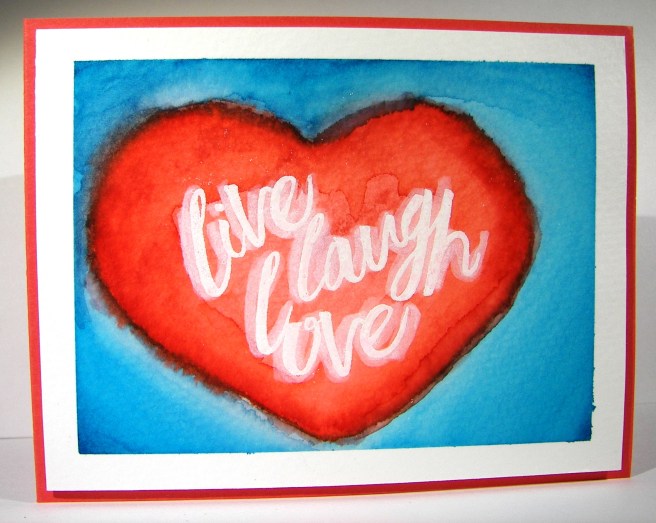
Summer is here and it seems like love is everywhere.  How fun is that!  I wanted to capture some of that carefree spirit that summer can bring and had a fun time giving it a try.

6-16

I must admit, I have been enjoying my water coloring quite a bit, but it is still my favorite medium right now.  I thought I might use a die cut on this image and layer it, but I forgot about that until I started typing.  I was wondering why I left the image off center like that.  I then remembered my original plan.  Well, I am okay with how it turned out.

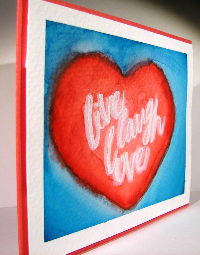
It began with stamping the sentiment in versamark ink and then embossing with white embossing powder.  The next step was to create some kind of heart over and around the words.  When that was done I stared at it for a while trying to decide on a background color. My oldest daughter suggested tempting turquoise since it felt like summer.  That went with my plans, so I went for it.  I kept the color the strongest in the corners and painted towards the heart.  I was trying to create a lighter area around the heart to make it look like it was floating a bit.  That worked pretty good.  Wish I could make a more balanced heart, guess that is why I love die cuts and punches so much.  They correct my work some…

In the end I was happy with the result.  I went ahead and did a touch of blending along the edge of the heart and the blue background.  This provided a bit of a border and gave some cool layering effects.  I went back around the lettering with a wink of stella brush which gave a bit of shadow, but also made the image appear almost blurred.  Interesting, but I still went with it.  I left it a single layer on the card base of watermelon wonder and there you go.

6-16 (1)

Have a creative day!

Moana

Country Livin’

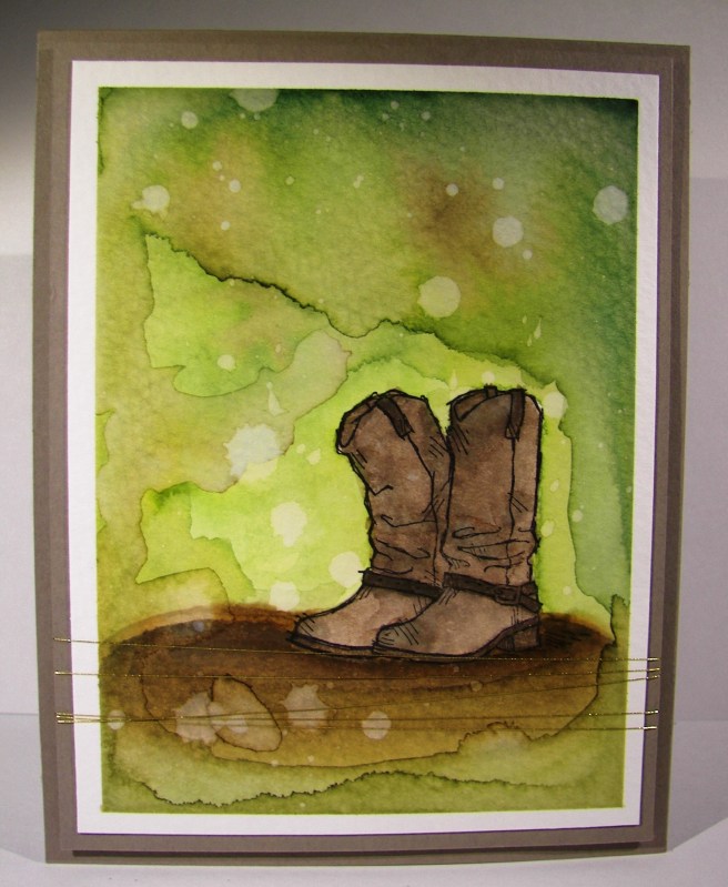
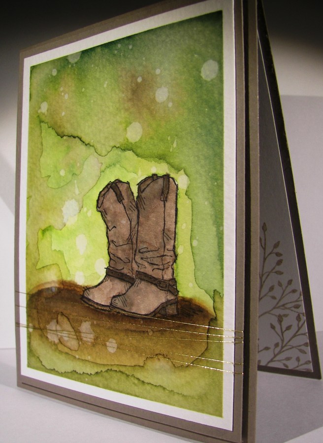
There is something so calm about a nice long water coloring session.  When I found myself needing a break from putting away yet more wedding reception decorations I looked for this stamp set.  When I saw these boots. I knew I would love creating with it.  I was right.

6-15

I honestly stamped just the boots in the lower right hand corner of the water color paper and started to layer color and distress it like crazy.  I can’t tell you how satisfying this card was to make.  I thought about putting a sentiment to it, but couldn’t find something that I thought worked well enough.  So I decided to leave it as an all occasion card.  I have adorable country girl friends that would enjoy this card just as much as any man.  And it is always great to have a great masculine card on hand, especially an all occasion one.

6-15 (1)

Have a creative day!

Moana

I Do…

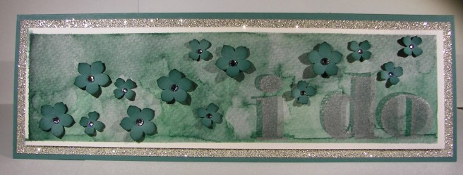
This is one huge, and most wonderful wedding card.  I think it is to the grandest scale I have done so far.  Must be because we are only a week away from our sons big day!  I think that I just might use this one for myself. I will have to think long and hard about what to write…

5-27

This card measures 11 1/4 x 3 3/4″, how about that!  I used a sheet of 12 x 12 to put this one together.  The front is layered with a large piece of dazzling diamond glimmer paper with a special water color panel for the card front.  The lettering was done with the Larger Than Life Alphabet & Number stamp set.  It is, sad to say, retiring.  Along with this beautiful Lost Lagoon color.

I spent quite a bit of time moving ink along this piece.  Painting, distressing, drying, and then repeating all of that until I liked what I saw.  The stamping was simple.  The first layer was done with lost lagoon and then again with silver encore ink.  The result gave a shadow look, but it is still two dimensional and flat as can be.  The flowers aren’t of course, and I love the look.  Kind of like blossoms traveling in the wind.  It will be interesting to try and create an envelope for this one, maybe it is too beautiful to put it in one. Hmmm….

5-27 (1)

Have a creative day!

Moana

Brushstrokes Through a Garden In Bloom

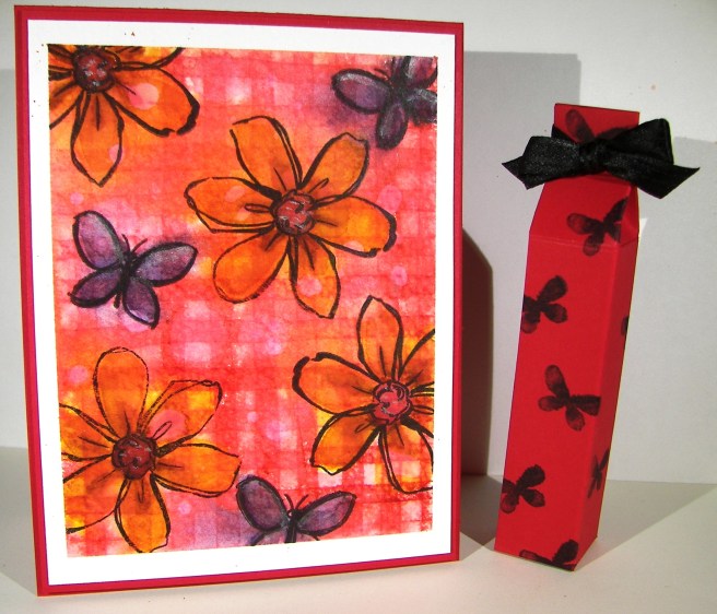
The ‘Brushstrokes’ background stamp finally made its way into my collection and I am wondering why I waited so long.  This project reminds me of a summer picnic.  The red checked table cloth, I think we have all had one at one time or another.

5-12 (1)

I stamped vertically and then horizontally with real red on water color paper.  I did tape it off first to give me the extra border I love so much.  The flowers and butterflies were stamped in black stazon and followed with the second step stamps to fill them in. Additional painting was done to sharpen the color some and touches of silver got in as well.

I used half a sheet of cardstock for the card base and couldn’t leave the other half just sitting there, so I made a tiny box to go along.  The black butterflies were stamped with the same set and I scored each panel measuring 7/8″ and topped it with a baby bow.  Adorable. Now another set can be added to the donation collection for Saturdays scouting fundraiser.

5-12

Have a creative day!

Moana


Awesomely Artistic with Watermelon Wonder

The weekends seem to get busier all of the time.  I guess that is what happens when you have a child getting married soon.  Errands and then some.  I wouldn’t have it any other way though.  I enjoyed some relaxing time yesterday afternoon finishing this gift set I actually started Friday night.  Talk about being busy.

5-9 (4)

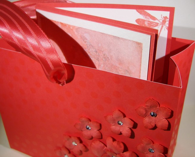
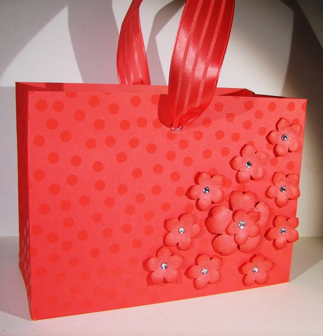
With my love of water color, you would have thought the card came first.  Not this time.  I started with this awesome designer series paper and made an adorable gift bag.  You would think I had tons of gifts to give all of the time with the amount of bags I make, not true though.  I just love to make them.  I do share them with others though, usually as a gift to use for others.  They all find happy homes, I promise.

5-9 (2)

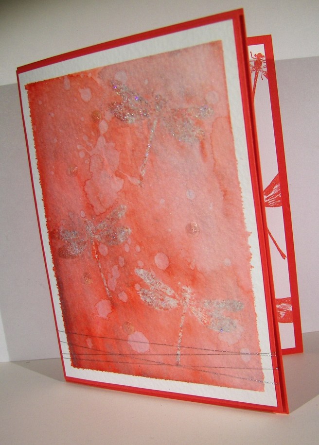
I did try something new with the card though.  The dragonflies were stamped in versamark on the water color paper, not new there.  I used iridescent ice on them, also not new. However, using them together as a resist for water coloring is new.  As color was applied the resist was pretty neat, not as clean as embossing powder, but still holding up.  I decided to add silver ink as well and then it changed even more.  The silver ink clung to the images more than the watermelon wonder ink did.  The look is fantastic, don’t you think? I added a little bit of silver metallic thread and five clear sequins to finish off the look.  Just divine.

5-9 (1)

Have a creative day!

Moana

June Weddings and a Sheltering Tree

Planning a wedding and the receptions to follow can be an exciting time, although very stressful.  Wanting everything to be wonderful, people to be happy, and a general feeling of love in the air.  Sometimes things, or even people, get in the way.  Everyone needs someone to shelter them from stress and frustration.  That is this tree this morning.

4-19 (1)

I am fortunate enough to have a son getting married this June to an absolutely wonderful woman.  It couldn’t be more wonderful.  The way this card looks is how I am attempting to transform my yard.  There will be other things too, really awesome stuff. but this look is all around.  My brain is full of wedding ideas these days.  No escaping it.

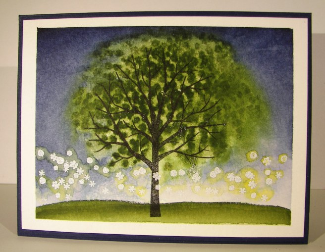
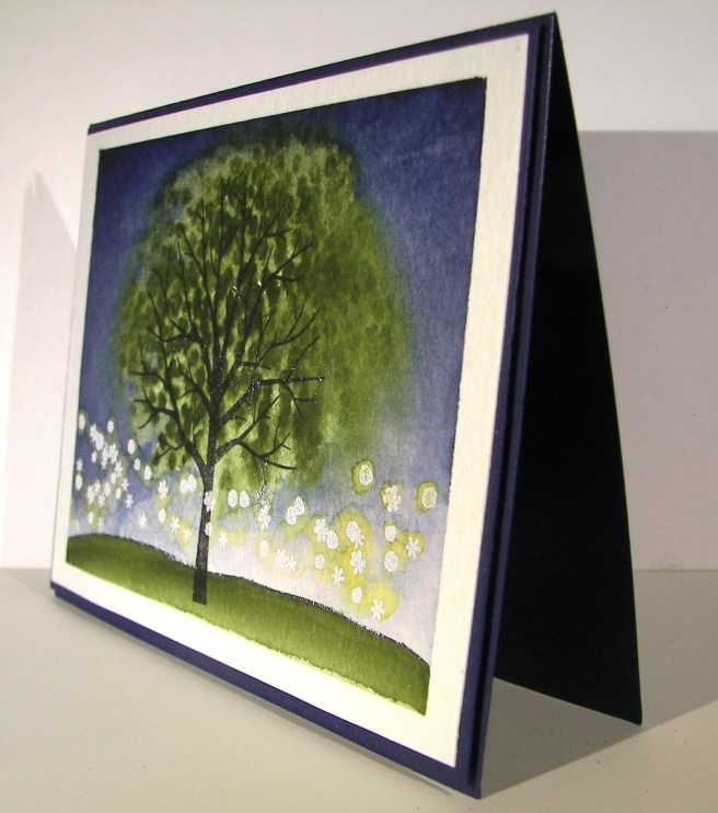
I stamped the tree base in black stazon and the leaves in mossy meadow.  The night sky is painted with night of navy.  I also painted the grass in mossy meadow.  I stamped sparkly flowers from the same set in versamark and added white embossing powder.  I added touches of daffodil delight around the ‘flowers’ to give them a bit of a glow.  They will be sparkly lights after all, and candles a plenty.  Wheeee!  There goes the wedding brain again.

I used tombo to glue the painting on another piece of night of navy card stock that has just a 1/8th” border.  Then that combination was layered onto a card base also in night of navy with plenty of dimensionals.  I left any sentiment off as well as additional embellishments. I couldn’t decide on any, so there you have it.

4-19 (2)

Have a creative day!

Moana

Floral Tone on Tone

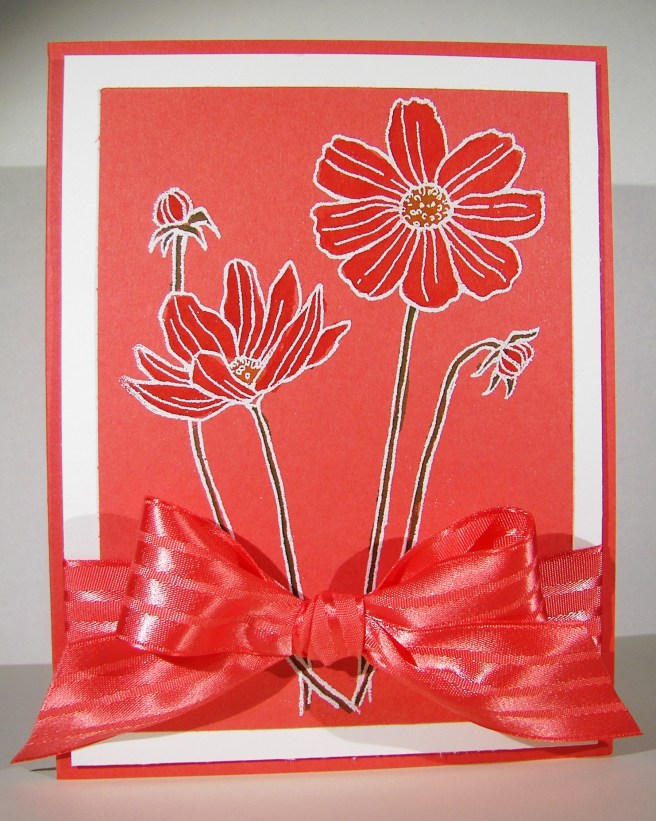
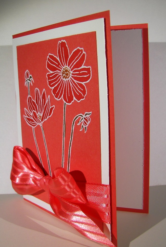
Pretty, pretty, and just so pretty.  That is what comes to mind here.  My husband thought it looked a little tropical with the white outline, I am really loving this card.  While driving back from an ice cream run last night the idea came to me.  There is no inspiration connection here, just a great idea.

4-14

The image was stamped in versa mark ink on watermelon wonder cardstock instead of white or water color paper.  Different for me, but it worked out well.  I embossed with white embossing powder and water colored in the flowers.  Pretty easy and such a nice effect.  I layered it in white to bring out the outline and wrapped it in some of the most beautiful ribbon I have.  Yummy!

4-14 (1)

Have a creative day!

Moana

Hey Dude, Get Well

Making a custom card can be fun, difficult and frustrating all at the same time.  Masculine cards are an interesting creature to say the least.  It doesn’t have to be covered in metal, fire or tools to have the masculine touch you are looking for, but flowers will just not work obviously.

3-1

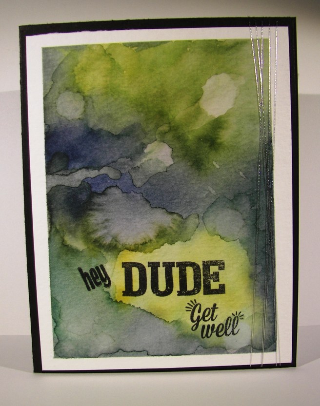
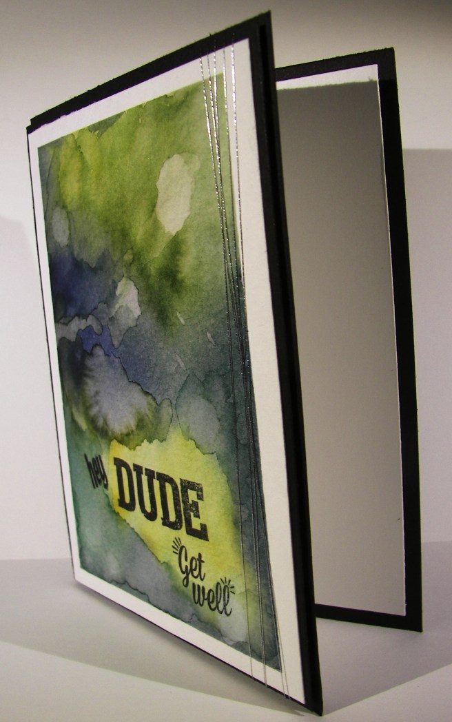
I used some stamps from two different Paper Pumpkin sets to give me the phrase combination I wanted.  How perfect is the word ‘Dude’.  It works equally well for both depending on the recipient, but is fantastic for a masculine theme.

I decided to create a grungy water color look instead of searching through paper, background stamps, or anything else.  That way I had control of the look and feel and could stop when it looked just right.  I spent quite a bit of time adding, sponging away, adding, drying and repeating it all.  Now I love it so much I don’t want to give it away.  It was a special request though, so it will get to be signed by a school staff and delivered this afternoon.  Good thing I have photos, because this one is going to get created again.

3-1 (1)

Have a creative day!

Moana

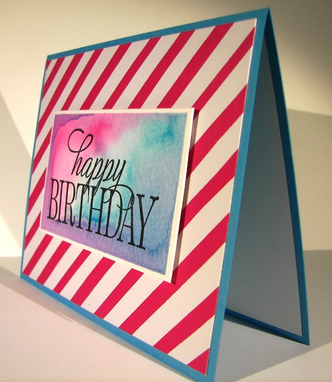
Birthdays should always be this exciting and colorful, don’t you think?  When I started this project I only had the base with the striped dsp setting on top.  I wasn’t sure at all what was going to come next.

2-22

I didn’t know how I was going to tie these bold colors together, and I wasn’t even sure they went together.  But as always, I stuck with it.  I decided to do a simple water color background with the two ink colors.  Sounds simple enough, right?  I stamped in  versamark ink and then brushed my paper with plenty of clean water.  I started with melon mambo in one corner and added a bunch of tempting turquoise in the other.  As I went back and forth some fun things started to happen.  I liked some of the mixing, but decided it was enough.  I dripped some clean water here and there to push color around and give a different look and ended up with quite a bit of water pooling.

Instead of dabbing it off with some paper towels I let it stay.  I took the heat tool to it and began to heat set the color.  The extra water and color around the edges started to activate and mix the inks even more.  I chased the ink around the edges of the image until it had all soaked in or dried up.  I was left with a really fun look that I don’t know if I could duplicate it again if I tried.  I will have to try though, because I love the look of it!  How fun!

2-22 (1)

Have a creative day!

Moana

Flowering Flourishes

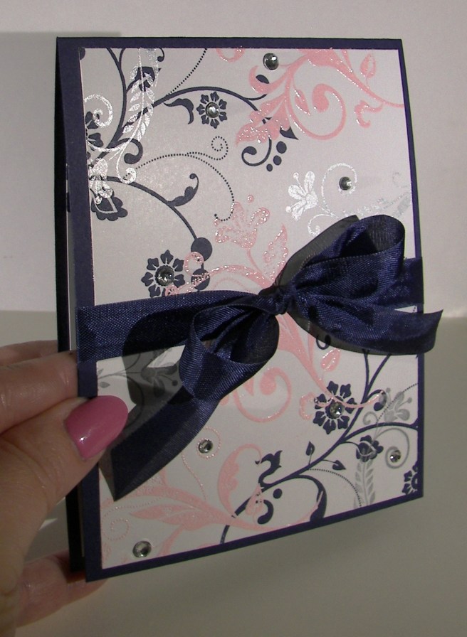
I think this will wrap up my adventures with this particular bridal shower invitation sample set.  I think I just might like this one the best.  I like the layers and different inks used with the added layer of embossing.

1-28 (1)

New stamps come out all of the time, but sometimes it is nice to go back to your favorites.  This set, Flowering Flourishes, is definitely one of my go to sets.  The detail is just beautiful and they layer so nicely together.  The simple elegance of it is so striking.  Just a one layer card today, even though the stamping has a bit of extra to it.  I did add a little extra sparkle here and there, sparkle is a must for this soon to be bride.

1-28 (3)

Have a creative day!

Moana

Courage Doesn’t Always Roar…

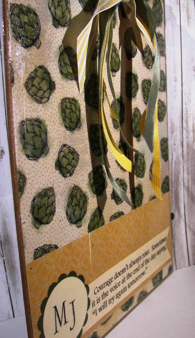
I wasn’t sure about posting this one, it is definitely not my usual type of project.  And if I am being totally honest, it is a bit of a mess.  It wasn’t my idea, but I needed to make a sample, so it happened.

1-15

I work with the youth in my church, specifically the young women ages 14-15, and this was our project last Wednesday night.  One of the girls had suggested this activity and we went at it.  I was to make the sample and I rushed through it a bit too quickly.  We only have a little over an hour to work with, so I was on a timer.  Also, this wouldn’t be my best crafting area.  It is so okay to know there are areas to improve in, and I don’t mind sharing my learning opportunities. (I don’t like to call them mistakes.)

I used two sheets of dsp for this project.  I love the paper. I did get a bit of teasing from the girls.  “Are those artichokes?”  Yes they are, and I love them.  The back side of the paper reminded me of a double wedding ring quilt pattern, so it was a win all the way around.  We were to modge podge pretty paper to a clip board, add some decoration, and finish it off with a favorite inspirational quote.  I have creases and bubbles, but I still love it. I also got into my retired stash of ribbon and found a bunch to use.  I will be happily using this clipboard.  I do need to sand the edges a bit, but otherwise, it is all done.

1-15 (1)

Have a creative day!

Moana

You’ve Got This

My mind is a little more scattered than usual this morning.  That is because there are more than one exciting things going on.  Yes, and that includes me finally getting to showcase this awesome stamp set!

You've Got This

Good things are about to happen, truly.  This is a weekend made for family, friends, and fun.  How exciting, right?

You've Got This

This card though.  I kept the layering very simple and clean.  I wanted to see both of these stamps well and not have one overpower the other.  I think that worked out pretty darn well if I do say so myself.

You've Got This

I stamped the image in versamark ink and heat embossed it using clear embossing powder.  When I stamped over with the background stamp, in sahara sand, the image showed through so nicely.  I did have to rub it a bit with a paper towel to get the ink off the embossing, but not much.  And there you have it!

I repeated the stamping somewhat on the inside using the background stamp edges.  I can see so many possibilities with this set.  I think I will have to set one day aside to see just what I can do with it.

Have a creative day!

Moana

Just For You

Sometimes I feel like there are one too many butterflies flying around my craft area.  But then I remember, you can never have too many butterflies!  Especially when Stampin’Up! keeps coming out with even more exciting stamps to use.  This set is just one of those types.  I could just put these everywhere.

Just For You

The color scheme is very simple, blushing bride and whisper white with tiny 1/8″ boarders.  I do love those.  Only one butterfly on this card front.  The base image is done in blushing bride.  The next layer, the detailed image, was stamped in versamark ink.  That alone looked wonderful with the darker tone.  A quick sprinkle of iridescent ice went over the versamark while it was still sticky and took a trip to the heat gun to melt it in place.

Just For You

I tried to angle the photo to show you the almost purple glimmer that comes from the powder.  You can kind of see it.  Absolutely lovely stuff.  The body and antennae are separate stamps that make the body.  And yes, this is a photopolymer set.  You just have to see through these stamps to get images just where you want them.

A quick sentiment from the same set and a tiny cotton ribbon bow, and it was done.  I did stamp a few dots on the inside panel, of course.

Have a creative day!

Moana