Enjoy…

Yummy, yummy and yummy.  That is what this card is.  It could be the paper, the delicate tag or the precious bit of copper metallic thread.  More likely, the combination of the three. Some simple cards are way more than simple.  I am going to have to get more of this paper for sure.

8-3 (2)

I looked through my stamp stash for a tiny phrase or saying that would be noticed but not distract.  One tiny word from the Endless Birthday Wishes set was just right.  It also helped to make the card truly an all occasion theme.  This project is likely to be reproduced a few times over.  Such a great layout and color scheme.

8-3 (1)

Have a creative day!

Moana

Delightful Garden in Bloom

This project is a companion to yesterdays post.  Both card fronts were made with the same combination of distress inks, just in different sequences.  This one was actually done first which is why the colors are more distinct.  I certainly am enjoying this kind of painting.

7-31 (2)

As I placed the water color paper into the smeared and spritzed inks I made sure to allow white spaces to remain.  I had to make myself stop adding color before some of that effect was lost.  I can’t wait to try it some more.

When I finished drying the piece it felt like something more was needed to tie it together. I found a great stamp from the Garden in Bloom set and did some random stamping. The ink was too dark full strength, so these flowers were stamped off once before being applied. Then a fun ribbon for a bit of interest to finish the front.  A little echo stamping was applied to the inside and the card was done.

7-31 (1)

Have a creative day!

Moana

Simple Distressing

I love it when a card looks more complicated to make than it really was.  This is a great example of that process.  This is probably as close to clean and simple as I get while staying comfortable with the end product.

7-30 (2)

I began with a piece of water color paper.  Normally I mask it to a board and apply ink to the surface.  This time I took some distress inks, rubbed them onto a craft surface, spritzed them with water and began to lay the paper into the ink.  I moved it around until I was happy with the coverage and dried it completely.  I sprinkled water with a wet brush to give the light spots.

One large stamp is all I wanted.  I sponged all around the edges to darken it a bit then decided to sponge the flowers themselves.  A simple task, but a lovely look. I left it at that, no other embellishments and I was good with it.  I did repeat it on the inside and loved it.

7-30 (1)

Have a creative day!

Moana

Bloomin’ Night of Navy

Working through a scrap pile can turn into something quite lovely.  This gold foil was left over from a Christmas card kit from nearly three years ago if you can believe that.  It worked well with another kit also left over.  Cleaning up and making a beautiful card, sounds like a win to me.

7-29 (2)

The card front was made with coordinating stamps from the Bloomin’ Love stamp set.  The solid flower was stamped first in night of navy fairly far apart.  That is a lot of dark ink there.  Then, with the outline stamp of the same flower I went all over the place using gold ink.  I knew it would even show up over the navy flowers.  I love the look of layered stamping.

It wasn’t quite enough, so I continued with heavy sponging around the edges until I was satisfied.  The gold foil paper was put through the Big Shot using the elegant dots embossing folder.  A nice touch for sure.  Those two pieces were layered on top of another piece of night of navy and then placed on a navy card base.  The inside got a lighter version of the same treatment and I was nearly done.

I had to put a bunch of large basic pearls in the centers of the flowers, because I couldn’t leave well enough alone.  That ensured this would be a hand delivered card instead of mailed, but it was worth it.  They did have a difficult time sticking to the edge flowers that had already been inked.  But with a little first pressure they stayed put.

7-29 (1)

Have a creative day!

Moana

Yellow Brick Road

I have gotten a bit lost over the past few days over a different series.  It is a re-telling of The Wizard of OZ, very unique perspective.  It is actually a quite twisted tale of what happens after the story we all know.  Working with middle school aged children gives me permission to read young adult fiction and I must be honest, I love it.  This one is no exception.  Hence my yellow brick road card today.  Book three done, but it continues on…darn!

7-19

Either way, how about this fun, bright and cheery card!  Using my brayer to apply ink to the inside of my embossing folder really makes these bricks interesting.  However, I wanted more, so I distressed as well.  First, I gave the freshly inked paper a hearty spritz with water.  That got the ink moving nicely.  I knew I was going to work this over a bit, so I did start out with water color paper, quite necessary.  I added more ink with my aqua painter all around the bricks, sponged off with a tissue to lighten areas, then dripped water all around and dabbed to remove ink too.  Great look here at the end.

I also had a bit of fun with the tag.  I stamped and punched my sentiment on water color paper.  I then liberally rolled the edges and in a bit too in the ink pad.  Then I spritzed it too. That caused the ink to move to the middle, but not all of the way.  So much fun.  The leaf die cuts were smushed in the ink pad too and then spritzed as well.  Everything got the same kind of treatment.  It allowed a different but connected look for all of the elements.  Wheee!

7-19 (1)

Have a creative day!

Moana

Country Basics

This particular project really made me slow down and think.  My usual haphazard color selection just didn’t work out, as you can tell from the huge collection of colors I have listed. This might be the most color I have used on one project.  It ended up kind of cool in the end, but not sure what it will end up serving as.

7-18

One single stamp was the beginning, just the guitar.  The rest of the images were at the end and quite an afterthought to be honest.  I painted the guitar with cajun craze and the color adventure began.  I had thought it would have been fun to sew metallic thread in the guitar string area, but when I spent so much time on the painting I really wanted to walk away. Maybe next time.

Even though it can be a bit frustrating, it is also quite relaxing to work like this.  It also helps a lot with patience.  I know that if I just stick with it, eventually it will come together. Then, the next project doesn’t seem so daunting, because look at what I managed to pull out of the trash bin!

7-18 (1)

I left it clean of sentiment and all other embellishments.  The images speak for themselves and that guitar, I love that guitar.

Have a creative day!

Moana

You Are Awesome

The other day my daughter was wearing a fun pair of pants that were so colorful and had a bunch of fun patterns.  Every time I looked at them I thought I should make a card.  So, I literally went digging through her laundry to find them and give it a go.  Inspiration comes from a lot of different places, but the laundry bin was a first for me.

7-12 (1)

I went through my paper files pulling scraps of the different colors I wanted.  Most of the strips were fine, but some needed to be trimmed to give some diversity.  Once I had the color strips ready I cut a base from printer paper to adhere them too.  It was pretty easy to do because they were just stripes, nothing too tricky.

7-12

I used one of the elements from the butterfly basics set to put a few black stripes down as well.  The piece was then trimmed to 4″ x 5 1/4″ and put through an embossing treatment.  I was able to slide the piece around a bit lining up the patterns inside the stripes and along borders.  I liked that part quite a bit.

The sentiments were stamped and layered with more basic black, but something still wasn’t quite right.  The stripes were too stark.  So, I got my trusty sponges out and went at the whole card front with smokey slate ink.  It hi-lighted the embossed areas more and gave a bit of a distressed look.  That is what I needed and I called it done.

7-12 (3)

Have a creative day!

Moana

I am Much More Me When I’m With You

What do you do with a huge pineapple stamp?  Well, just about anything you want I guess.  I loved it, but probably had more questions than answers.  This is definitely one of those answers.  I asked my daughter to pick out a stamp from my stash of new product and give me a color.  She chose light green and this stamp.  Sometimes you just need a nudge in the right direction to get moving.

6-24

Yesterday, and well into the evening, I spent my time helping a good friend with a wedding photo shoot.  You never know how much you are needed, but judging how tired I am today, it would have been so hard for her without me.  And of course we had an absolute blast.  We work nearly seamlessly together, another plus.  I thought this would suit us nicely.

I went with light water color washing using only two colors.  I wasn’t sure how they would blend in the middle, hoping it wouldn’t make some kind of brown.  It turned out great.  I opted for minimal distressing and one single stamping.  The leaves needed a bit, so I used my aqua painter to blend them a bit, but left the pineapple pattern alone.  I stamped it again on the inside, but more in the corner for more interest.  Good stuff there!

6-24 (1)

The tags & labels framelit set fit perfectly around the sentiment and provided the perfect place for my favorite ribbon.  A few of the new enamel dots found there way as well.  The card front and inside panels were both layered with an additional piece of pear pizzazz card stock and the front was popped up with dimensionals.  There you go!

Have a creative day!

Moana

Layering Love

Summer is here and it seems like love is everywhere.  How fun is that!  I wanted to capture some of that carefree spirit that summer can bring and had a fun time giving it a try.

6-16

I must admit, I have been enjoying my water coloring quite a bit, but it is still my favorite medium right now.  I thought I might use a die cut on this image and layer it, but I forgot about that until I started typing.  I was wondering why I left the image off center like that.  I then remembered my original plan.  Well, I am okay with how it turned out.

It began with stamping the sentiment in versamark ink and then embossing with white embossing powder.  The next step was to create some kind of heart over and around the words.  When that was done I stared at it for a while trying to decide on a background color. My oldest daughter suggested tempting turquoise since it felt like summer.  That went with my plans, so I went for it.  I kept the color the strongest in the corners and painted towards the heart.  I was trying to create a lighter area around the heart to make it look like it was floating a bit.  That worked pretty good.  Wish I could make a more balanced heart, guess that is why I love die cuts and punches so much.  They correct my work some…

In the end I was happy with the result.  I went ahead and did a touch of blending along the edge of the heart and the blue background.  This provided a bit of a border and gave some cool layering effects.  I went back around the lettering with a wink of stella brush which gave a bit of shadow, but also made the image appear almost blurred.  Interesting, but I still went with it.  I left it a single layer on the card base of watermelon wonder and there you go.

6-16 (1)

Have a creative day!

Moana

Country Livin’

There is something so calm about a nice long water coloring session.  When I found myself needing a break from putting away yet more wedding reception decorations I looked for this stamp set.  When I saw these boots. I knew I would love creating with it.  I was right.

6-15

I honestly stamped just the boots in the lower right hand corner of the water color paper and started to layer color and distress it like crazy.  I can’t tell you how satisfying this card was to make.  I thought about putting a sentiment to it, but couldn’t find something that I thought worked well enough.  So I decided to leave it as an all occasion card.  I have adorable country girl friends that would enjoy this card just as much as any man.  And it is always great to have a great masculine card on hand, especially an all occasion one.

6-15 (1)

Have a creative day!

Moana

Farewell Swallowtail

I have loved this stamp for so long.  It is sad to say that it will retire at the end of this month.  However, there is a stash of stash of retired stamps that I cannot part with.  This is definitely going to join those.  Other retired ones I sell off, but ones that are just too wonderful get to stay out with the current product.  Kind of like a wise old tree.

5-25

The butterfly was stamped on a piece of masked water color paper in black stazon.  The color pallet was different, but intentional.  I picked colors that would create interesting blends with the idea that none of the original painting would  stay to true color.  A lot of blending went on here.  I painted coordinating sections first without blending.  After I added crushed curry I kept with that color and used it to begin blending the edges the color sections.  I just did that until I was happy.

The background was painted in mint macaron, darker to one side trying to create a bit of a shadow.  Distressing had to happen here and boy did it.  I flicked water, dabbed it up, and repeated that process again until I was satisfied.  Then the gold wink of stella pen went to work in a few areas.  Again, hard to see, but it is there.  Use your imagination, where would you have painted light lines of gold glitter?

5-25 (1)

Have a creative day!

Moana

Butterfly Garden

Half way through this little adventure I realized the designer series paper wanted me to stick with whisper white and not very vanilla.  Well, the ribbon was on the pearls were in motion, so I stayed the course.  Not too bad, but it did slow me down.

5-17

I left off the sentiment to give it an option or two.  I have also noticed that the camera is really good at picking up little things that my eyes miss.  Darn, I thought those edges were a little more flat.  Not to worry, it looks just fine.

The butterfly thinlits hadn’t been out in a while and I do so love them.  I keep thinking they will tear apart as I put them to work, but they manage to stay together.  I can bend, curl and mush them around in general and the paper stays true.  It is so nice to work with really good product.

5-17 (1)

Have a creative day!

Moana

Remarkable…

This quite simply was round two.  I had this fun idea to emboss this flower with silver powder on black card stock.  Thought that would look pretty cool.  Then, I thought I would water color with a bit of silver encore ink and touch it up with wink of stella.  Can I just say that all went in the trash bin?  True story, not a good combination there.  Next try…better.

5-16

These colors are all I have on my brain lately.  The wedding is three weeks away and the reception I am hosting is four weeks away.  It is hard to find blackberry bliss in the spring out and about. I have managed what I can, and have had to let go of other ideas.  It is going well.  Just like this card duo.

5-16 (1)

Simple stamping and die cutting with oval framelits.  Touches of basic pearls to set it off and wrapped in pretty satin ribbon.  My kind of yummy.  After donating my stash of cards and bags for a fund raiser, this is the first one to begin the rebuilding.  All for a good cause.

5-16 (2)

Have a creative day!

Moana

Bohemian Work of Art

Rich colors and exciting patterns, that is the theme for today.  In between wedding reception planning I have managed to create this lovely due.  Now I get to add this to the collection of card sets and greeting cards I am donating for a cub scout fundraising event tonight.  I get to share my work and clean out my stash at the same time!  I call that a win.

5-14

The card began with the chevron stamp from the Work of Art set.  I didn’t really pay too close attention, just stamped it four times down a piece of water color paper.  The color pallet came from the bohemian designer series paper set, only leaving out the yellow tone. The focus was on bermuda bay and I started there.  Color was layered, sponged off, added, and distressed a ton until I was satisfied.  Then I did something that was new for me.  I hi-lighted some of the distress areas with my gold wink of stella brush pen.  That was super fun and I had a hard time stopping.

5-14 (1)

The gift bag was made from a whole sheet of designer series paper.  I went for a wide stocky bag instead of my usual tall slender ones.  It is nice to change things up a little bit here and there, don’t you think?  The ribbon I had in rich razzleberry was just long enough to go around the bag top.  I do love using up product that is retiring before it actually retires.  I am not often that lucky.

5-14 (2)

Have a creative day!

Moana

Brushstrokes Through a Garden In Bloom

The ‘Brushstrokes’ background stamp finally made its way into my collection and I am wondering why I waited so long.  This project reminds me of a summer picnic.  The red checked table cloth, I think we have all had one at one time or another.

5-12 (1)

I stamped vertically and then horizontally with real red on water color paper.  I did tape it off first to give me the extra border I love so much.  The flowers and butterflies were stamped in black stazon and followed with the second step stamps to fill them in. Additional painting was done to sharpen the color some and touches of silver got in as well.

I used half a sheet of cardstock for the card base and couldn’t leave the other half just sitting there, so I made a tiny box to go along.  The black butterflies were stamped with the same set and I scored each panel measuring 7/8″ and topped it with a baby bow.  Adorable. Now another set can be added to the donation collection for Saturdays scouting fundraiser.

5-12

Have a creative day!

Moana


Awesomely Artistic with Watermelon Wonder

The weekends seem to get busier all of the time.  I guess that is what happens when you have a child getting married soon.  Errands and then some.  I wouldn’t have it any other way though.  I enjoyed some relaxing time yesterday afternoon finishing this gift set I actually started Friday night.  Talk about being busy.

5-9 (4)

With my love of water color, you would have thought the card came first.  Not this time.  I started with this awesome designer series paper and made an adorable gift bag.  You would think I had tons of gifts to give all of the time with the amount of bags I make, not true though.  I just love to make them.  I do share them with others though, usually as a gift to use for others.  They all find happy homes, I promise.

5-9 (2)

I did try something new with the card though.  The dragonflies were stamped in versamark on the water color paper, not new there.  I used iridescent ice on them, also not new. However, using them together as a resist for water coloring is new.  As color was applied the resist was pretty neat, not as clean as embossing powder, but still holding up.  I decided to add silver ink as well and then it changed even more.  The silver ink clung to the images more than the watermelon wonder ink did.  The look is fantastic, don’t you think? I added a little bit of silver metallic thread and five clear sequins to finish off the look.  Just divine.

5-9 (1)

Have a creative day!

Moana

Bird of Paradise Giftbag

This beautiful box was supposed to be shared yesterday, but that day had too many demands on it.  So, it waited patiently for me to get to it today.  Still just as pretty this morning as yesterday morning.  What pretty paper, right?

5-4

One whole 12 x 12 sheet went into this project.  I wanted to have a tall box, but not my usual shape.  Not too many options, I just wanted to show off the wonderful pattern of the designer series paper.  So I widened out the front and back to 4″ and narrowed in the sides to 1 3/4″.  It worked out nicely.  It won’t hold heavy items, but my daughter had the desire to use it to gift a scarf.  That would work out.

The flowers are cut with the botanical builder framelits using cajun craze.  Too perfect.  The leaves are from the same framelit set with old olive.  Not too tricky, right?  I wrapped silver metallic thread around the top, so that can be slid off to insert a gift and placed back on.  Yet another awesome gift bag ready to go.

5-4 (2)

Have a creative day!

Moana

Bermuda Bay Flourishes

I was wondering how it would look to stamp on water color paper with one of my favorite stamps and then spritz it with some water.  Would I like the effect?  Would it keep enough of the images to be recognizable, or just turn into swirls of color.  It turned out somewhere in between and I like it.

5-2 (2)

I stamped a few times with the largest flourish from the set and then a few more with the smallest one.  Then, I just spritzed about four times and watched the ink swirl a bit then dried it the rest of the way with my heat tool.  I think it will be a fun go to technique for background paper.

The butterfly punches were used to make a bunch of decorative elements for the card front and a couple for the inside.  All of the butterflies were raised up on dimensionals, sponged and curled some with a bone folder.  Pearls were used on all of the butterflies and the smallest pearls were placed all over the card front.  Those tiny details make the difference.

5-2 (1)

Have a creative day!

Moana

City By the Bay

Wouldn’t you love a view of the city like this?  Well, my view is a whole lot more country, but I would one day love to be able to enjoy one like this.  I might have to settle for occasional holiday trips, but it would still be wonderful.

4-30

I put quite a bit of planning into this project.  I had to think backwards in order to keep the layers straight.  I embossed my whisper white piece with elegant dots and used the recessed side to make my ‘wall’.  I inked up my sponge and just pounced in here and there to create this look.  I kept going until it looked more like a textured wall than a piece of embossed paper.  The edges got sponged.

The hearth and home thinlit of the window was used twice.  Once to create the hole in the wall and again to make the window frame.  I glued the white one to the tip top taupe one with tombo liquid glue and nestled it back into place with the card front.  That way it looked raised up without a lot of fuss.

The skyline was created with the calling all heroes set.  It was stamped with black stazon onto water color paper.  The texture of the paper made it look really neat.  I went to work on the water line and then moved up to the sunset.  The windows were colored in with gold wink of stella, even though you can’t tell as much, they do sparkle.  That was centered in the window and got a heavy dose of dimensionals.  I am sure I could have worked it out easier if I had thought a bit more, but sometimes a creative journey takes a few extra turns.

4-30 (1)

Have a creative day!

Moana

English Garden with Rose Wonder

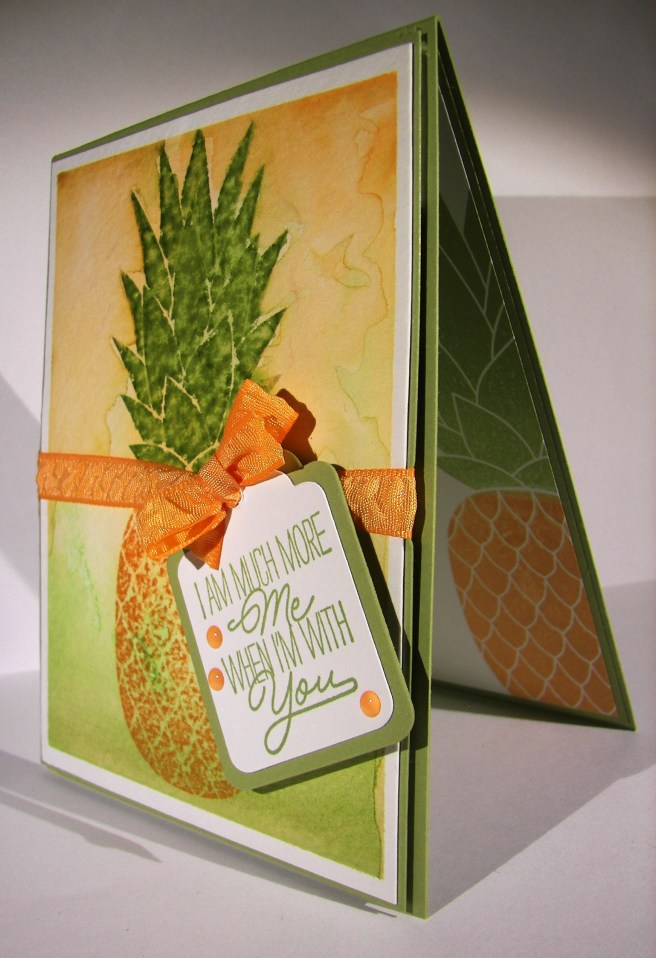
The morning may be trying to run away from me, but I am trying to keep up.  I did get this set made yesterday, but haven’t had the chance to get it shared yet.  Let’s hear it for lunch breaks, everyone needs one.

4-29 (3)

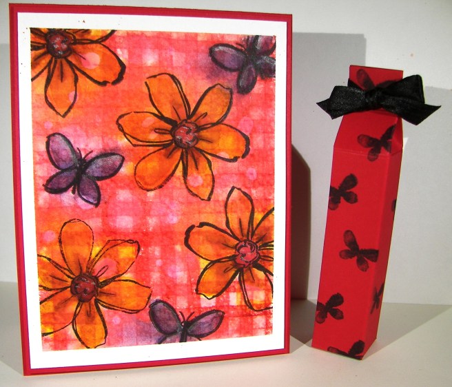
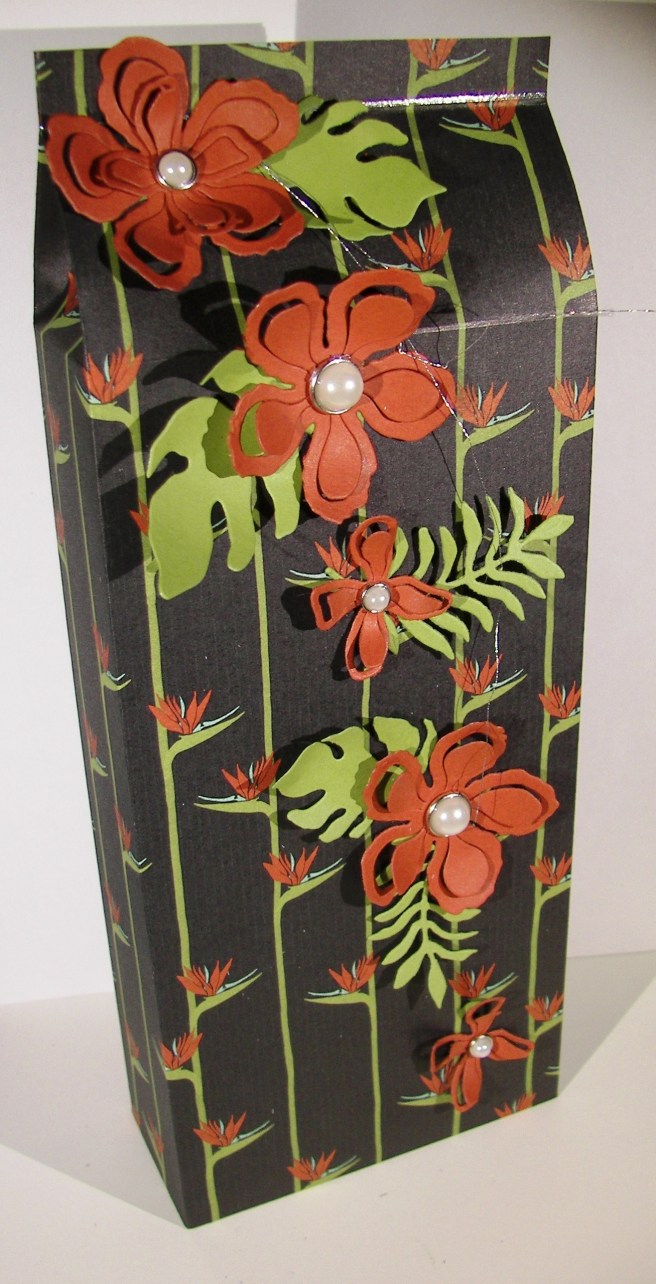
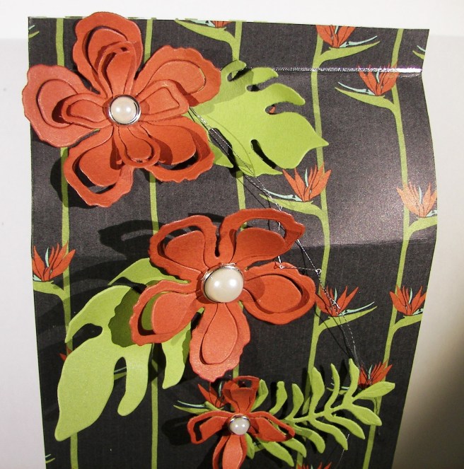
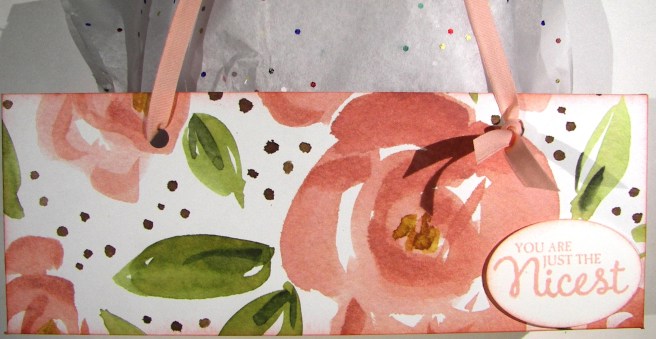
The card was the beginning of this trio, and the paper was the focus.  It is sad to say that this paper is retiring soon, I sure have loved using it.  What can be better than water colored floral paper?  With my kind of projects, not much.  Unless I sit down and paint my own, with paper this pretty I don’t have to.

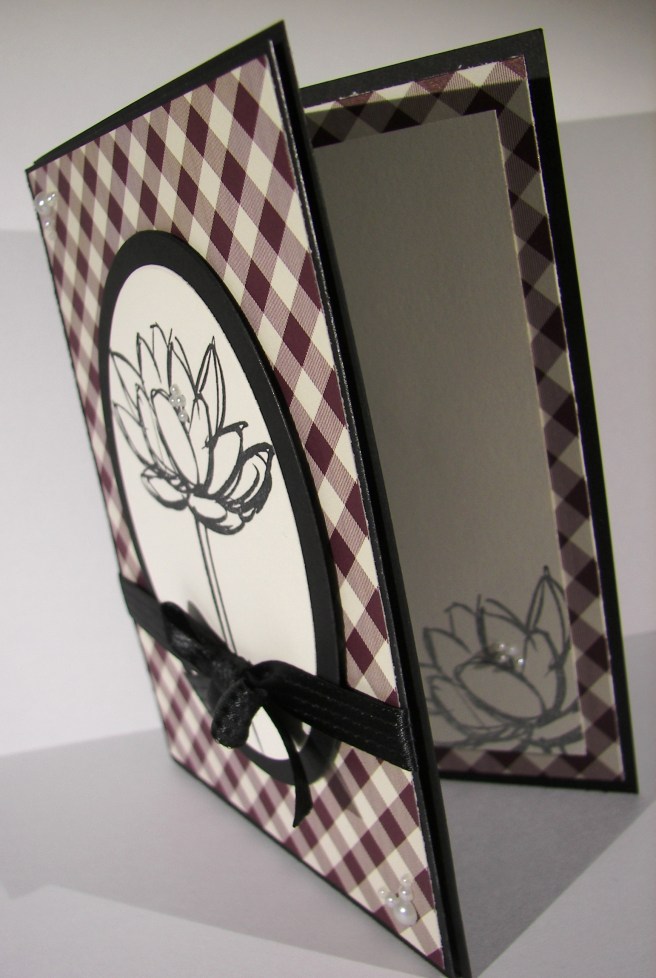
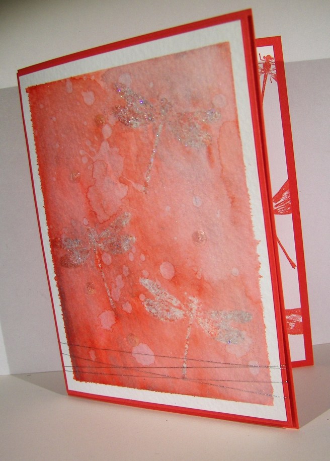
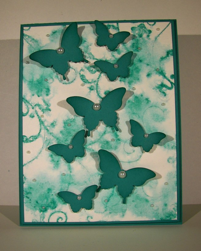
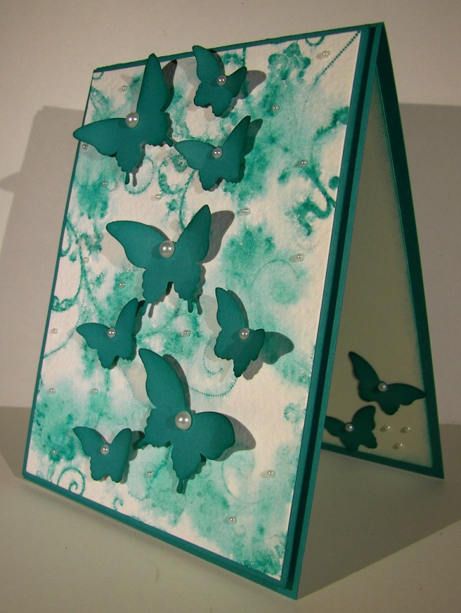
The designer paper is layered on a piece of blushing bride cardstock and then on a pear pizzazz card base.  Old olive is actually the light green used in this paper, but I wanted a lighter tone and thought it looked nice.  All of the sentiments come from the Rose Wonder stamp set, there are some lovely ones in there.  I stamped, did a banner punch, sponged and then sponged another one to layer underneath.  The strip is 1/2″ wide and was left over when I cut the piece of whisper white for the inside card panel.  I love those little leftover strips, they always come in handy.

4-29 (2)

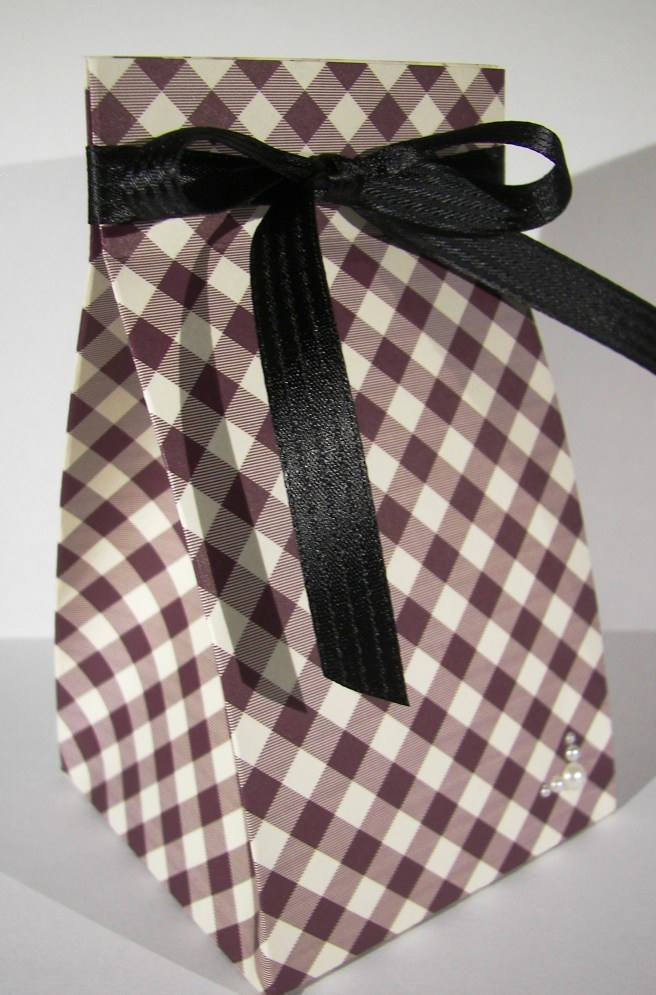
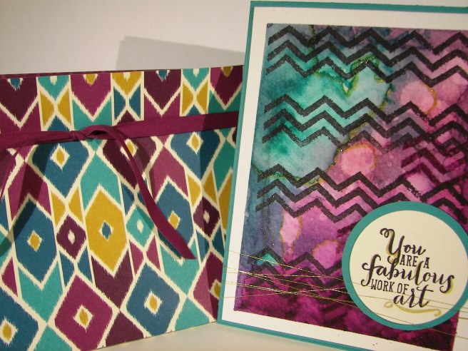
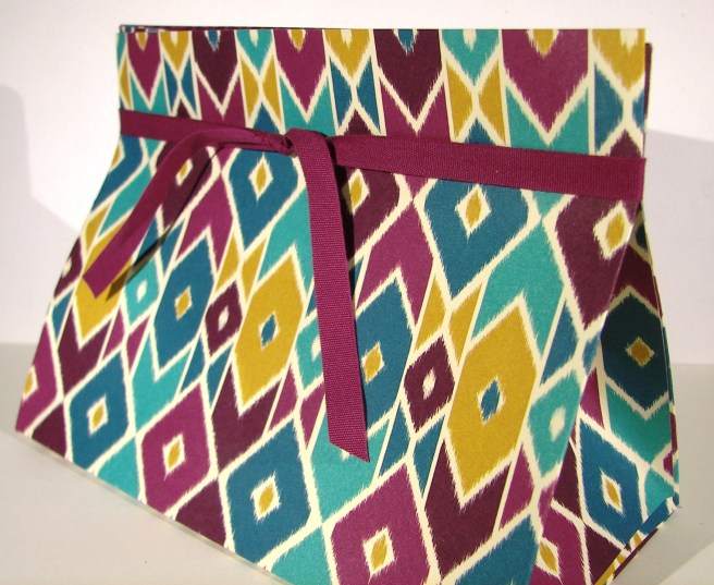
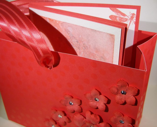
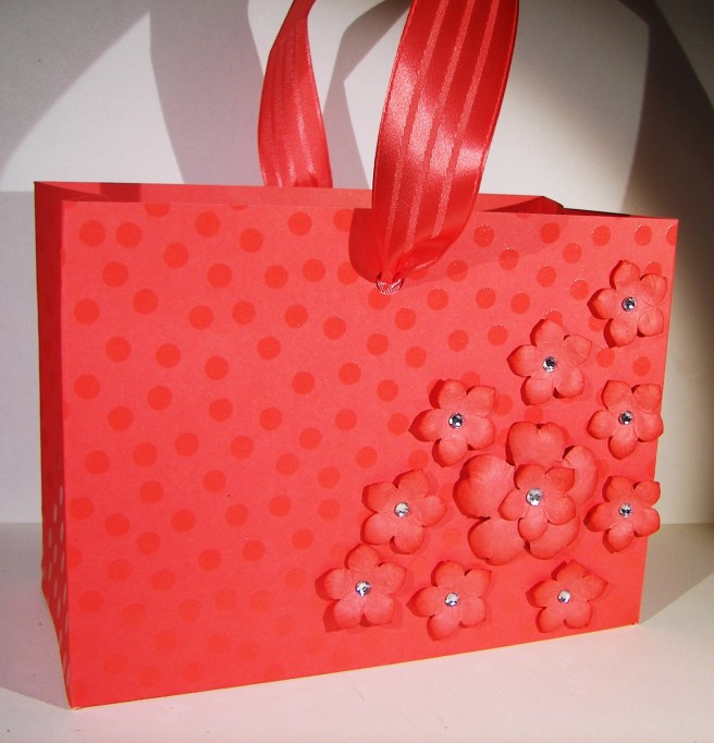
I made a couple of gift bags with totally different dimensions in mind.  I usually work with tall rectangle shapes, but went with a short clutch concept.  The cardstock version could hold heavier tall items, but the designer series paper needs to keep it light.  I had several ideas of gift items that would fit inside easily inside, lots of chocolate to be honest.  I love sharing a chocolate treat or two, you should give it a try.

4-29 (1)

Have a creative day!

Moana