You Are a Fabulous Work of Art

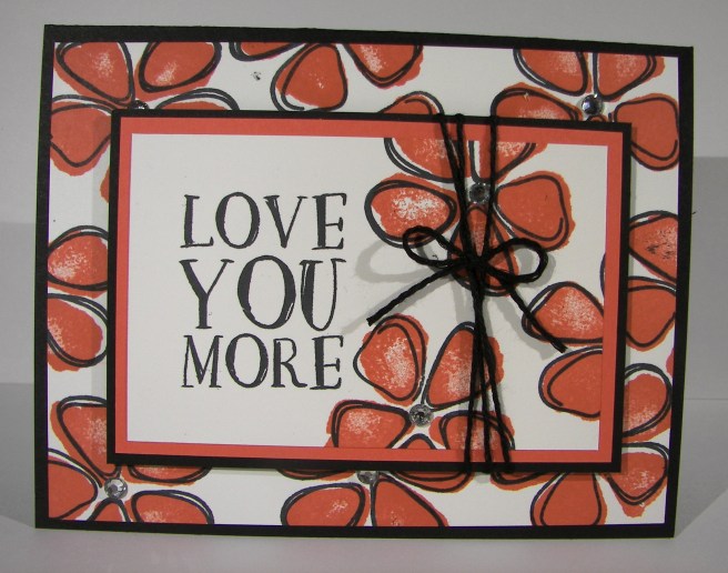
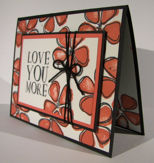
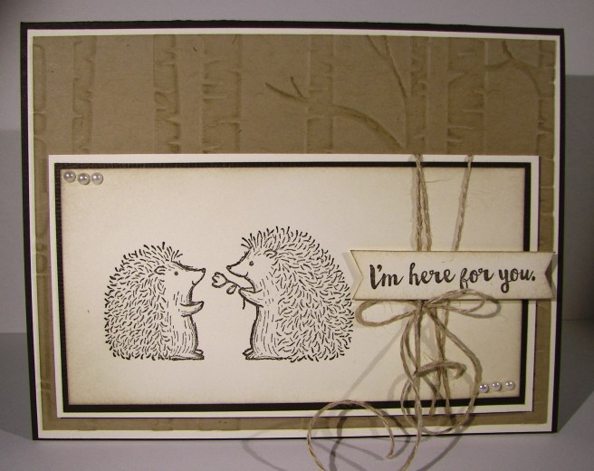
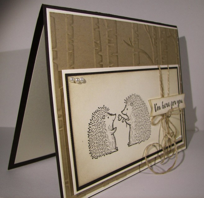
This project is actually an invitation, but could easily be a lovely card to share.  In a moment of forgetfulness we found ourselves needing to pump out 25 invitations in an hour.  It took a bit longer than that, but it was managed.  That is how easy this card it.

1-23

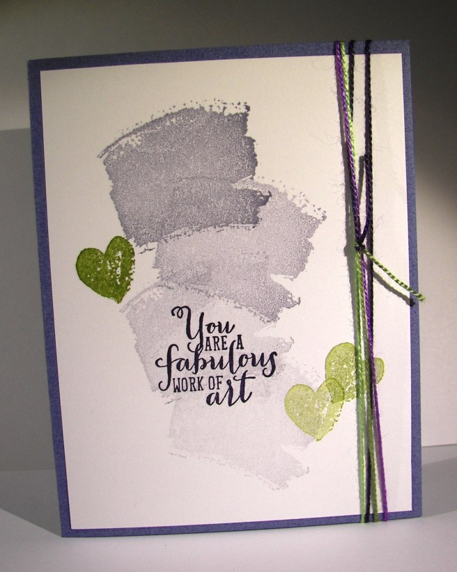
I used wisteria wonder stamped four times at an angle, slightly tilting it as I went.  That gave me the simple background I needed for the sentiment.  That was then stamped in elegant eggplant and I loved the look.  I was in a great hurry, but wanted a bit more diversity, so I brought in this variegated crochet thread with colors that would coordinate. This gave me a green to go with, so in came the old olive.  I stamped three hearts and called the front finished.

1-23-1

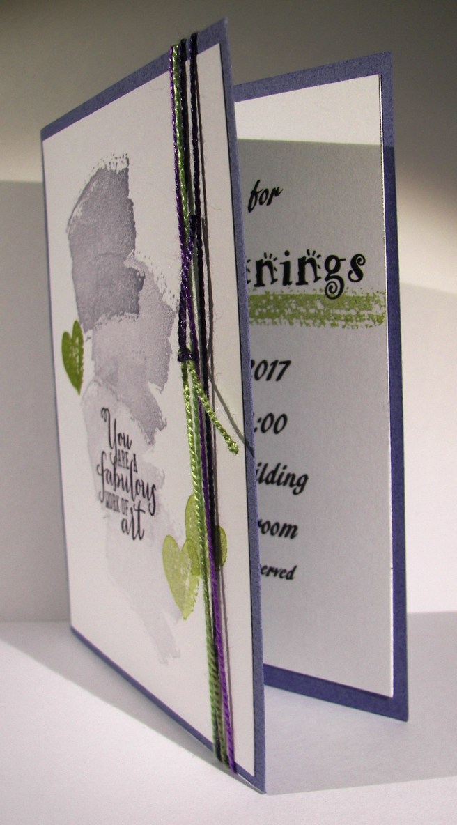
My husband and daughter worked to get the inside information card while I did the fronts. I wanted to connect them a bit, so I added one more stamp there.  I used the long stripe to stamp under the title of the event.  It was super quick, but worked out wonderfully.

Have a creative day!

Moana

Lift Me Up

Sometimes when there are too many choices it is best to keep it simple.  While this card may not look simple, it still gives that feeling with just two colors used.  The background paper comes from a set that is full of vibrant color.  I couldn’t decide, so I chose a more subdued pattern and I love it.

1-19

This little set is going to go to my sweet daughter tucked away in a frozen university town in southeast Idaho, poor little ice cube.  Paper crafting is something we share a great love of, and I know she will be over the moon for this.

The balloon was die cut from night of navy and backed in whisper white.  The balloon can actually be backed in several colors with the framlits available.  There are five sections laid in order across the back, mine being all white.  But if I had chosen, each section could have been a different color and they would match up perfectly, looking amazing.  Next time.

I wanted a bit of separation in tone, so I layered a bit of velum cardstock over the background paper to soften the color a bit.  It totally went along with the cloud kind of feel. I thought it was perfect.  My sentiment also came from the same set and was die cut with the layering oval framelits.  It may be a bit crooked, but I let it stay that way.

1-19-1

I couldn’t resist stamping more from that wonderful set.  It is full of so many wonderful images.  Two hot air balloons, four clouds, a few decorative elements and six sentiments. How great is that!  I had to sneak a little treat bag in to match.  I knew I was sending it in a box with other gifts, so I could make a simple 3-D sour cream container.  I think chocolate for sure.

Have a creative day!

Moana

Fear Not My Friend…

When I am wanting to convey more emotion in a card, I go directly to water coloring.  The softness it creates is perfect.  And with this card, I literally poured my heart into it.

8-20

I wanted more space to work with so I created a larger card than normal.  This one measures 5″ x 6.5″.  Big, but not too big.  I also created my inside writing panel at the same time.  This card wasn’t going to just get a blank insert, or even a nicely stamped one. Besides, I love writing on water color paper, so very satisfying.

I stamped my floral image and sentiment first so I could control the strength of color where they were.  Then I brushed the papers with clean water to allow plenty of color movement. I kept the background light and tried to keep mixing to a minimum.  The colors I choose don’t always blend nicely, but that doesn’t stop me.  I dried, distressed a bit, and dried until I was happy.

I painted the flowers with strong color, allowed them to dry clean.  Then worked them over properly.  This included adding, dobbing, and adding color on the flower petals for a bit.  I centered the flowers with a strong yellow, but kept the color from the edge of the flower center.  Then I hit that area with a water spritzer and watched the flower bloom all over again.  The color moved nicely and then was dobbed some more.  Gold wink of stella was brushed into the petals and blended with water again.  The overall effect was lovely.

A special card for a very special friend.  She is far more brave than I can imagine.

8-20 (1)

Have a creative day!

Moana

You’re in My Thoughts

This is me getting more comfortable with this sassy paper stack.  I have to admit though, the colors are what make it work.  Aren’t they beautiful together?  I don’t think I would have paired them myself, but I will be now.

8-14

Sometimes a simple card works for me.  This one just has a few layers focusing on the patterns of the paper and a simple sentiment.  I left a bit of a gap at the top of the sentiment so I could wrap a bit of ribbon around it.  This ribbon, I love it.  It looked kind of funky in the catalog, but I went for it anyway to share it with my class.  Glad I did.

8-14 (1)

Have a creative day!

Moana

Love You More

Smudges and all, I love this card.  Leave it to me to use a stamp set that is filled with two step fruit images to use the flowers instead.  Like I said, I love flowers.  The fruits are great though, and I do plan on making fun projects with them too.  I actually used an old kit from nearly a year ago.  I love putting old kits to use.

8-12

The prior kit had patterned paper in these colors, but has been retired, so I thought I would make my own.  Making background images is so much fun to me.  It takes me back to the roots of my stamping, using quality tools for endless creativity.  This stamp set is made for just that thing.  You will be seeing it a lot I think.

The flowers were stamped first in calypso coral and then outlined with the coordinating stamp.  They match, but don’t have to be exact.  It goes with the artsy look it is designed with.  Works even better for me.  And the sentiment, how perfect is that.  I opted to center the flowers with large basic rhinestones instead of the stamped center.  Either would have been nice, but I wanted sparkle.  A finishing touch of solid bakers twine with a sweet bow. It actually came together pretty quick, it helps to have leftover kits to work with.  That makes me fuss less when I have last minute class cancellations because I know I will put the pre-cut kits to good use eventually.

8-12 (1)

Have a creative day!

Moana

I’m Here For You

Don’t you just love these two?  I am not one to fall for whimsy stamps, especially cutsie animal ones.  But these guys got me.  The whole set is that way and I have used it so much. It is only a host set, so you can’t just buy it, but need to host a workshop to get to it. Totally worth it though.  Who doesn’t love a fun creative workshop though, right?

8-5 (2)

I was actually able to put to use an old workshop kit for this project.  It was a sympathy card with a totally different look, but it worked great for this one too.  I sometimes put leftover workshop kits back into my supplies, but sometimes I just keep those kits separate.  They have come in handy more than once, so I keep a small stash on hand.

Simple stamping and light sponging across the embossed folders was really all there was here.  I did run the linen thread across a bone folder to help get the kinks out and give the ends a curl as well.  I didn’t paint or sponge these two, amazing for me really, but I managed.

8-5 (1)

Have a creative day!

Moana

Comfort & Healing to You…

There are so many talented people out there that love to share their projects like I do. Sometimes one will come along that I not only enjoy, but have to give it a try.  This project is a mix of a couple of different ideas with my own twist.  I do love how it turned out.

7-21

One of the projects I studied had the card base smooth, which was lovely, and no extra layers, just the circle tag.  The other had the same layers I used with a different embossing folder, but I didn’t want to use that one.  I decided on the brick wall folder, but thought it still looked a bit plain.  After it got a good sponging and distressing I was much happier.  I even sponged the die cut piece because it just didn’t match the rest.  A healthy dose of basic pearls finished everything off.

7-21 (1)

The inside of a card almost always gets a whisper white or very vanilla piece, but I went with the card front color of so saffron like another example showed.  The color is light enough to be written and stamped on equally well.  A very nice touch.

Have a creative day!

Moana

Yellow Brick Road

I have gotten a bit lost over the past few days over a different series.  It is a re-telling of The Wizard of OZ, very unique perspective.  It is actually a quite twisted tale of what happens after the story we all know.  Working with middle school aged children gives me permission to read young adult fiction and I must be honest, I love it.  This one is no exception.  Hence my yellow brick road card today.  Book three done, but it continues on…darn!

7-19

Either way, how about this fun, bright and cheery card!  Using my brayer to apply ink to the inside of my embossing folder really makes these bricks interesting.  However, I wanted more, so I distressed as well.  First, I gave the freshly inked paper a hearty spritz with water.  That got the ink moving nicely.  I knew I was going to work this over a bit, so I did start out with water color paper, quite necessary.  I added more ink with my aqua painter all around the bricks, sponged off with a tissue to lighten areas, then dripped water all around and dabbed to remove ink too.  Great look here at the end.

I also had a bit of fun with the tag.  I stamped and punched my sentiment on water color paper.  I then liberally rolled the edges and in a bit too in the ink pad.  Then I spritzed it too. That caused the ink to move to the middle, but not all of the way.  So much fun.  The leaf die cuts were smushed in the ink pad too and then spritzed as well.  Everything got the same kind of treatment.  It allowed a different but connected look for all of the elements.  Wheee!

7-19 (1)

Have a creative day!

Moana

Fear Not

This was something new for me.  I knew I wanted to have water colored bookmarks, but thought it would be smarter to make one large background piece and then trim it down to the sizes I needed.  Such a large piece of blank paper.  It was a bit overwhelming for some time.  Like the stamp says, fear not.

7-17 (1)

After a while I felt a little more comfortable, but not all the way there.  Distressing such a large piece was kind of confusing.  I stuck with it, dried it and took it to the cutting board. When they were smaller I knew they would be wonderful.  The edges got a gentle sponging along with light stamping from the same set.

Then a quick layering on elegant eggplant cardstock, the main color I painted with, and some new solid bakers twine to coordinate and it was all done.  These will be wonderful to share with the young women I teach.  Love those girls.

7-17 (2)

Have a creative day!

Moana

You Are Awesome

The other day my daughter was wearing a fun pair of pants that were so colorful and had a bunch of fun patterns.  Every time I looked at them I thought I should make a card.  So, I literally went digging through her laundry to find them and give it a go.  Inspiration comes from a lot of different places, but the laundry bin was a first for me.

7-12 (1)

I went through my paper files pulling scraps of the different colors I wanted.  Most of the strips were fine, but some needed to be trimmed to give some diversity.  Once I had the color strips ready I cut a base from printer paper to adhere them too.  It was pretty easy to do because they were just stripes, nothing too tricky.

7-12

I used one of the elements from the butterfly basics set to put a few black stripes down as well.  The piece was then trimmed to 4″ x 5 1/4″ and put through an embossing treatment.  I was able to slide the piece around a bit lining up the patterns inside the stripes and along borders.  I liked that part quite a bit.

The sentiments were stamped and layered with more basic black, but something still wasn’t quite right.  The stripes were too stark.  So, I got my trusty sponges out and went at the whole card front with smokey slate ink.  It hi-lighted the embossed areas more and gave a bit of a distressed look.  That is what I needed and I called it done.

7-12 (3)

Have a creative day!

Moana

Enjoy the Little Things

Yesterday was a very thoughtful day.  I was able to enjoy a day all to myself, which is quite rare in itself.  I had grand plans, a bit too grand, but decided to change them all around and enjoy it differently. This was one of my moments spent, a very indulgent chunk of time working ink all over this lovely card.

7-9

I was given some new paper and brushes for my birthday, so of course I had to get to work using them.  I took this beautiful paper to the brink of maximum absorption.  Sometimes it just takes more time to get the colors just the way you want them.  If you were to smooth your hand over the top of this card you would feel the difference in texture.  The edges of course kept their very smooth surface, but the inked area is actually raised up.  Cool, right?

I did start with the embossed phrase first.  Then I worked around the edges and started in with all of the color mixing.  This copper embossing powder is so fantastic, I absolutely love the color.  It gives a much more masculine feel and goes better with my kind of color pallet ideas for sure.  So, I basically just embossed my sentiment and then went to town on the ink til I was happy.  And I am so happy, so very happy with this one.  I tend to do my best work when I am creating for someone in particular, especially when that someone is my husband.  What more can I say?

7-9 (1)

Have a creative day!

Moana

Hang In There

Sometimes I am just so this little frog.  Good intentions, high goals and all kinds of good things seem just out of reach.  So, push on and hang in there.

7-6

I am absolutely in love with these jars.  The stamps and the framelits really are quite fun to create with.  I wish I had more time to sit and play, but the time I get is enough to keep me balanced.  I like stamping the jar in some blue tone, cutting it out and then cutting out another jar in velum to lay over the top.  It gives an opaque look and softens the stamping. I think I would like to use window sheets too, but for now I am all about the velum.

I painted this little frog with emerald envy and touched his eyes up with soft sky.  The fireflies were stamped in black stazon with the wings painted in soft sky and the body in gold wink of stella.  I love the sparkle.  You can’t see it, but trust me, it is so there. Adorable, just adorable.

7-6 (1)

I stamped a little of the frog in emerald envy just inside the card insert.  Kind of like he was peeking out a bit.  So there you have it!

Have a creative day!

Moana

Well, This Just Stinks

I think sometimes cards can just be funny and that is more than enough.  When I read the sentiment I used I knew I didn’t care what the rest of the stamps were like, I had to have it. Good thing it is really a great set with fun and sincere sentiments.  This phrasing, especially with the intro, is kind of an inside joke.  No pun intended…tee hee…

6-28

The background stamping was pretty darn easy.  I used an element stamp from the Basket for You stamp set and just stamped my way across the card front.  I could have been a bit more careful to keep some of the edges better in line, but my desk is such a mess I just went for it.  Really, my desk hasn’t ever been this bad.  I think it will be top of my to do list tomorrow.  Summertime really gets me out of whack.  As you can tell by this very late blog.

Anyway, then the fun die cut letter had to get done.  I didn’t want those huge letters to take over my funny phrase, even though they are so large.  So, I decided to stamp them lightly in gold.  It kept them not as strong and allowed the rest to really catch your eye.  In order to keep them lined up I arranged them on the card front how I wanted them and laid a piece of painters tape across them, lifted them up, turned them over to put on dimensionals, and then placed them right where I wanted them.  It worked out pretty good.  The tape lifted some of the ink, guess I should have heat set it first.  Oh well, you can hardly notice it.

6-28 (1)

I sponged all around the edges on the front and a touch on the inside panel.  All in all, this little project really makes me laugh.  There are times when life is great and sometimes it just stinks and it is more than okay to say so.  Even better to laugh about it.

Have a creative day!

Moana

Flourishing Phrases

This particular project went through a few different phases.  This is how it started out, all about blue.  I had the ocean on my mind and gave it a try.  I had intended on using a new embossing folder after I water colored, but to be honest, I forgot once I got all this going.

6-25

After I painted with all of the blue inks I have I did some detail work using my gold wink of stella.  I focused on some of the watermarks and edges of color.  The look it creates is really awesome.  It is tricky to know when to stop because it is so much fun.  Mission accomplished here for sure.

6-25 (1)

The next step was to add a special tag.  This one got a bit out of control and went to a busy style that really isn’t my own.  However, I decided to leave it and see how it balanced out with the huge butterfly addition I had in mind.  I water colored large areas of paper to provide both my tag area as well as the butterflies.  It is much easier to paint whole sheets instead of small specific die cuts.

6-25 (2)

When this butterfly combo came along I really began to wonder just what I was up to.  I think that is because I love decorative painted backgrounds so much I rarely cover them up. They are such great all occasion cards, but I pushed forward.  I did edge the butterflies with the wink of stella, which of course you cannot see in these photos.  It is there though, and it looks so pretty.  You can see it better in the lead featured image which is much more close up.  Basic pearls, gold metallic thread with a little more patience and this project was finally finished.  It measures 5 1/2 x 5 1/2 plus the butterfly hanging off the edge.  A custom envelope will definitely be in order here.

Have a creative day!

Moana

We’ll Weather This Together

A project can go through several phases, and some can be unexpected.  The original vision kind of got lost somewhere along the way, had some confusion, but ended up reasonably pleasing.  These ladybugs though, too much love there.

6-22

My daughters have a canvas in their bedroom that inspired this little card.  I was looking at it recently and thought of the new stamp and framelit set that could help me create my own version.  I pulled some of my favorite pastel colors for the background and started the process.  The more colors I use the longer it takes me to become satisfied with how they blend and flow together.  I went through this one three different times and then once more when I added in the yellow around my little bugs.

6-22 (1)

I water colored on a scrap piece a mix of pool party and blushing bride.  The umbrella was then cut out and hit again with more blushing bride.  The clouds and raindrops were cut from areas that just had pool party.  And yes, I did glue all of those parts down, even those little drops.  I love the dimension the thick water color paper gives to them. Before I stamped my sentiment I added a touch of wink of stella to the clouds and raindrops.  All the pieces were layered together and put in place.  And before the blog had even been finished I was able to use it to brighten someones day.  Wonderful.

Have a creative day!

Moana

Artistically Asian

New stamps, new stamps, new stamps!  I love having new stamps!  This particular one caught my eye right away on my first browse through this seasons catalog.  I could easily get lost exploring the possibilities, there are so many.

6-17

But, I am totally in the mood for water coloring, so what else would I turn to just now?  I thought some of the new in-colors combined with gold would compliment the Asian feel of the stamp set.  And, I absolutely agree with myself.  Good thing too…

Flirty flamingo is the card base and the main color I painted with.  These colors go so very well together.  I used a lot of water and kept the color light building the intensity but not overdoing it.  Experimenting with this kind of painting is really something you just need to sit down and do it.  I have learned some things that work better for me, and of course there are tons of very talented people online that generously share their techniques to learn from.

I did stamp over the floral image again with both flirty flamingo and gold encore ink.  I wasn’t looking for a particular effect, just more of the image itself.  Then I hit it pretty hard with the gold wink of stella brush pen.  I accented the image quite a bit then followed along some of the water mark lines.  They ended up giving me a bit of a mound for the plant to rest on and maybe an interesting mountain or two in the background?  That wasn’t the intention, but I keep seeing that when I look at it.  Judge for yourself.

6-17 (1)

Have a creative day!

Moana

Layering Love

Summer is here and it seems like love is everywhere.  How fun is that!  I wanted to capture some of that carefree spirit that summer can bring and had a fun time giving it a try.

6-16

I must admit, I have been enjoying my water coloring quite a bit, but it is still my favorite medium right now.  I thought I might use a die cut on this image and layer it, but I forgot about that until I started typing.  I was wondering why I left the image off center like that.  I then remembered my original plan.  Well, I am okay with how it turned out.

It began with stamping the sentiment in versamark ink and then embossing with white embossing powder.  The next step was to create some kind of heart over and around the words.  When that was done I stared at it for a while trying to decide on a background color. My oldest daughter suggested tempting turquoise since it felt like summer.  That went with my plans, so I went for it.  I kept the color the strongest in the corners and painted towards the heart.  I was trying to create a lighter area around the heart to make it look like it was floating a bit.  That worked pretty good.  Wish I could make a more balanced heart, guess that is why I love die cuts and punches so much.  They correct my work some…

In the end I was happy with the result.  I went ahead and did a touch of blending along the edge of the heart and the blue background.  This provided a bit of a border and gave some cool layering effects.  I went back around the lettering with a wink of stella brush which gave a bit of shadow, but also made the image appear almost blurred.  Interesting, but I still went with it.  I left it a single layer on the card base of watermelon wonder and there you go.

6-16 (1)

Have a creative day!

Moana

Love, Love, Love…

When the new catalog comes out each year I do a quick scan for the super obvious favorites. Here is the first one that was an absolute must have.  To be honest, I focused so much on the adorable jars and lettering I didn’t notice just how huge the stamp set was.  Well, it is amazing.  Talk about options.  I could do a series just using this set and have tons of projects, all looking unique.

6-9

I began by creating a background using marina mist ink on water color paper.  I have been using quite a bit of designer series paper lately and missed making some of my own.  I do feel better now.  After it was all painted and distressed I moved onto the jars.  I could hardly wait.

They were stamped in marina mist on whisper white paper then cut out using the matching framelit pieces.  I do love perfect little images all ready to go.  They were layered a bit, but you can still easily see that they all say love on the front.  I am still in wedding mode and the card reflects this.  I will be hanging dozens of mason jars below several of my trees today that will get candles and create a lovely look.  The couple is already so wonderful, I just want a beautiful evening for them and all of our friends.  Just two days away!

I did a tiny bit of stamping inside.  The small jar was used but stamped off once to give it a lighter look and allow me to write over it if needed.  Then, I stamped with silver encore ink a wrapped string to match the front.  I went back and added large basic rhinestones on the metallic thread and thought it was perfect.

6-9 (1)

Have a creative day!

Moana

God is Love

A quick stroll through my scrap pile kits and I found this treasure.  I swapped out the embossing folder and stamp sets and came up with something wonderful.  Before it was a different nature scene with a sympathy sentiment.  I like this one too.

5-26

The Trust God stamp set has finally reached retirement.  I cannot tell you how many times I have used this particular set.  This, along with yesterday’s Swallowtail, will join the special shelving unit of stay with me stamps.  I couldn’t part with it.  The new catalog has a couple of sets that are very nice, but in my opinion, won’t be replacing this one.

The tree was stamped in the center with early espresso and sponged with crumb cake.  That is the same treatment for the sentiment, which was punched with the also retiring extra large oval punch.  Dang, I am going to miss that one too.   I do enjoy trying new things, especially when it challenges my crafting.  Plenty of dimensionals and a touch of basic pearls finished this card off.

5-26 (1)

Have a creative day!

Moana

Bohemian Work of Art

Rich colors and exciting patterns, that is the theme for today.  In between wedding reception planning I have managed to create this lovely due.  Now I get to add this to the collection of card sets and greeting cards I am donating for a cub scout fundraising event tonight.  I get to share my work and clean out my stash at the same time!  I call that a win.

5-14

The card began with the chevron stamp from the Work of Art set.  I didn’t really pay too close attention, just stamped it four times down a piece of water color paper.  The color pallet came from the bohemian designer series paper set, only leaving out the yellow tone. The focus was on bermuda bay and I started there.  Color was layered, sponged off, added, and distressed a ton until I was satisfied.  Then I did something that was new for me.  I hi-lighted some of the distress areas with my gold wink of stella brush pen.  That was super fun and I had a hard time stopping.

5-14 (1)

The gift bag was made from a whole sheet of designer series paper.  I went for a wide stocky bag instead of my usual tall slender ones.  It is nice to change things up a little bit here and there, don’t you think?  The ribbon I had in rich razzleberry was just long enough to go around the bag top.  I do love using up product that is retiring before it actually retires.  I am not often that lucky.

5-14 (2)

Have a creative day!

Moana