You Are My Everything

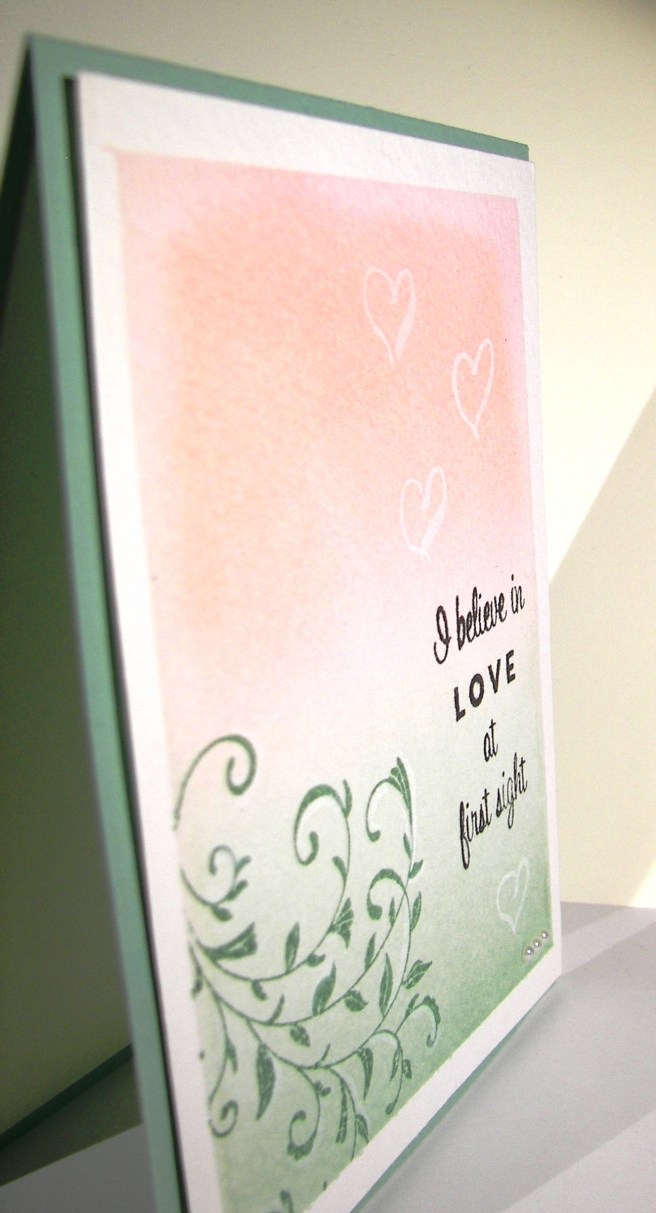
There are days when I really don’t know what I want to make, but that isn’t today and it shows.  When I know who I am creating for it shines through.  The awesome extra free stamp set in this months paper pumpkin kit had the stamps I had to use.  How beautiful are they?  Well, I will be using them excessively I am sure.

4-17

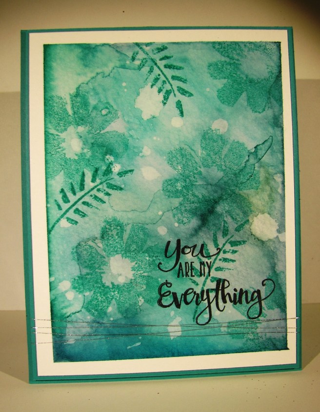
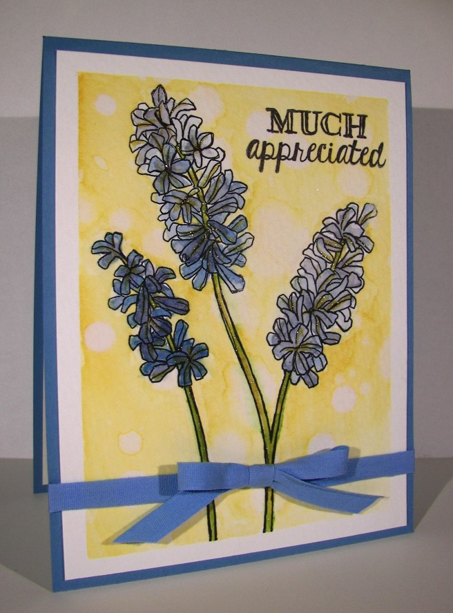
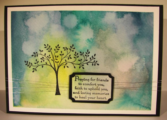
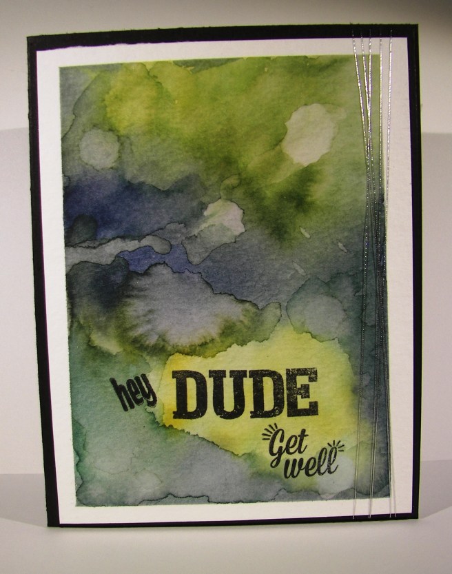
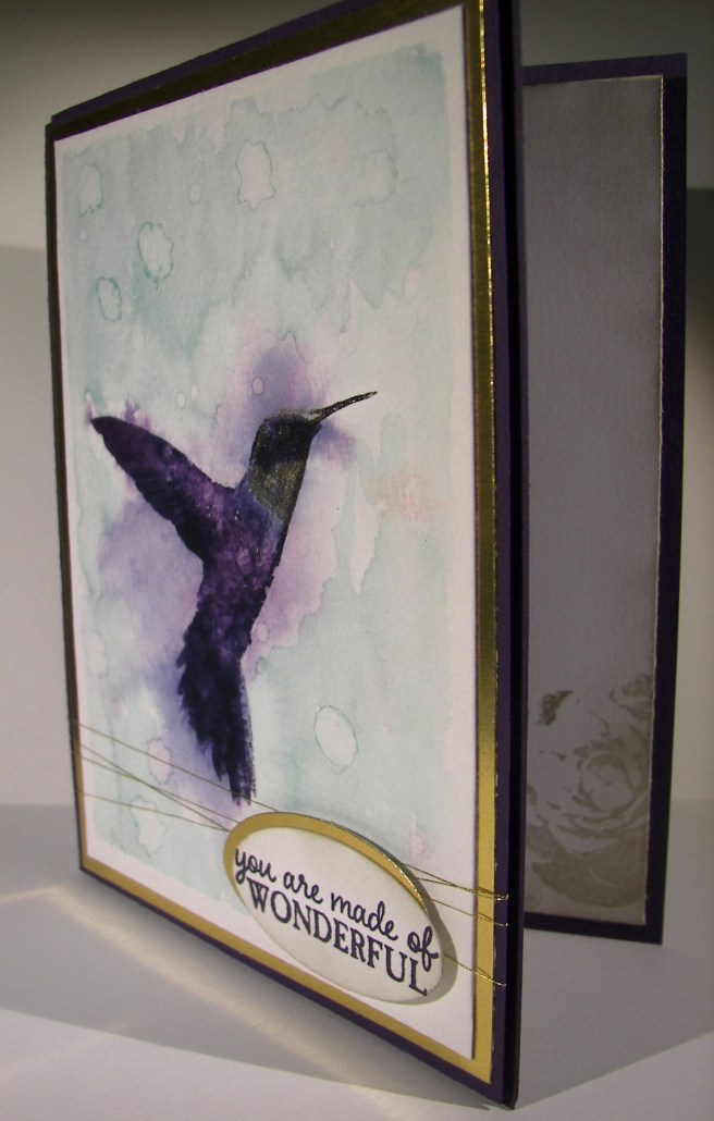
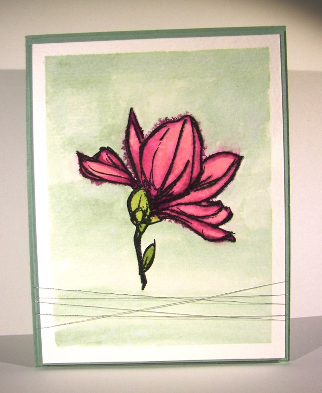
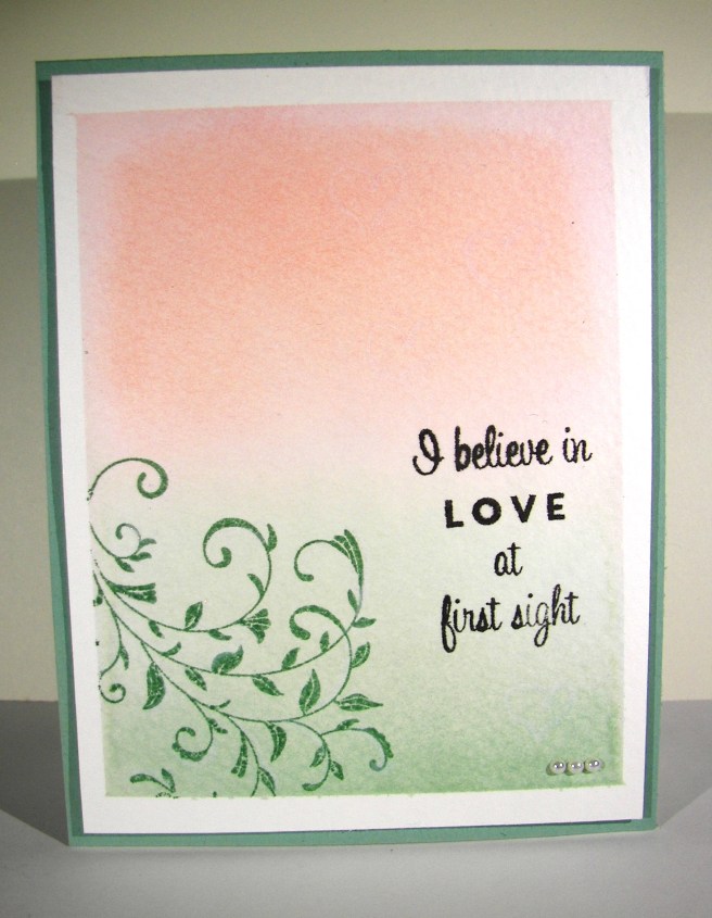
I knew I wanted to make a card for my husband with the two stamps  that share the phrase ‘You Are My Everything’.  It couldn’t be more perfect.  Once I knew that I knew the color pallet I needed and the medium as well.  Blues and water coloring are the perfect combination for him.

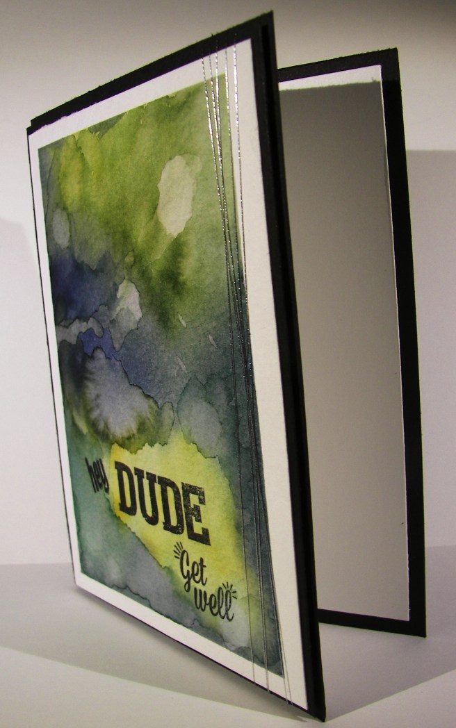
The technique of water coloring really doesn’t have a lot of guidelines.  I do start with a wet masked surface.  Then I begin to add and take away color, dry and wet again sprinkle and dab, and color all over again.  It is more of keep going til you get the results you want than a step by step process.  So much fun, really.

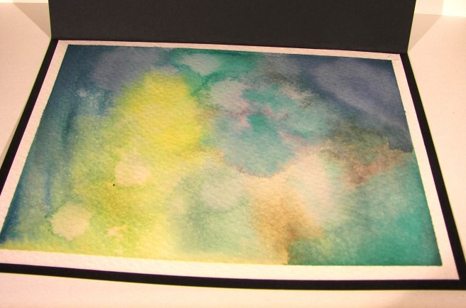
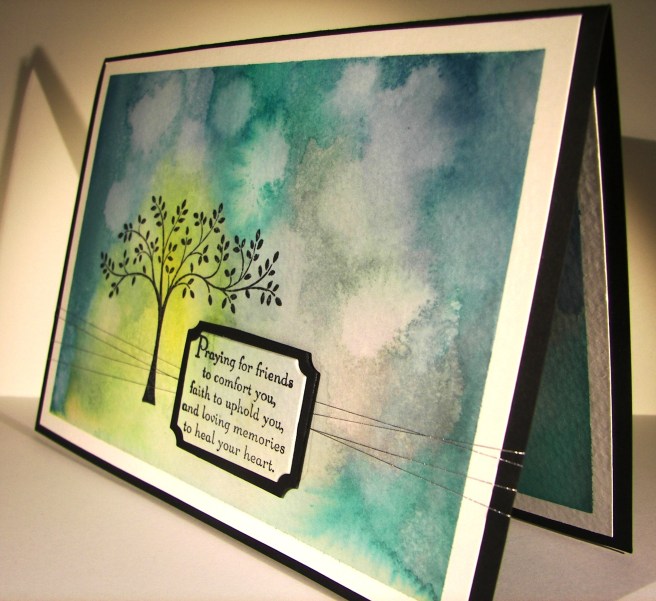
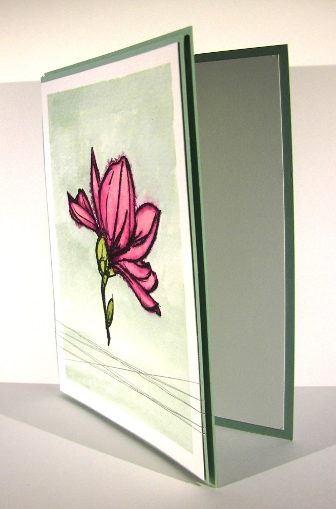
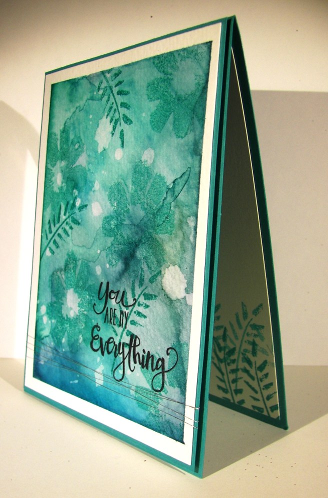
Then I stamped the large flower in bermuda bay, once stamped off first, here and there.  I added a fern stamp a few times, full strength not stamped off.  Then finished with the two stamps that make the sentiment.  I did a little echo stamping to coordinate the inside with the card front.  To complete the project I layered the art onto another piece of bermuda bay card stock and wrapped it several times in silver metallic thread.  Then up on dimensionals for a little extra style and sit back to enjoy the view.  I do love this card.  I think it looks like a beautiful batik fabric I would love to own and sew with.

4-17 (1)

Have a creative day.

Moana

Helping Me Grow

I do love to water color, that much is more than obvious.  Since spring is everywhere I knew I had to do some flowers like the ones I see everywhere.  How about lupin?  Pretty sure I spelled that wrong, but they are the prettiest wildflower, next to the poppy of course, that are growing all around this time of year.  My husband even recognized the flower on the card, and that is saying something.

4-13 (2)

I stamped the large floral image on my masked piece of water color paper in black stazon. The flowers were initially painted in marina mist, letting the ink run lighter as I went up the flower.  After, I added in hi-lights of wisteria wonder in the centers and across some of the petals.  The stems were done in pear pizzazz.  I did a touch more with the gold wink of stella to give it a sparkle.  That was both on the petals and the stems.  I know, it is hard to see in the photo, but it is there.

I painted the background in so saffron, allowing it to be lighter and darker just here and there.  I didn’t have a specific rule in mind, I let it happen.  I then used my aqua painter to drop clean water across the card to make water spots.  I let the drops sit there for several minutes then came back and dabbed them up with paper towels.  That removed ink and left the fun spots behind.

A simple bow across the front finished it off.  I used a piece of very vanilla for the inside.  I decided not to leave it blank and opted for a repeated image of the front.  Instead of black, I used so saffron stamped off and placed it right in the middle just like the front.  The idea is that it is light enough to be written over, kind of like a water mark.  It looks great.

4-13 (1)

Have a creative day.

Moana

Mother’s Day Take Two

Earlier in the year I made a couple of cards with this darling little chick from a sale-a-bration stamp set.  I instantly fell in love.  So did my mother.  I decided she needed to have one of her own and not just a card.

4-12 (1)

A prior paper pumpkin kit had this frame along with pretty little things to make a wonderful decorative gift.  I couldn’t make it for my own mother since she gets the same kits each month and I didn’t want to give her something she already had.  It sat upon the shelf for some time.  Until last night when I needed it, the frame that is.  I also used the wrapping cardstock and ribbon to go around it.  Now I will send it away for an early mother’s day gift.  She will be super excited.

The little chick was stamped in black stazon on a 4 x 4″ sheet of water color paper.  I started pulling ink pads until I had everything painted just like I wanted.  I did use my heat tool a few times along the way to set color when I wanted to layer another.  The yellows I let all blend together without worry.  But I wanted the cheeks to stay pink and tried to keep the beak a little more under control.  The shadow needed to be dried before the background was applied, but that is about it.  After I put a touch of marina mist for blue eyes I used wink of stella to give them some sparkle.  Just a fun little project to make my mom smile.  So fun.

4-12

Have a creative day.

Moana

It’s Your Day!

Yesterday was one of my TA’s birthdays.  Boys turning 14 don’t want a lot of fluff, just cut to the good stuff.  I stopped on the way to school and picked up a large chocolate bar and wrapped in this awesome, retired, water color patterned dsp.  He is also an artist, so I knew he would appreciate the water color theme going on.

3-22

It was so easy to assemble.  I placed tear n’ tape along three sides and wrapped the large candy up.  First I wrapped the paper around fairly tight and sealed it like a flat tube.  Then, I just removed the other strips of tape to flat seal the ends.

I took the scraps of my linen thread and wrapped them around and tied a knot.  I just took my hand painted, and stamped of course, gift tag and looped it through one of the extra strands.  Another simple knot and this lovely package was ready to go.  Sorry I didn’t get a photo of the finished product, but I wasn’t sure just what candy I would be able to get. Stores out in the country don’t always have a large selection.  The way the paper was prepared I could have turned it into a large sour cream container styled  box and been just fine as well.  For the win!

3-22 (1)

Have a creative day!

Moana

Dear Heart, Sweet Boy

This project was all about giving myself a challenge.  I grabbed a piece of dsp, decided on three colors, picked a stamp set I hadn’t used a long time and went for it.  This was definitely not my usual style, but it felt good.

3-20

The card itself wasn’t too complicated, just one layer for the background.  I stamped my little boys on water color paper with black stazon and opened the ink pads.  Their faces were done with a very diluted wash of pink pirouette with the hair in tip top taupe.  I wanted them to look like the same boy just doing different things.

Each boy face was accented with one color only.  For the darker areas I kept the ink fairly strong.  When I accented I diluted it a bit more and even more for the outlined areas in the background.  I left it simple because I wasn’t really going for perfection, just soft coloring. I punched their faces out with the 1 3/4″ circle punch and a background of black with the 2″ circle punch.  They were arranged on the front and layered with a bit of dimensionals.

The banner was stamped from the same set and a light wash of each color was put on its own section.  Then each end was punched with the bitty banner punch.  I also put that up on dimensionals.  I repeated the pattern of paper inside with more dsp and a smaller piece of very vanilla to write my message on.  Such a sweet card, for a very sweet boy indeed.

3-20 (1)

Have a creative day!

Moana

Balloon Celebration

Experimenting with water coloring has become one of my new favorite things to do.  I am so young in this medium that it is a constant adventure.  I do try not to do it all of the time, but it might just be my favorite.  Hard to put that off.

3-18

I did stamp off the balloons twice before they got to the card front.  I wanted dark color, but still opaque.  It worked nicely.  The second layer stamping was done only stamped off once to make sure it was seen well.  Also a good fit.  I did go over the balloons again with the aqua painter to smooth things out.  A bit of dabbing with a paper towel helped to create better highlight spots.  Fun and fun. I am still waiting for the back-ordered balloon punch, so I had to layer the balloons with just ink.  That is why I had them opaque.  To allow the layering to show the balloons behind, just like it would with a real bouquet of balloons.  I do think this card is good for just about anyone’s birthday, masculine too.  A really great project that was satisfying on so many levels.

3-18 (1)

Have a creative day!

Moana

Thoughts & Prayers for my Friend

When someone close to you experiences loss it is always painful, more for some than others.  This is a time when I spend an extra amount of time for just the right expressions and feelings.  There are just so many.

3-15

This young man recently lost his twin brother to cancer at the tender age of 15.  He battled very hard, three times  over, but just couldn’t prevail in the end.  I must say though, he never complained or looked unhappy.  Truly inspiring.

3-15 (1)

I spent a lot of time with color and layering for both the outside and the inside of the card.  I really wanted to spend plenty of time.  It helped me gather my thoughts so I could write what I really wanted to say.  It definitely means more to me to have a hand made card for occasions like these.

3-15 (2)

Have a creative day.

Moana

Watercolor Wings Just for You

Saturday mornings are usually busy with everything under the sun and then some.  I had the opportunity to chat with my oldest daughter while she got ready for work.  We put each other on speaker phone so we could keep moving along.  This is what I did during our chat.

3-12

With all of the excitement of Sale-a-bration products and the wonderful spring catalog, it is easy to put aside all of the great product in the annual catalog.  This set, Watercolor Wings, has been a favorite since it came out.  I hadn’t had it put to use lately and thought that was long overdue.

I stamped my ink layers onto watercolor paper this time not quite sure how it would all turn out.  The initial stamping was a bit too detailed for the effect I was going for, but I remained patient and kept going.  I moved in with the aqua painter and began blending, but still wasn’t satisfied.  Perhaps because I had stamped off to get the tones I wanted the ink didn’t want to move around too much.

I thought things were a bit stark still so I came in with pear pizzazz for my background. That really helped out a lot.  But the butterflies still weren’t what I wanted.  I got a spritzer out and put more water on.  Which led to dabbing water off, spraying again, and moving along to the heat tool and doing it all over again.  I did finally get a result I liked, but decided to bring out the wink of stella pens, both the clear and gold glitter ones, and put in finishing details.  I think it all worked out, but I wasn’t sure for a while.  Sometimes watercolors can be that way.

3-12 (1)

Have a creative day!

Moana

Beautiful Ride for My Nali Bug

This card has been in the planning part of my brain since the spring catalog came out.  I waited to get the set because I thought it would be one more for me than anything else.  I just might turn out to be wrong on that one, but we will see.  I made this one for my oldest daughter, Denali.  Some of my pet names for her are Nali, Bug, and the coziest is My Nali Bug.  That is just what this card is, My Nali Bug.  I shared it with her before this blog went live and she was so cute about it.  How fun is that!

3-10

I simply stamped the car in the lower portion of my water color paper and got the ink out.  I had originally thought to write her name on the car door, but changed to the balloon last minute.  I think I could get lost in this stamp.  How many creative ways have you seen one of these cars painted in the years they have been driving on the roads?  My brain is thinking of ways to make them on this little guy too.  So much fun and never enough time.

Simple layering of my two focal colors, and this card was done.  I enhanced the layering inside the card to give it a bit more color, but that is really it.  I added some wink of stella to the windows and the silver ink areas of the car.  I touched up the rims with a white gel pen.  It wasn’t perfect, but the surface wasn’t ideal for that pen.  The texture of cold press water color paper is my favorite, so there will be some concessions here and there.  Good enough.

3-10 (1)

Have a creative day!

Moana

Hey Dude, Get Well

Making a custom card can be fun, difficult and frustrating all at the same time.  Masculine cards are an interesting creature to say the least.  It doesn’t have to be covered in metal, fire or tools to have the masculine touch you are looking for, but flowers will just not work obviously.

3-1

I used some stamps from two different Paper Pumpkin sets to give me the phrase combination I wanted.  How perfect is the word ‘Dude’.  It works equally well for both depending on the recipient, but is fantastic for a masculine theme.

I decided to create a grungy water color look instead of searching through paper, background stamps, or anything else.  That way I had control of the look and feel and could stop when it looked just right.  I spent quite a bit of time adding, sponging away, adding, drying and repeating it all.  Now I love it so much I don’t want to give it away.  It was a special request though, so it will get to be signed by a school staff and delivered this afternoon.  Good thing I have photos, because this one is going to get created again.

3-1 (1)

Have a creative day!

Moana

Picture Perfect Hummingbird

Is it possible to be defeated by a stamp set?  It was surely happening with this project.  I decided to tackle a four step stamp, yes, this innocent looking hummingbird.  I took a photo of my study series, or my path of frustration to say the least.

2-27 (1)

I am much more used to sitting down, getting out whatever I want, and having it turn out pretty darn amazing.  This was not to be the case.  However, if I was to come across 3-D glasses, I might have had more fun.  My first two attempts obviously were poor color choices.  The hummingbird I had in mind was not going to come together.

I changed to monochromatic thinking that might help.  It did some, and I improved, but was still unhappy.  Keeping this guy all lined up, even being able to see through the stamp, was proving harder than anticipated.  I switched to water color paper and played some more.  I gave it one more try, with elegant eggplant, night of navy, gold, and black stazon.

Stamp one was in elegant eggplant, stamp two in gold (the little neck), stamp three was done in night of navy, and the final stamp (which included the beak) was done in black stazon.  I got to work with my aqua painter for the background wash, in soft sky, and then added coloring to the bird.  It got out of control fairly quick and I thought I was done for sure.  I was being so careful, so I thought.  I ended up putting a thick layer of paper towels over the image to seep up the crazy color mess.  When I peeled it away I got a little hope, it didn’t look so impossible.

When I had finished I fell in love with it.  I am not sure if I could duplicate it, because of all of the water color layering effects, but I won’t be scared to try.  It is such a pretty image and I love it in water color.  Especially with the gold ink and the wink of stella added in.

2-27 (2)

Have a creative day!

Moana

Sweet Li’l Things

I haven’t visited my little chickie for a while now and loved saying hello again.  This stamp just says adorable like crazy.  I normally wouldn’t get a stamp set for just one image, but this one was just too perfect to pass up.  Of course it helped that it was a free gift with purchase, so there you go!

2-24

I used the Sweet Li’l Things DSP for the background.  That is how I created the pallet for my water coloring today.  I was a bit distracted chatting on the phone with my daughter while painting, so I didn’t dry as often as I should have, but I decided I could live with the little edge goofs here and there.  Besides, I wasn’t going for a blue ribbon, just a smile or two.

The strawberry patterned paper underneath the card is the other side of the designer paper I used for the background.  I think I will turn that into a matching gift bag when I decide to use the card.  Might not be too soon because I want my lil’ chickie to be on my desk for a while.  I made a tiny triple banner set for the greeting and used the bitty banner punch for the edges.  So easy to make the edges just right.  The paper strips are 1/2″, so they fit right inside the punch.  I twisted them the way I wanted them and gave them a quick staple.  Then I used my bone folder to give them a bit of a curl then added a ribbon knot to finish it off.

Everyone is layered in 1/8″ borders and set up on dimensionals.  This one would definitely require extra postage going through the mail.  But since I plan on using this as a gift set, I didn’t worry one bit about how thick it got.

2-24 (1)

Have a creative day!

Moana

Birthdays should always be this exciting and colorful, don’t you think?  When I started this project I only had the base with the striped dsp setting on top.  I wasn’t sure at all what was going to come next.

2-22

I didn’t know how I was going to tie these bold colors together, and I wasn’t even sure they went together.  But as always, I stuck with it.  I decided to do a simple water color background with the two ink colors.  Sounds simple enough, right?  I stamped in  versamark ink and then brushed my paper with plenty of clean water.  I started with melon mambo in one corner and added a bunch of tempting turquoise in the other.  As I went back and forth some fun things started to happen.  I liked some of the mixing, but decided it was enough.  I dripped some clean water here and there to push color around and give a different look and ended up with quite a bit of water pooling.

Instead of dabbing it off with some paper towels I let it stay.  I took the heat tool to it and began to heat set the color.  The extra water and color around the edges started to activate and mix the inks even more.  I chased the ink around the edges of the image until it had all soaked in or dried up.  I was left with a really fun look that I don’t know if I could duplicate it again if I tried.  I will have to try though, because I love the look of it!  How fun!

2-22 (1)

Have a creative day!

Moana

Remarkable You

It is so nice to have a day off from school and work, but it does put things off more than a bit.  I seem to be having more and more of that as of late, but I do keep trying to get it back in the right gear.  Now I have wedding reception plans to toss into the mix.  Exciting!

2-15

I pulled a few ink colors that I wondered about going together.  Blackberry bliss is such a strong color I hesitate sometimes to put it with others.  This pastel grouping compliments it nicely though.  I don’t think I have watercolored with it yet either.  That was fun for sure.  I used a basic card front made from cold pressed water color paper, masked a quarter inch border off and got to work.  This project was one of the times I just let it happen without too much planning or thought.  I find that less stressful because you don’t have an exact finish in mind, just simple imagery and colors.  Works well for me.

I layered my front on a backgroun of mint macaron with a narrow 1/8″ border, and then placed it again on the card base.  I didn’t do any inside stamping this time.  Just a simple and clean piece of whisper white waiting to be written on.  I think that was all it called for.

2-15 (2)

Have a creative day.

Moana

Make 16 Shine

Turning 16 can be exciting, or overrated, take your pick.  I know a young lady who is excited for lots of reasons, but hesitant as well.  She worries a bit much sometimes.  She loves gray and it is so beautiful on her.  Just like 16 will be.  This card is for her.

2-2

I masked a piece of cold press water color paper and did a wet wash using smokey slate and basic gray.  I just kept adding color until I was happy.  Patience wasn’t on my side, so  the heat gun got to work to dry it.  I wanted a few distress areas so I dripped some water on, let it activate the color, let it run a bit and daubed it up.  Just right.

The new Large Numbers Framelits Dies are so fantastic.  They are huge!  Sparkle was necessary, so silver glimmer paper was the perfect choice.  Before placing the numbers, I wrapped some silver metallic thread several times around the card front for just a touch of ribbon.  I wasn’t some, but not a distraction from the huge 16 just shining there.  The edges of the dimensional sheets fit perfectly behind the numbers so I didn’t have to get all tricky with cutting just the right size.  How great is that!  Of course the card front was attached with a bunch of dimensionals as well.

2-2 (2)

Have a creative day!

Moana

Rose Wonder

This was a fun project for sure.  As you have heard me say so much recently, I do love to water color with my stamping.  I wasn’t sure if these two colors would come together in an attractive mix, but they did well.  Having the touches of navy with the blush as a primary is really enjoyable.

1-26

I think I might be making the decisions a bit tricky for these bridal shower invitation choices.  I am not sure which one I like better between the two, guess I will have to come up with another one just for good measure.  I can’t spend too much time playing though, I have workshop coming this weekend.  It is fun to play though.

I stamped this huge wonderful rose on water color paper with stazon ink.  I didn’t goof it up too much, so I went with my first attempt.  I did a trial run with the colors on a scrap of water color paper just to check it out and I liked it.  So, I wet down my stamped image and got to work.  I spent a bit of time trying to be cautious, then I just went for it.  That is why I love to water color, it is pretty darn forgiving.  I even used my trial scrap as a background punch, cool right?  I do try not to waste.

1-26 (1)

Have a creative day!

Moana

First Sight

I keep getting drawn into playing with water colors.  Maybe that is just my thing for right now, and I love it.  The effect is just so soft and subtle.  And it isn’t even very tricky.

1-18

I do have a hard time putting embellishments on top of this kind of card front.  So I settled for a short strand of basic pearls and a hint of Wink of Stella.  I drew a few hearts and hi-lighted my stamped flourish to give it a little interest.  You have to turn the card to see it, so it is very subtle.  I didn’t want much to get in the way of the color blending.  When I tried different ribbon options it just was this huge separation that was pretty sad.  Clean and simple does the trick today for sure.

1-18 (1)

Have a creative day!

Moana

Celebrate Forever

The other day I asked my husband and youngest daughter to draw me a doodle that I could use for a card front.  I make cards all of the time and rarely hesitate to get to work.  This was different though.

1-16

I don’t have stamps, or papers, or materials that go with his style of art.  It presented a challenge to be sure.  If I had been thinking ahead I would have had him draw on water color paper.  You work with what you are given, right?  It is easy for me to focus on all of the problem areas, but I think it will work nicely.  And it is an original, one of a kind.

1-16 (1)

I used two different sentiments to create this combo.  I masked off half of each phrase and got just what I wanted.  I think I have gotten a bit spoiled to have just the right tools for nearly everything I do.  When I had to trouble shoot I got pretty darn frustrated.  Plenty of learning opportunities today.  I hope you get brave and try something different, even if it is a bit overwhelming.

1-16 (2)

Have a creative day!

Moana

Flowering Fields Thank You

So I was looking through my blog site and discovered this as a draft and not a blog.   Oooops on my part.  I really loved this one too.  Enjoy!


While browsing a catalog I came across this book.  The title was awesome, but to be honest, I knew I had to make a card that looked like it.  It sat at my desk for several days until I had a little time to experiment.  I got my inks out and went to work.

Flowering Fields Thank You

I went back and forth on using just ink, or a versamark with gold embossing powder.  I went with just ink and then used my aqua painter with some ink to add details and make the flowers a bit more prominent.  Aren’t these pretty?  Yet another awesome free set during Sale-a-bration!  Wheeee!  The thank you came from Another Thank You.

Flowering Fields Thank You

I masked the water color paper and brushed it heavily with water before I added ink.  I added, dobbed, and added more until I was satisfied.  So much fun, honestly.  I could do that a lot.  Wouldn’t it be fun if we could just hide away in a creative bubble?  Either way, I absolutely loved making this card.  But not more than sending it to share a very special thank you.

Flowering Fields Thank You

Have a creative day!

Moana

Thoughts & Prayers Raining Down

This is the lovely view I have had all this past week.  It has been so wonderful to enjoy the cool cloudy days filled with light rain.  It makes everything look bright and clean, and the smell is wonderful.

Thoughts & Prayers Raining Down

I stamped my image first and washed the paper with plain water.  I then proceeded to layer on my ink until it was dark on the top and the right layer of light on the bottom.  I continued dabbing my brush along the top pointing down for ink to kind of fall down.  It started to look more and more like rain.  I finished it off with spritzing water, allowing it to dry some and doing it again. The last time I spritzed heavier allowing for some drops to form, and then controlled them down the piece.  It worked wonderfully.  How simple is that?

Thoughts & Prayers Raining Down

Have a creative day.

Moana