You Deserve a Happy Birthday!

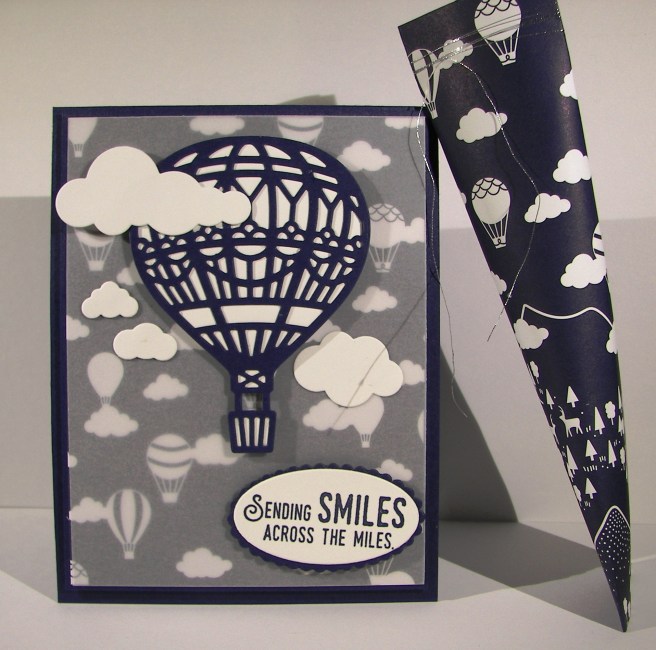
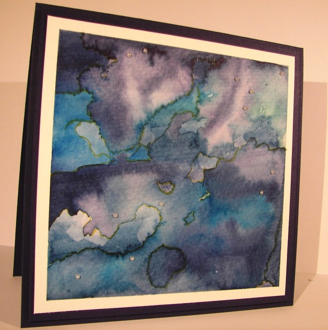
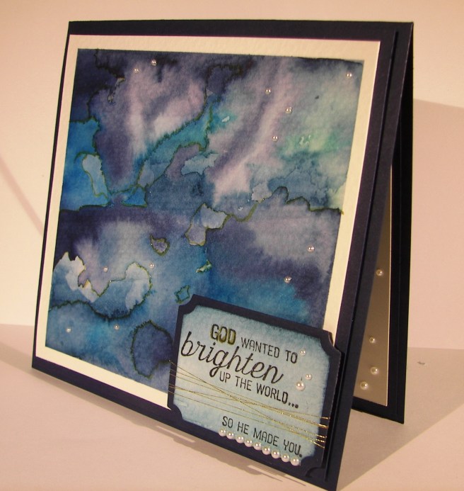
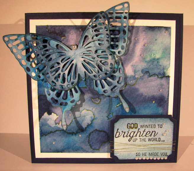
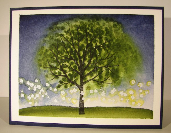
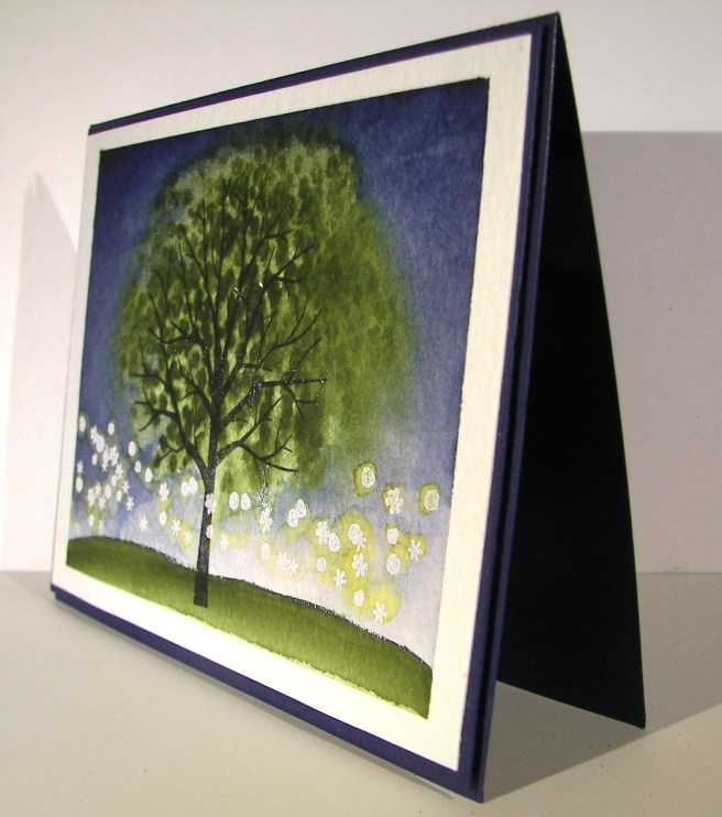
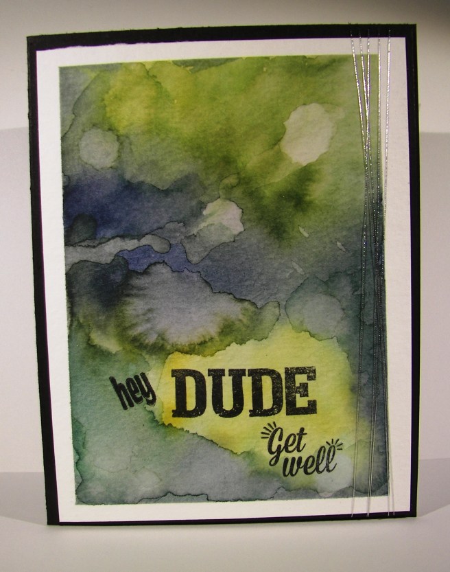
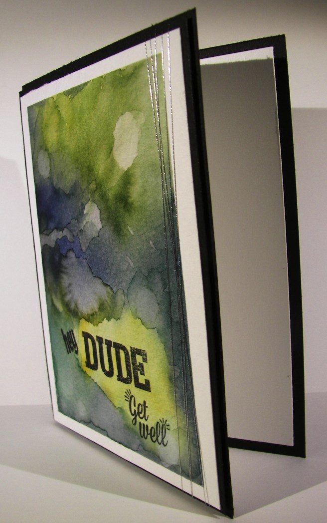
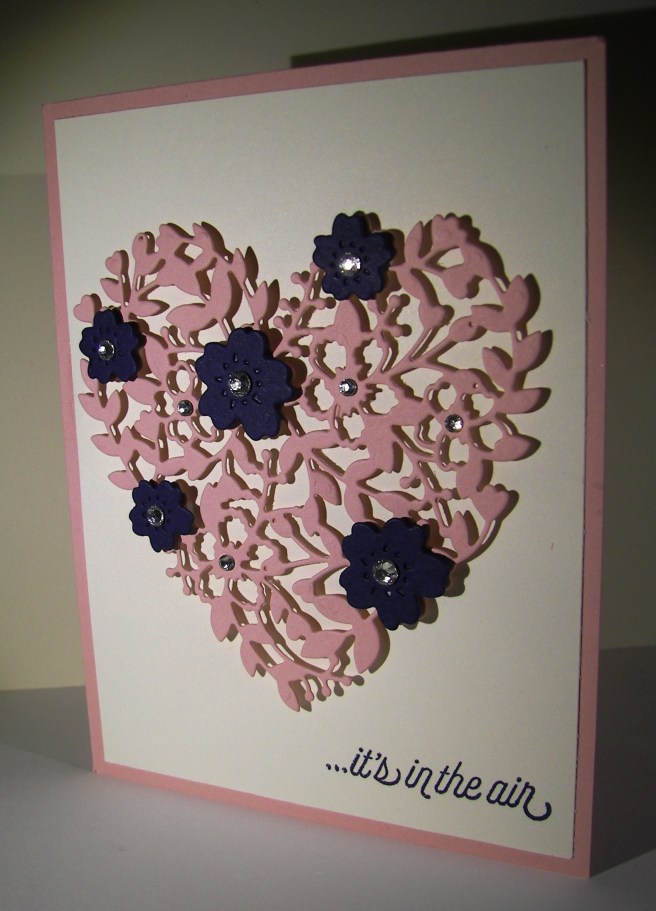
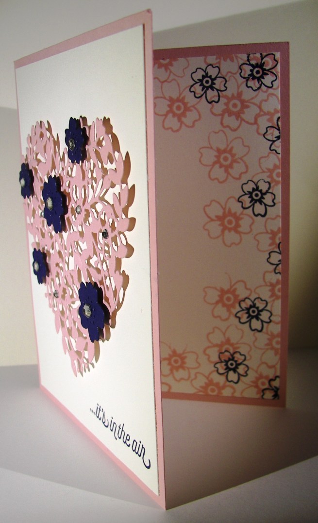
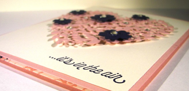
Here we go with day two of this little seven day adventure.  Use up my extra kits and make them look different.  Some parts I like better than others, but here it is just the same.

3-30

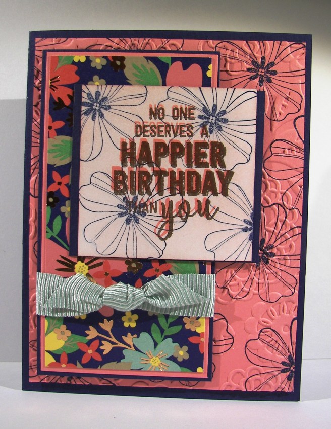
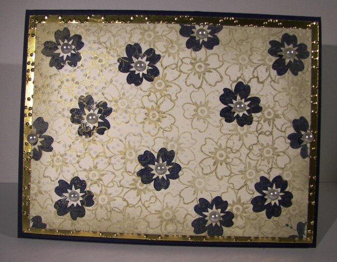
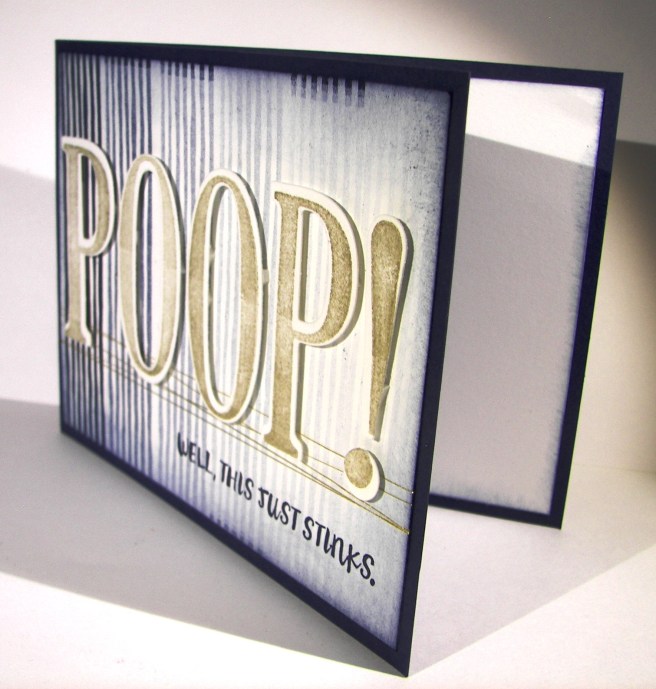
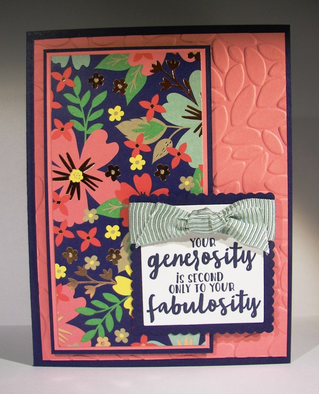
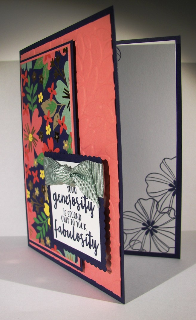
The background cardstock had some floral stamping from the flower shop stamp set and then was run through the big shot with the lovely lace embossing folder.  The patterns might not have gone the best, but I stuck with it.  When I continued the stamping on the sentiment layer I wasn’t sure again.  I thought black wording would look too similar to the night of navy so I went with flirty flamingo.  Wouldn’t you know it that one of the words got hidden in a flower. So I stamped the sentiment again offset with versamark and then sprinkled on copper embossing powder.  It coordinates nicely with the foiled pattern on the designer series paper.

3-30 (4)

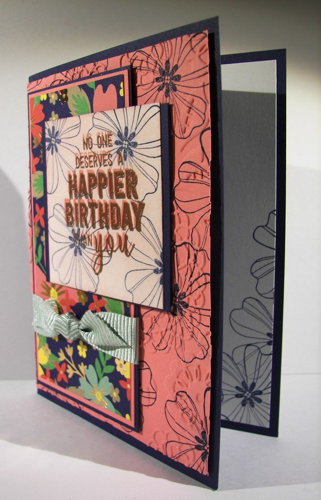
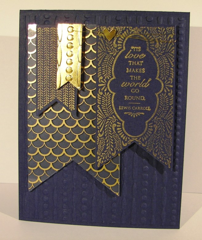
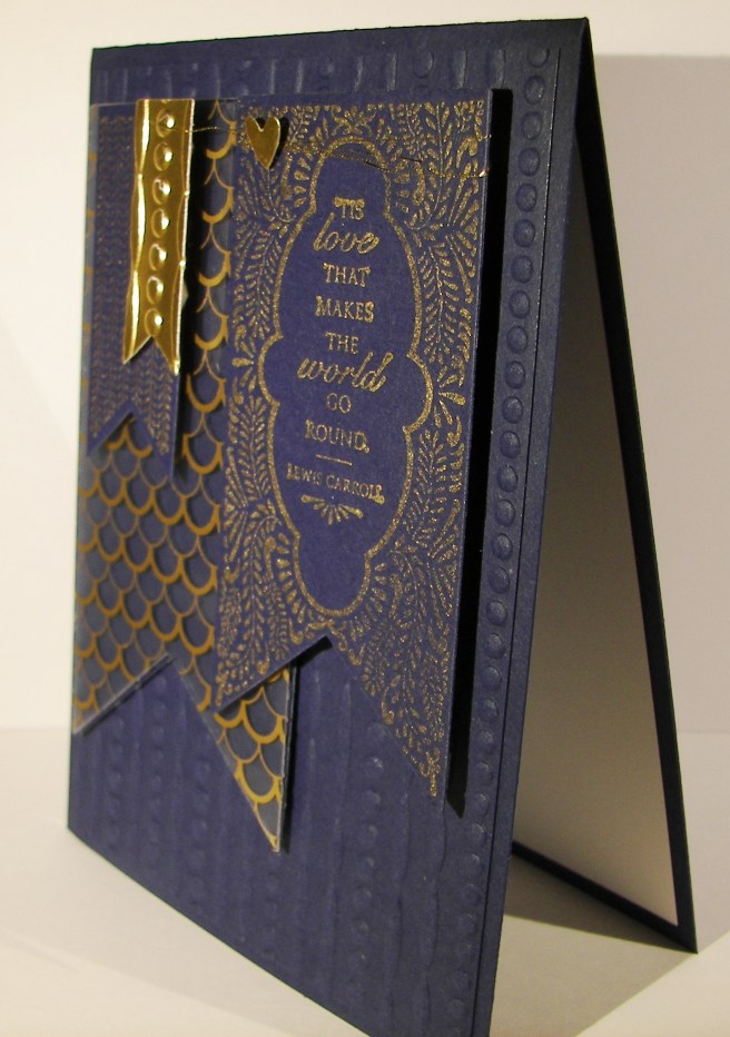
It did give it a bit of a 3-D look, but you could read it easier.  I still wasn’t sure about all of the patterns going on here.  It seems like they are fighting for attention.  I don’t think I could tell you who won, but I kept on with it anyway.  I tilted the card a bit for this photo trying to show the foiled paper and matching embossing, you get the idea I think.

3-30 (3)

Have a creative day!

Moana

Lift Me Up

Sometimes when there are too many choices it is best to keep it simple.  While this card may not look simple, it still gives that feeling with just two colors used.  The background paper comes from a set that is full of vibrant color.  I couldn’t decide, so I chose a more subdued pattern and I love it.

1-19

This little set is going to go to my sweet daughter tucked away in a frozen university town in southeast Idaho, poor little ice cube.  Paper crafting is something we share a great love of, and I know she will be over the moon for this.

The balloon was die cut from night of navy and backed in whisper white.  The balloon can actually be backed in several colors with the framlits available.  There are five sections laid in order across the back, mine being all white.  But if I had chosen, each section could have been a different color and they would match up perfectly, looking amazing.  Next time.

I wanted a bit of separation in tone, so I layered a bit of velum cardstock over the background paper to soften the color a bit.  It totally went along with the cloud kind of feel. I thought it was perfect.  My sentiment also came from the same set and was die cut with the layering oval framelits.  It may be a bit crooked, but I let it stay that way.

1-19-1

I couldn’t resist stamping more from that wonderful set.  It is full of so many wonderful images.  Two hot air balloons, four clouds, a few decorative elements and six sentiments. How great is that!  I had to sneak a little treat bag in to match.  I knew I was sending it in a box with other gifts, so I could make a simple 3-D sour cream container.  I think chocolate for sure.

Have a creative day!

Moana

Bloomin’ Night of Navy

Working through a scrap pile can turn into something quite lovely.  This gold foil was left over from a Christmas card kit from nearly three years ago if you can believe that.  It worked well with another kit also left over.  Cleaning up and making a beautiful card, sounds like a win to me.

7-29 (2)

The card front was made with coordinating stamps from the Bloomin’ Love stamp set.  The solid flower was stamped first in night of navy fairly far apart.  That is a lot of dark ink there.  Then, with the outline stamp of the same flower I went all over the place using gold ink.  I knew it would even show up over the navy flowers.  I love the look of layered stamping.

It wasn’t quite enough, so I continued with heavy sponging around the edges until I was satisfied.  The gold foil paper was put through the Big Shot using the elegant dots embossing folder.  A nice touch for sure.  Those two pieces were layered on top of another piece of night of navy and then placed on a navy card base.  The inside got a lighter version of the same treatment and I was nearly done.

I had to put a bunch of large basic pearls in the centers of the flowers, because I couldn’t leave well enough alone.  That ensured this would be a hand delivered card instead of mailed, but it was worth it.  They did have a difficult time sticking to the edge flowers that had already been inked.  But with a little first pressure they stayed put.

7-29 (1)

Have a creative day!

Moana

Beautiful Banners

Well, I certainly got distracted today.  Here it is nearly evening and I forgot I had this half way done.  Suppose I could finish it after all.  I was tempted to just skip today and save this for tomorrow, but let’s just share it.

7-20

This project was all about the foil designer acetate that came out in this years catalog.  Not until I gave in to use it did I discover it was gold foil on one side and silver foil on the other. I was pretty darn pleased if I say so myself.  I do think I will try this project again with silver, because I do think I prefer blue and silver after all.  But this certainly is lovely.

I used four different banner thinlits and two of the banner stamps.  The layering was simple, just a little patience while I sorted out the positioning.  Both the silver and gold encore inks are so beautiful stamped on dark card stock.  I do tend to prefer the look of embossing powder when it comes to metallic ink, but it did just fine.  Such a beautiful sentiment.

7-20 (1)

I started with the small banner cut in gold foil, but it was too smooth and shiny so I put it through the same embossing folder I used for the background paper.  And, it tied it together as well.

Such a lovely day of distractions, hope you had one too!

Moana

Fear Not

This was something new for me.  I knew I wanted to have water colored bookmarks, but thought it would be smarter to make one large background piece and then trim it down to the sizes I needed.  Such a large piece of blank paper.  It was a bit overwhelming for some time.  Like the stamp says, fear not.

7-17 (1)

After a while I felt a little more comfortable, but not all the way there.  Distressing such a large piece was kind of confusing.  I stuck with it, dried it and took it to the cutting board. When they were smaller I knew they would be wonderful.  The edges got a gentle sponging along with light stamping from the same set.

Then a quick layering on elegant eggplant cardstock, the main color I painted with, and some new solid bakers twine to coordinate and it was all done.  These will be wonderful to share with the young women I teach.  Love those girls.

7-17 (2)

Have a creative day!

Moana

It’s Your Birthday

Do you broadcast your birthday or not?  Well, I think birthdays should always be celebrated, even if you like it small, celebrate.  This is the kind of card that can certainly draw attention and that is totally what I had in mind.

7-1

The stamp set has the marquee image by itself and has different sentiments you can put inside the middle as well as the bottom arrow box.  It doesn’t have to be about a birthday, but that is how I chose to use it for the first time.  I kind of muddled through this project since I only knew I wanted to use embossing powder and a black card base.  Leaves a lot of steps to be followed, even if a bit off.

Most if the projects I have seen with this particular stamp set include stamping the image on different colored card stock papers, cutting the different parts out and then layering them to give a little diversity.  I wasn’t in the mood for that, so I went with my trusty water coloring.  I am not used to coloring around an image so specifically, but it all worked out pretty good in the end.

7-1 (1)

Touches of wink of stella helped make it the rest of the way, even though it is hard to see in the photo here.  Projects always look better in real life rather than photos, but what else can you do, right?

Have a creative day!

Moana

Well, This Just Stinks

I think sometimes cards can just be funny and that is more than enough.  When I read the sentiment I used I knew I didn’t care what the rest of the stamps were like, I had to have it. Good thing it is really a great set with fun and sincere sentiments.  This phrasing, especially with the intro, is kind of an inside joke.  No pun intended…tee hee…

6-28

The background stamping was pretty darn easy.  I used an element stamp from the Basket for You stamp set and just stamped my way across the card front.  I could have been a bit more careful to keep some of the edges better in line, but my desk is such a mess I just went for it.  Really, my desk hasn’t ever been this bad.  I think it will be top of my to do list tomorrow.  Summertime really gets me out of whack.  As you can tell by this very late blog.

Anyway, then the fun die cut letter had to get done.  I didn’t want those huge letters to take over my funny phrase, even though they are so large.  So, I decided to stamp them lightly in gold.  It kept them not as strong and allowed the rest to really catch your eye.  In order to keep them lined up I arranged them on the card front how I wanted them and laid a piece of painters tape across them, lifted them up, turned them over to put on dimensionals, and then placed them right where I wanted them.  It worked out pretty good.  The tape lifted some of the ink, guess I should have heat set it first.  Oh well, you can hardly notice it.

6-28 (1)

I sponged all around the edges on the front and a touch on the inside panel.  All in all, this little project really makes me laugh.  There are times when life is great and sometimes it just stinks and it is more than okay to say so.  Even better to laugh about it.

Have a creative day!

Moana

Flourishing Phrases

This particular project went through a few different phases.  This is how it started out, all about blue.  I had the ocean on my mind and gave it a try.  I had intended on using a new embossing folder after I water colored, but to be honest, I forgot once I got all this going.

6-25

After I painted with all of the blue inks I have I did some detail work using my gold wink of stella.  I focused on some of the watermarks and edges of color.  The look it creates is really awesome.  It is tricky to know when to stop because it is so much fun.  Mission accomplished here for sure.

6-25 (1)

The next step was to add a special tag.  This one got a bit out of control and went to a busy style that really isn’t my own.  However, I decided to leave it and see how it balanced out with the huge butterfly addition I had in mind.  I water colored large areas of paper to provide both my tag area as well as the butterflies.  It is much easier to paint whole sheets instead of small specific die cuts.

6-25 (2)

When this butterfly combo came along I really began to wonder just what I was up to.  I think that is because I love decorative painted backgrounds so much I rarely cover them up. They are such great all occasion cards, but I pushed forward.  I did edge the butterflies with the wink of stella, which of course you cannot see in these photos.  It is there though, and it looks so pretty.  You can see it better in the lead featured image which is much more close up.  Basic pearls, gold metallic thread with a little more patience and this project was finally finished.  It measures 5 1/2 x 5 1/2 plus the butterfly hanging off the edge.  A custom envelope will definitely be in order here.

Have a creative day!

Moana

Your Generosity and Fabulosity

This is another one of last weekends workshop projects.  A very simple but lovely card. There are so many things that I love about it, but especially how they all work together.

6-23

The layering design is all about showing off the designer series paper.  The embossing folder draws attention to it and the sentiment accents it.  In this pack of paper there are several two sided patterned pieces, but two sheets of gold foil designer series paper.  This pattern is one of the two and I love it!

I accented the sentiment with the layered square framelits and some of the awesome new mini striped ribbon.  It might have been a bit over sized, but it is what I wanted so I did it. A touch of echo stamping on the inside to tie it to the designer paper and I was good.  Another great project that will find its way to another fabulous person.

6-23 (1)

Have a creative day!

Moana

Farewell Swallowtail

I have loved this stamp for so long.  It is sad to say that it will retire at the end of this month.  However, there is a stash of stash of retired stamps that I cannot part with.  This is definitely going to join those.  Other retired ones I sell off, but ones that are just too wonderful get to stay out with the current product.  Kind of like a wise old tree.

5-25

The butterfly was stamped on a piece of masked water color paper in black stazon.  The color pallet was different, but intentional.  I picked colors that would create interesting blends with the idea that none of the original painting would  stay to true color.  A lot of blending went on here.  I painted coordinating sections first without blending.  After I added crushed curry I kept with that color and used it to begin blending the edges the color sections.  I just did that until I was happy.

The background was painted in mint macaron, darker to one side trying to create a bit of a shadow.  Distressing had to happen here and boy did it.  I flicked water, dabbed it up, and repeated that process again until I was satisfied.  Then the gold wink of stella pen went to work in a few areas.  Again, hard to see, but it is there.  Use your imagination, where would you have painted light lines of gold glitter?

5-25 (1)

Have a creative day!

Moana

Make a Wish

How about making a wish for a hard to find masculine birthday card?  Done.  I caught myself looking at a new pack of night of navy card stock that needed to be filed.  That is where I began.  I flipped through my designer series paper looking for one that had the same color in it.  Didn’t take too long.

5-11

I love the floral patterns in the english garden set, but decided to look to the ‘b sides’ of the papers.  That is where this beauty was hiding.  I had seen it when I first opened it, but was distracted into the others and forgot about it.  Today was a good day to use it.

A simple design was all I wanted today.  So I layered paper leaving just a 1/8″ border and picked a stamp that would fit inside the note tag punch.  Pretty quick and easy.  There are times when I could just sit for hours on a project, and other times I have to get up and go. Today is a go day, as I look at the clock one more time.

5-11 (1)

Have a creative day!

Moana

City By the Bay

Wouldn’t you love a view of the city like this?  Well, my view is a whole lot more country, but I would one day love to be able to enjoy one like this.  I might have to settle for occasional holiday trips, but it would still be wonderful.

4-30

I put quite a bit of planning into this project.  I had to think backwards in order to keep the layers straight.  I embossed my whisper white piece with elegant dots and used the recessed side to make my ‘wall’.  I inked up my sponge and just pounced in here and there to create this look.  I kept going until it looked more like a textured wall than a piece of embossed paper.  The edges got sponged.

The hearth and home thinlit of the window was used twice.  Once to create the hole in the wall and again to make the window frame.  I glued the white one to the tip top taupe one with tombo liquid glue and nestled it back into place with the card front.  That way it looked raised up without a lot of fuss.

The skyline was created with the calling all heroes set.  It was stamped with black stazon onto water color paper.  The texture of the paper made it look really neat.  I went to work on the water line and then moved up to the sunset.  The windows were colored in with gold wink of stella, even though you can’t tell as much, they do sparkle.  That was centered in the window and got a heavy dose of dimensionals.  I am sure I could have worked it out easier if I had thought a bit more, but sometimes a creative journey takes a few extra turns.

4-30 (1)

Have a creative day!

Moana

June Weddings and a Sheltering Tree

Planning a wedding and the receptions to follow can be an exciting time, although very stressful.  Wanting everything to be wonderful, people to be happy, and a general feeling of love in the air.  Sometimes things, or even people, get in the way.  Everyone needs someone to shelter them from stress and frustration.  That is this tree this morning.

4-19 (1)

I am fortunate enough to have a son getting married this June to an absolutely wonderful woman.  It couldn’t be more wonderful.  The way this card looks is how I am attempting to transform my yard.  There will be other things too, really awesome stuff. but this look is all around.  My brain is full of wedding ideas these days.  No escaping it.

I stamped the tree base in black stazon and the leaves in mossy meadow.  The night sky is painted with night of navy.  I also painted the grass in mossy meadow.  I stamped sparkly flowers from the same set in versamark and added white embossing powder.  I added touches of daffodil delight around the ‘flowers’ to give them a bit of a glow.  They will be sparkly lights after all, and candles a plenty.  Wheeee!  There goes the wedding brain again.

I used tombo to glue the painting on another piece of night of navy card stock that has just a 1/8th” border.  Then that combination was layered onto a card base also in night of navy with plenty of dimensionals.  I left any sentiment off as well as additional embellishments. I couldn’t decide on any, so there you have it.

4-19 (2)

Have a creative day!

Moana

Balloon Celebration

Experimenting with water coloring has become one of my new favorite things to do.  I am so young in this medium that it is a constant adventure.  I do try not to do it all of the time, but it might just be my favorite.  Hard to put that off.

3-18

I did stamp off the balloons twice before they got to the card front.  I wanted dark color, but still opaque.  It worked nicely.  The second layer stamping was done only stamped off once to make sure it was seen well.  Also a good fit.  I did go over the balloons again with the aqua painter to smooth things out.  A bit of dabbing with a paper towel helped to create better highlight spots.  Fun and fun. I am still waiting for the back-ordered balloon punch, so I had to layer the balloons with just ink.  That is why I had them opaque.  To allow the layering to show the balloons behind, just like it would with a real bouquet of balloons.  I do think this card is good for just about anyone’s birthday, masculine too.  A really great project that was satisfying on so many levels.

3-18 (1)

Have a creative day!

Moana

Hey Dude, Get Well

Making a custom card can be fun, difficult and frustrating all at the same time.  Masculine cards are an interesting creature to say the least.  It doesn’t have to be covered in metal, fire or tools to have the masculine touch you are looking for, but flowers will just not work obviously.

3-1

I used some stamps from two different Paper Pumpkin sets to give me the phrase combination I wanted.  How perfect is the word ‘Dude’.  It works equally well for both depending on the recipient, but is fantastic for a masculine theme.

I decided to create a grungy water color look instead of searching through paper, background stamps, or anything else.  That way I had control of the look and feel and could stop when it looked just right.  I spent quite a bit of time adding, sponging away, adding, drying and repeating it all.  Now I love it so much I don’t want to give it away.  It was a special request though, so it will get to be signed by a school staff and delivered this afternoon.  Good thing I have photos, because this one is going to get created again.

3-1 (1)

Have a creative day!

Moana

Picture Perfect Hummingbird

Is it possible to be defeated by a stamp set?  It was surely happening with this project.  I decided to tackle a four step stamp, yes, this innocent looking hummingbird.  I took a photo of my study series, or my path of frustration to say the least.

2-27 (1)

I am much more used to sitting down, getting out whatever I want, and having it turn out pretty darn amazing.  This was not to be the case.  However, if I was to come across 3-D glasses, I might have had more fun.  My first two attempts obviously were poor color choices.  The hummingbird I had in mind was not going to come together.

I changed to monochromatic thinking that might help.  It did some, and I improved, but was still unhappy.  Keeping this guy all lined up, even being able to see through the stamp, was proving harder than anticipated.  I switched to water color paper and played some more.  I gave it one more try, with elegant eggplant, night of navy, gold, and black stazon.

Stamp one was in elegant eggplant, stamp two in gold (the little neck), stamp three was done in night of navy, and the final stamp (which included the beak) was done in black stazon.  I got to work with my aqua painter for the background wash, in soft sky, and then added coloring to the bird.  It got out of control fairly quick and I thought I was done for sure.  I was being so careful, so I thought.  I ended up putting a thick layer of paper towels over the image to seep up the crazy color mess.  When I peeled it away I got a little hope, it didn’t look so impossible.

When I had finished I fell in love with it.  I am not sure if I could duplicate it, because of all of the water color layering effects, but I won’t be scared to try.  It is such a pretty image and I love it in water color.  Especially with the gold ink and the wink of stella added in.

2-27 (2)

Have a creative day!

Moana

Flowering Flourishes

I think this will wrap up my adventures with this particular bridal shower invitation sample set.  I think I just might like this one the best.  I like the layers and different inks used with the added layer of embossing.

1-28 (1)

New stamps come out all of the time, but sometimes it is nice to go back to your favorites.  This set, Flowering Flourishes, is definitely one of my go to sets.  The detail is just beautiful and they layer so nicely together.  The simple elegance of it is so striking.  Just a one layer card today, even though the stamping has a bit of extra to it.  I did add a little extra sparkle here and there, sparkle is a must for this soon to be bride.

1-28 (3)

Have a creative day!

Moana

Hooray! for Perfect Pairings

I could probably keep making samples for these bridal shower invitation choices.  Where do you draw the line?  Is three enough?  How about five?  Perhaps four is just right…

1-27

Even though this is still floral, it is has a much stronger navy blue influence.  With the soft seam binding ribbon, the navy doesn’t seem too overpowering.  Not too complicated a card here.  There are 1/8″ simple borders layered with a decorated front.  I started with the navy flower background stamping and then included the pink centers.  How fun is it to have just the colors you want.  The beauty of stamping.

1-27 (2)

Have a creative day!

Moana

Rose Wonder

This was a fun project for sure.  As you have heard me say so much recently, I do love to water color with my stamping.  I wasn’t sure if these two colors would come together in an attractive mix, but they did well.  Having the touches of navy with the blush as a primary is really enjoyable.

1-26

I think I might be making the decisions a bit tricky for these bridal shower invitation choices.  I am not sure which one I like better between the two, guess I will have to come up with another one just for good measure.  I can’t spend too much time playing though, I have workshop coming this weekend.  It is fun to play though.

I stamped this huge wonderful rose on water color paper with stazon ink.  I didn’t goof it up too much, so I went with my first attempt.  I did a trial run with the colors on a scrap of water color paper just to check it out and I liked it.  So, I wet down my stamped image and got to work.  I spent a bit of time trying to be cautious, then I just went for it.  That is why I love to water color, it is pretty darn forgiving.  I even used my trial scrap as a background punch, cool right?  I do try not to waste.

1-26 (1)

Have a creative day!

Moana

Bloomin’ Love

I do enjoy making something special by request.  It isn’t always easy to start, but once you do, the ideas just begin flowing.  This is my first go at a bridal shower invite.

1-25

The brides colors are a blush pink and navy blue.  My blue looks a bit royal purple here, but it is a deep navy.  How about this lovely framelit die cut?  I thought I might go a bit bonkers trying to get it all detailed out, but I managed.  I am not always the most patient one, but this die requires it.  I had to put it through the big shot back and forth several times to get all of the cuts done.  It was worth the fussing though.  The detail is amazing.

1-25 (1)

I might have gotten a bit carried away on the inside stamping.  I was chatting while I stamped and before I knew it, it had gotten pretty busy.  If this one ends up being the choice, we might have to print the details on velum to be an overlay.  That would be pretty though too.  Love is definitely in the air.

1-25 (2)

Have a creative day!

Moana