Marriage is a Journey

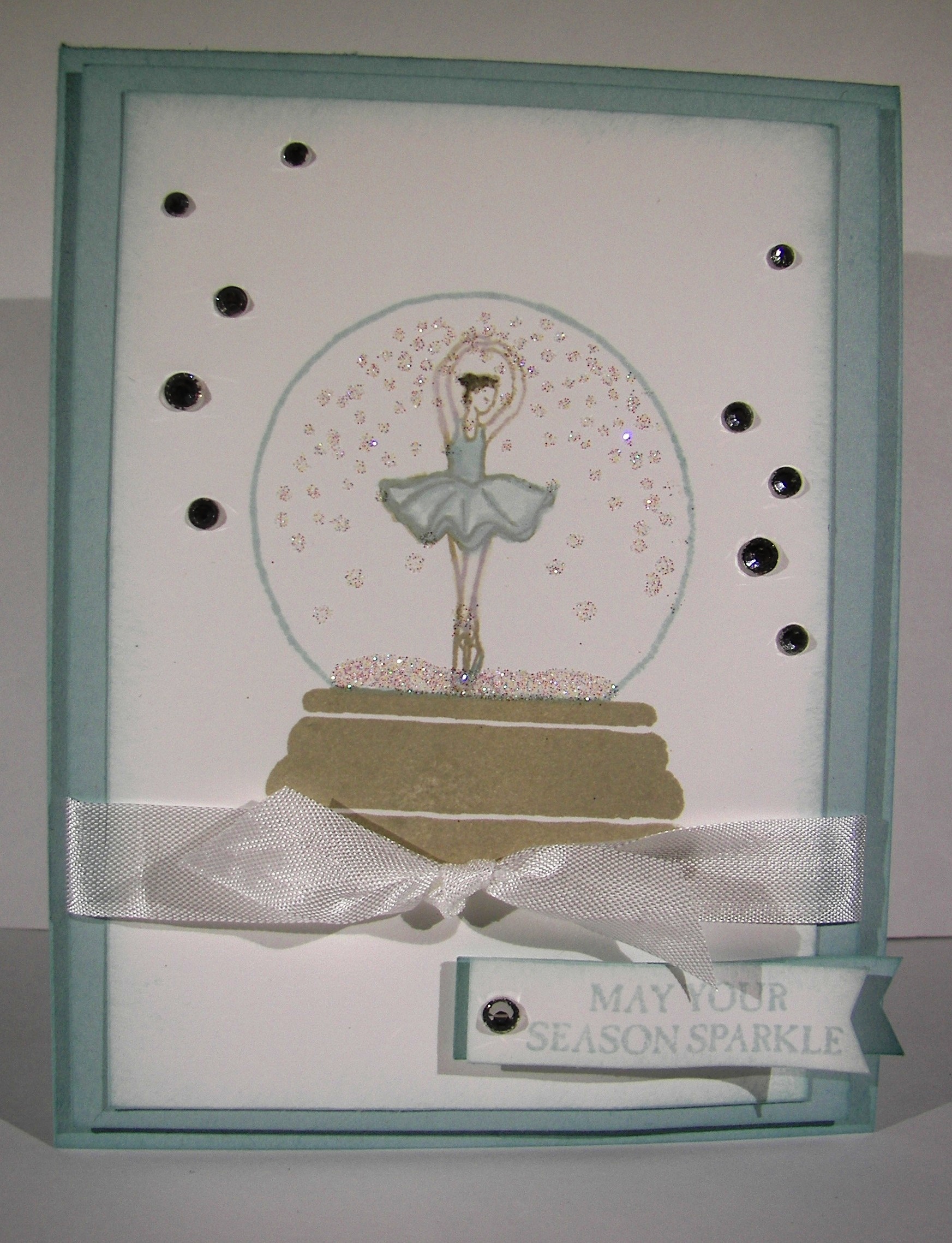
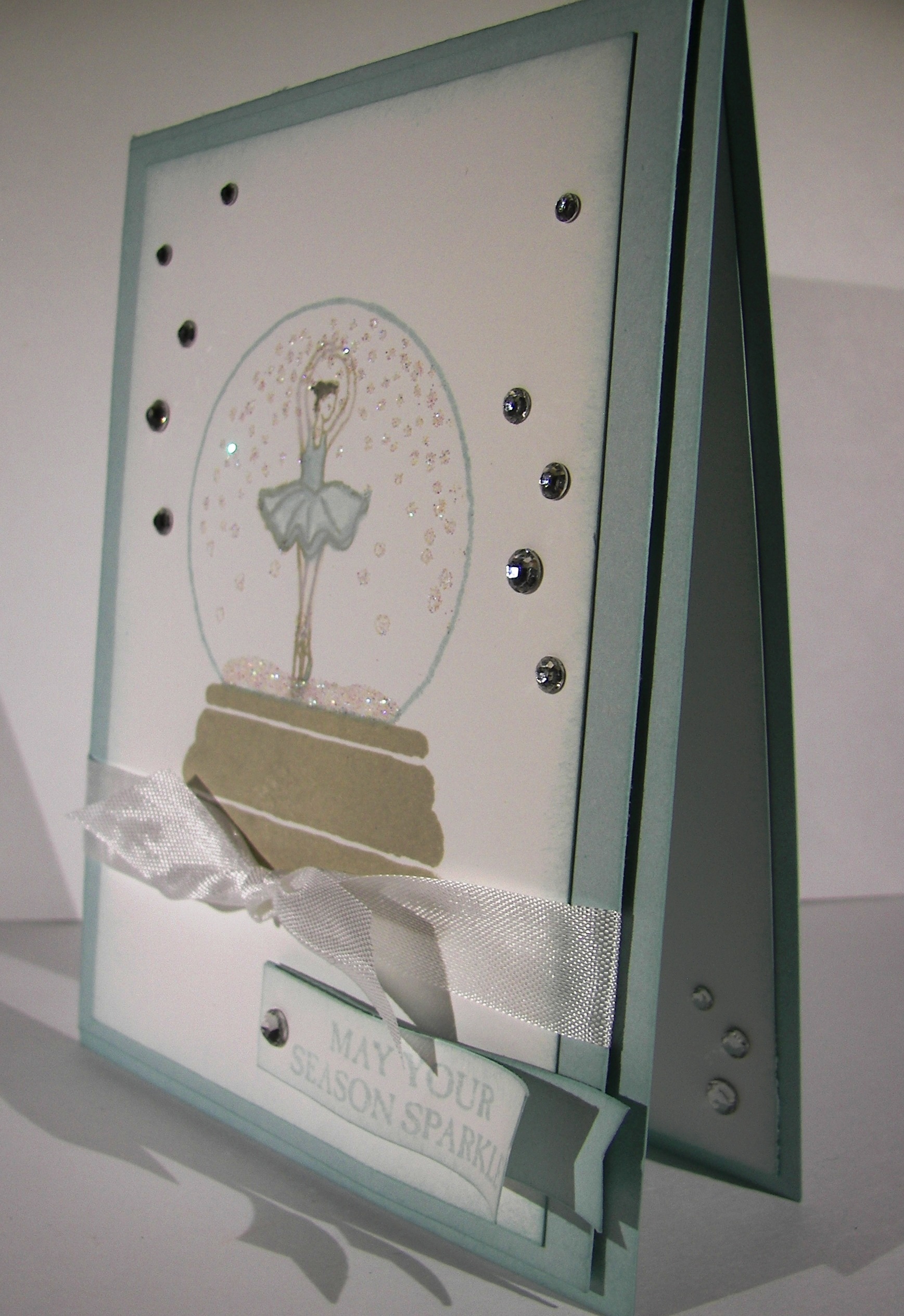
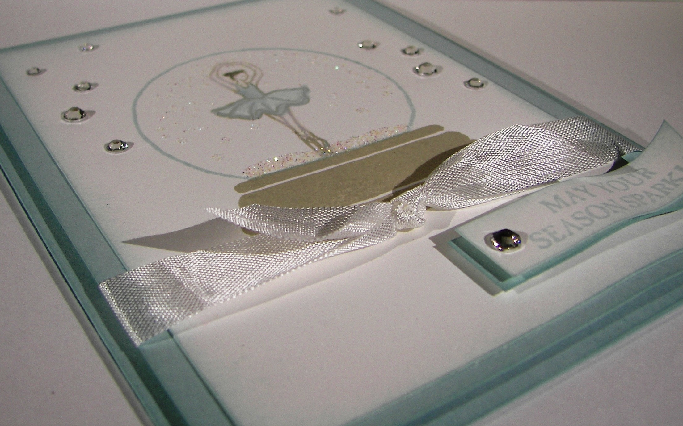
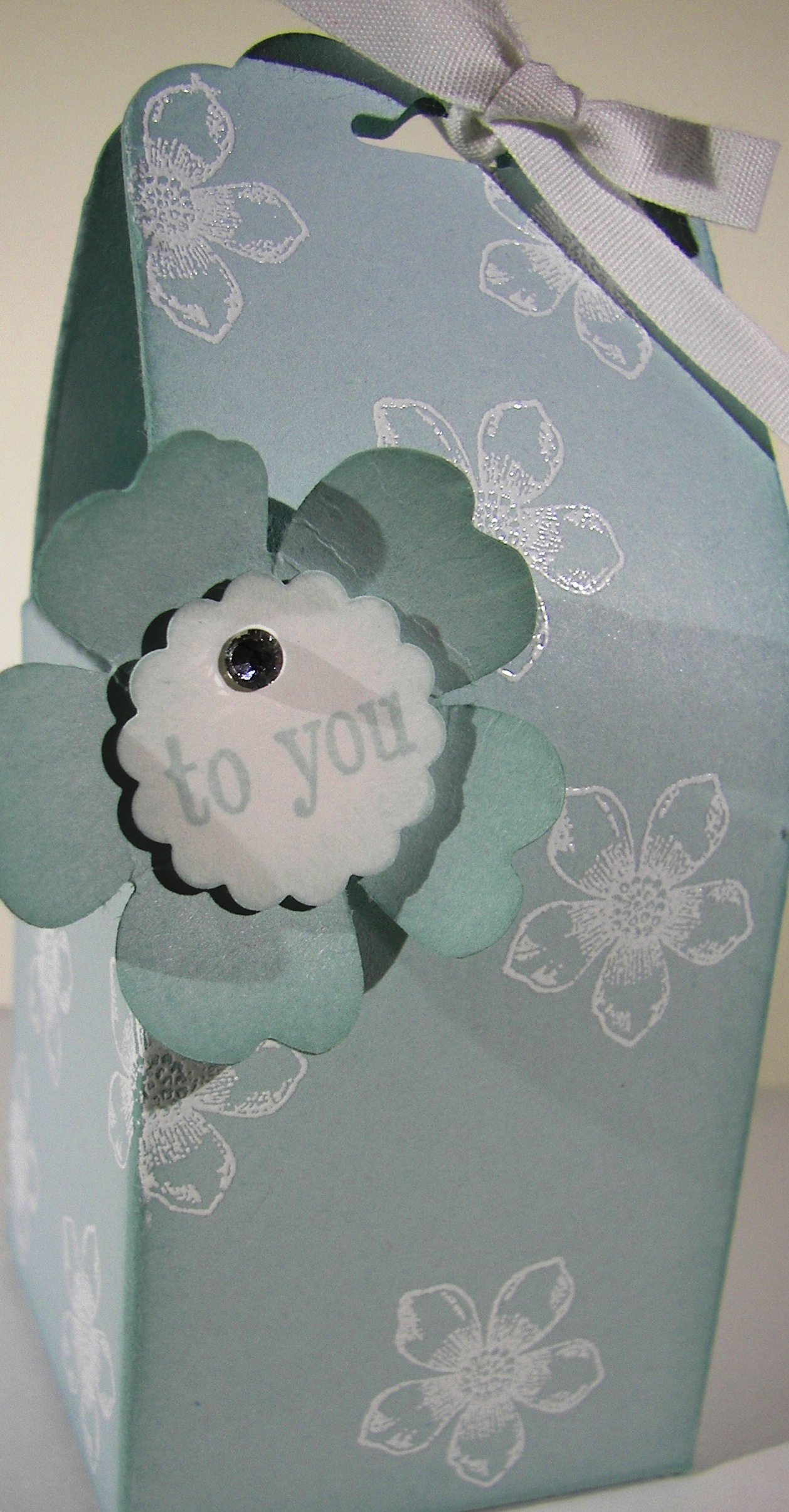
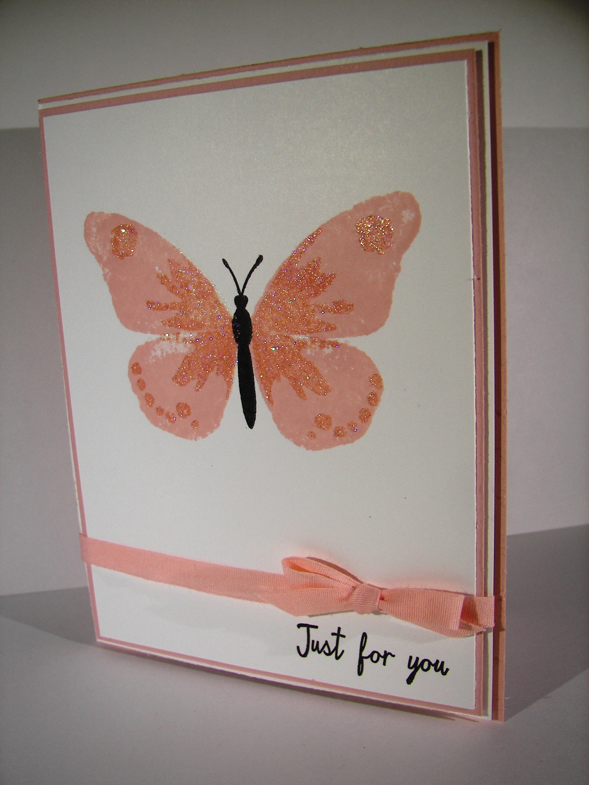
Time for something wonderful, like a wedding.  A white on white card with this much sparkle says wedding like nothing else.  It almost feels like a wedding gown.  So lovely.

7-16

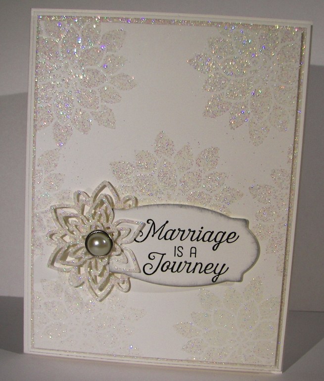
The entire card was made from one sheet of heavy weight card stock, plus a piece of dazzeling diamond glimmer paper.  That stuff is so fantastic to work with, but I am a bit stingy sometimes.  This time, I put it to really good use.

The layers were simple, with just a 1/8″ border added along to each one.  I used the center of the glimmer paper to die cut the floral images I used to decorate the front and the inside. Since it was covered by the other layers, you can’t even see the holes.  Great use of paper.  I also stamped and die cut my sentiment from another layer of the white card stock that was covered as well.  Even with a card this glamorous you can still be practical.

I stamped the card front with versa mark ink, sprinkled with heat n stick powder and heated until it was ready to receive something more.  It was actually pretty by itself, but I did cover the freshly sticky flowers with iridescent ice powder and then heated again.  You can see how beautiful it looks.  Capturing sparkle on camera can be tricky, but not with this technique.  It is that much more in person, really beautiful.

7-16 (1)

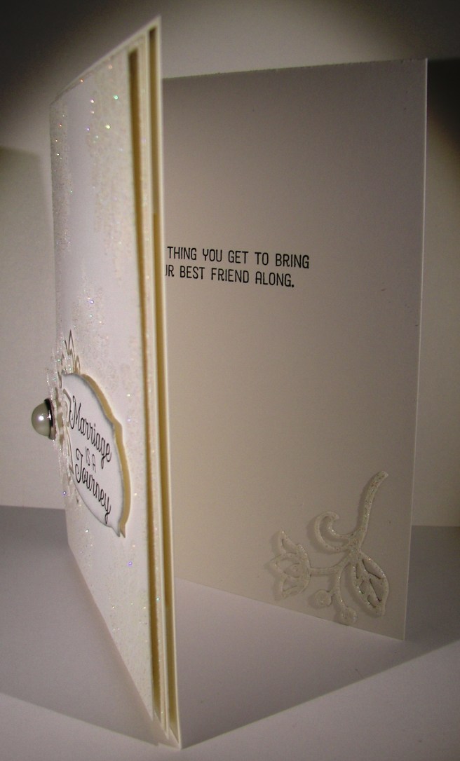
Isn’t this sentiment set just so adorable for a wedding card?  I am looking forward to my 26th anniversary next month with my best friend, just fantastic!

Have a creative day!

Moana

Layering Love

Summer is here and it seems like love is everywhere.  How fun is that!  I wanted to capture some of that carefree spirit that summer can bring and had a fun time giving it a try.

6-16

I must admit, I have been enjoying my water coloring quite a bit, but it is still my favorite medium right now.  I thought I might use a die cut on this image and layer it, but I forgot about that until I started typing.  I was wondering why I left the image off center like that.  I then remembered my original plan.  Well, I am okay with how it turned out.

It began with stamping the sentiment in versamark ink and then embossing with white embossing powder.  The next step was to create some kind of heart over and around the words.  When that was done I stared at it for a while trying to decide on a background color. My oldest daughter suggested tempting turquoise since it felt like summer.  That went with my plans, so I went for it.  I kept the color the strongest in the corners and painted towards the heart.  I was trying to create a lighter area around the heart to make it look like it was floating a bit.  That worked pretty good.  Wish I could make a more balanced heart, guess that is why I love die cuts and punches so much.  They correct my work some…

In the end I was happy with the result.  I went ahead and did a touch of blending along the edge of the heart and the blue background.  This provided a bit of a border and gave some cool layering effects.  I went back around the lettering with a wink of stella brush which gave a bit of shadow, but also made the image appear almost blurred.  Interesting, but I still went with it.  I left it a single layer on the card base of watermelon wonder and there you go.

6-16 (1)

Have a creative day!

Moana

Awesomely Artistic with Watermelon Wonder

The weekends seem to get busier all of the time.  I guess that is what happens when you have a child getting married soon.  Errands and then some.  I wouldn’t have it any other way though.  I enjoyed some relaxing time yesterday afternoon finishing this gift set I actually started Friday night.  Talk about being busy.

5-9 (4)

With my love of water color, you would have thought the card came first.  Not this time.  I started with this awesome designer series paper and made an adorable gift bag.  You would think I had tons of gifts to give all of the time with the amount of bags I make, not true though.  I just love to make them.  I do share them with others though, usually as a gift to use for others.  They all find happy homes, I promise.

5-9 (2)

I did try something new with the card though.  The dragonflies were stamped in versamark on the water color paper, not new there.  I used iridescent ice on them, also not new. However, using them together as a resist for water coloring is new.  As color was applied the resist was pretty neat, not as clean as embossing powder, but still holding up.  I decided to add silver ink as well and then it changed even more.  The silver ink clung to the images more than the watermelon wonder ink did.  The look is fantastic, don’t you think? I added a little bit of silver metallic thread and five clear sequins to finish off the look.  Just divine.

5-9 (1)

Have a creative day!

Moana

June Weddings and a Sheltering Tree

Planning a wedding and the receptions to follow can be an exciting time, although very stressful.  Wanting everything to be wonderful, people to be happy, and a general feeling of love in the air.  Sometimes things, or even people, get in the way.  Everyone needs someone to shelter them from stress and frustration.  That is this tree this morning.

4-19 (1)

I am fortunate enough to have a son getting married this June to an absolutely wonderful woman.  It couldn’t be more wonderful.  The way this card looks is how I am attempting to transform my yard.  There will be other things too, really awesome stuff. but this look is all around.  My brain is full of wedding ideas these days.  No escaping it.

I stamped the tree base in black stazon and the leaves in mossy meadow.  The night sky is painted with night of navy.  I also painted the grass in mossy meadow.  I stamped sparkly flowers from the same set in versamark and added white embossing powder.  I added touches of daffodil delight around the ‘flowers’ to give them a bit of a glow.  They will be sparkly lights after all, and candles a plenty.  Wheeee!  There goes the wedding brain again.

I used tombo to glue the painting on another piece of night of navy card stock that has just a 1/8th” border.  Then that combination was layered onto a card base also in night of navy with plenty of dimensionals.  I left any sentiment off as well as additional embellishments. I couldn’t decide on any, so there you have it.

4-19 (2)

Have a creative day!

Moana

Floral Tone on Tone

Pretty, pretty, and just so pretty.  That is what comes to mind here.  My husband thought it looked a little tropical with the white outline, I am really loving this card.  While driving back from an ice cream run last night the idea came to me.  There is no inspiration connection here, just a great idea.

4-14

The image was stamped in versa mark ink on watermelon wonder cardstock instead of white or water color paper.  Different for me, but it worked out well.  I embossed with white embossing powder and water colored in the flowers.  Pretty easy and such a nice effect.  I layered it in white to bring out the outline and wrapped it in some of the most beautiful ribbon I have.  Yummy!

4-14 (1)

Have a creative day!

Moana

Flowering Flourishes

I think this will wrap up my adventures with this particular bridal shower invitation sample set.  I think I just might like this one the best.  I like the layers and different inks used with the added layer of embossing.

1-28 (1)

New stamps come out all of the time, but sometimes it is nice to go back to your favorites.  This set, Flowering Flourishes, is definitely one of my go to sets.  The detail is just beautiful and they layer so nicely together.  The simple elegance of it is so striking.  Just a one layer card today, even though the stamping has a bit of extra to it.  I did add a little extra sparkle here and there, sparkle is a must for this soon to be bride.

1-28 (3)

Have a creative day!

Moana

Sparkly Seasons Ballerina

Doesn’t everyone get enchanted with a pretty snow globe?  This particular stamp set has a few options to make one happen, but this pretty ballerina might be my favorite.  She is so delicate and lovely.

Sparkly Seasons Ballerina

The base is stamped in sahara sand and the globe is in soft sky.  That is also the card base and background color. I stamped her in sahara sand as well to give a hint of skin color without having to make it happen.  I did water color her tutu and slippers though, couldn’t resist that.  Her hair just had a touch of marker coloring.

Sparkly Seasons Ballerina

I stamped the ‘sparkle’ inside the globe with versa mark ink and then covered it with dazzling diamonds.  Loved it.  But I needed more.  So I used the 2-way glue pen to color a layer around the bottom of the globe and used more dazzling diamonds.  I liked that a lot better.  Of course I had to put a bunch of rhinestones around as well.  Sparkle means sparkle.  I even put a few inside.

Sparkly Seasons Ballerina

Have a creative day!

Moana

Sparkly Seasons Pumpkin Patch

It may not look very busy, but these little pumpkins almost did me in.  I nearly got to the point of just showing you how frustrated I was and that there was not much to show for it.  Then I thought about iridescent ice, and the world came together.

Sparkly Seasons Pumpkin Patch

I love that stuff.  It can make the most simple things look almost magical.  I used three different framelits for my pumpkins and got to work.  I used a large stylus to create grooves and texture to the surface, but from the back side.  It really broke down the fibers a lot.  Then I began to water color streaks to give dimension.  That didn’t do a whole lot.  Then I spritzed water and swiped ink on with my finger.  It got better.  Then I sponged with pumpkin pie and added early espresso too.  At that point they looked okay, but still kind of sad.

Sparkly Seasons Pumpkin Patch

That is when I tried the iridescent ice.  I daubed the whole surface with versamark and sprinkled on the powder.  I only used one coating and thought that would be enough.  It was just right.  I did sponge a bit more with early espresso afterwards.  I layered the pumpkins together using dimensionals, with the stems too, and wrapped them all in linen thread.  I wanted to leave it then, but decided on a simple word phrase.  And there you go!

Sparkly Seasons Pumpkin Patch

Have a creative day!

Moana

Believe Bookmark with Lighthearted Leaves

Welcome to my Sunday morning.  When I have the opportunity to teach a church lesson I always feel blessed.  Teaching often gives more to the teacher than to the student.  Maybe not at a school setting, but church, for sure.

Believe Bookmark with Lighthearted Leaves

I do my best thinking while I am crafting, so I almost always have some kind of handout that relates to the lesson.  It also allows me to think of who I am teaching individually, and to make sure I am taking into consideration who they are and how they feel.  Such a wonderful time.

Believe Bookmark with Lighthearted Leaves

I definitely dipped into my retired product stash for these bookmarks.  The cardstock and ink are hello honey, current, but the other color is summer starfruit.  What a great color to work with.  I thought they went well together, so I got to use some of my retired dsp stash and retired ribbon too!  Win for all.  I think people often overlook the fact that it is okay to stamp on patterned paper, as long as the pattern is small.  That was the case for this pattern for sure.  It came together so quickly.  Once the design was clear  in my mind, about five minutes, another thirty-five and I was all done.  Yup, I churned out a dozen of these in less than an hour.  Again, a win for all.

Believe Bookmark with Lighthearted Leaves

Have a creative day!

Moana

Moonrise Wonderland

This is the kind of thing I get to see all of the time.  The moon isn’t quite that large of course, but you get the idea.  I absolutely love it when you can see so much detail in nature.

10-29

I started with the moon.  The punched image and the negative sheet were both used.  The moon was sponged inside the mask with So Saffron and detailed some with Delightful Dijon.  The beautiful trees from Wonderland were stamped in versamark ink, after a hefty rubbing with the embossing buddy, and then covered in black embossing powder.  I had to be patient with the heat gun to get all of that powder melted, but it is so lovely.

10-29 (1)

I only used a few colors to create the background.  An aqua painter was  used along the bottom with Mossy Meadow to give me a bit of a hill and the ground.  Then Elegant Eggplant and Night of Navy were used to sponge in the sky.  I used the punched circle to mask the moon and it worked so nice.  Instead of using masking paper which is thin, I just used cardstock.  The ink has a hard time getting right up the to edge of the image and gives it a bit of a halo effect.  If yo don’t like it that way and want more exact detail, use something thinner.  This made me very happy.

It was layered up once on another piece of Elegant Eggplant cardstock and given a bit of height with dimensionals all the way around.  The inside cardstock was sponged lightly with more Elegant Eggplant just to tie it together a bit more.  All done!

10-29 (2)

Have a creative day!

Moana

Dazzling Diamonds Dragonfly

I liked the randomness of picking one single stamp and designing a project around it.  Today was just the beautiful dragonfly from the Awesomely Artistic stamp set.  My favorite image honestly.  I wish I had more.

Dazzling Diamonds Dragonfly

The new DSP pack patterns sure are awesome.  I had a hard time deciding which side to use.  I usually enjoy the patterns, but can see myself making gift sets with all of the different papers here.  Total coordination really makes me very happy, even within a gift set.

Dazzling Diamonds Dragonfly

It isn’t always easy to get decent photos of my work.  The ladies in my club often tell me how much better they look in person.  Isn’t that true of so many things though?  But the dazzling diamond dragonfly here needed to be angled a bit for you to really see it.  I wasn’t sure how happy I would be with it on whisper white, but I love it!

Dazzling Diamonds Dragonfly

Have a creative day!

Moana


Bombs Away Birthday!

Well, I must admit, I think Call of Duty visited my craft table this morning.  My plan began differently, honestly.  But then things got a little interesting.

Bombs Away Birthday!

I started out with the fun birthday bomb stamp and made background paper.  I knew I wanted to add my husbands name, but wasn’t sure on the color.  Since the black is so strong, I knew I needed to heat emboss the lettering.

Bombs Away Birthday!

Of course all of my colors are not quite masculine, and I wanted bright color.  I guess I could have done silver, but too late for that.  I had a couple of tiny spots that didn’t get powder to stick, so I thought I would just sponge a little ink here and there to fill them in.

Bombs Away Birthday!

I went out of the lettering a bit on the second B, so I gave in and sponged away. Then I giggled as I imagined how much cherry cobbler looked like dried blood, especially next to a bunch of bombs.  Maybe this is a bit tacky or even offensive, but my husband will get a kick out of it, and it is totally for him.  Happy Birthday my love!

Have a creative day!

Moana

Floral Gift Box

When my daughter came home this week for her university break she brought this little birdhouse box with her.  My mother had given it to her to deliver to me to try and create a version of it.

Floral Gift Box

I don’t have a diecut that would do this, so I had to think it out a little bit.  Although I had several frustrations, I ended up with something cute.

Floral Gift Box

I started out with a piece of paper 7″ x 8.5″.  I scored along the 8.5″ side at 2, 4, 6, and 8″ leaving an edge of a half inch.  I turned it one quarter around and scored it at 2″.  This became the bottom.  Along the top, with the long scores going up, I proceeded to cut with my trimmer, not scissors.  I cut along the score lines down to 2.5″ on all score lines.  This gave the top flaps.  Two of them were punched with the scallop tag topper and the other two were trimmed down a bit.  My design became a bit flawed and I had to improvise a bit.

Floral Gift Box

I stamped the paper with versamark ink and applied white embossing powder to give me the cute little flowers you see.  They turned out so pretty.  The rest of the box assembly was pretty basic.  I know I don’t give a lot of detail, I get impatient.  I am working on it.

Have a creative day.

Moana

No Bones About It

No, I don’t have little children, and yes, I did have to have this set.  I actually pegged it for a favorite when the new catalog first came out.  It really isn’t the speed of my card group I teach, but I wanted it for myself.  How cute is it?

No Bones About It

There are four different dinosaurs in the set, all with matching skeletons, some fossil plant looking stamps, some splats and these awesome footprints.  As well as a few super cool sentiments to go along.

No Bones About It

This card was done in mossy meadow and whisper white with no frills.  I embossed the base with the chevron folder and made my layered tag from the tags & labels framelits set.  Plenty of dimensionals for everyone and there you go.  I did accent it a bit with some linen thread using the 1/16″ hand held punch for the knot to show through.

No Bones About It


I am going to really enjoy this set a lot, and I mean a lot.

Have a creative day!

Moana

Timeless Elegance

Jumping in with both feet here everyone.  I managed to once again open a new pack of DSP, that I am so in love with, take out my favorite pattern and make something without guilt.  Isn’t this paper just so beautiful?

Timeless Elegance

I feel like I got into my daughters sketch book and took out drawings for a card front.  Almost a dreamy feel.   The whole pack of paper is so pretty.  One side has a hand drawn feel and the other sides are more patterned and organized.  Best of both worlds.  I also like that it isn’t just black and vanilla, but includes sahara sand for that perfect balance.  I will be buying more of this I can tell.

Timeless Elegance

To give a touch of color, even though it didn’t need it, I got out my blackberry bliss sponge dauber and did some ever so exact swirling.  It took just a few seconds to swirl around and bring in some color.  Good stuff.

Timeless Elegance

I tried to use a ribbon or something else to accessorize it, but kept pulling it off.  The paper spoke for itself on this project.  I couldn’t even do a layered tag for the sentiment.  So I used my versamark and embossing powder to put the sentiment right on the paper.   I even left the inside clean to keep the focus all on this paper.

Have a creative day!

Moana

Just For You

Sometimes I feel like there are one too many butterflies flying around my craft area.  But then I remember, you can never have too many butterflies!  Especially when Stampin’Up! keeps coming out with even more exciting stamps to use.  This set is just one of those types.  I could just put these everywhere.

Just For You

The color scheme is very simple, blushing bride and whisper white with tiny 1/8″ boarders.  I do love those.  Only one butterfly on this card front.  The base image is done in blushing bride.  The next layer, the detailed image, was stamped in versamark ink.  That alone looked wonderful with the darker tone.  A quick sprinkle of iridescent ice went over the versamark while it was still sticky and took a trip to the heat gun to melt it in place.

Just For You

I tried to angle the photo to show you the almost purple glimmer that comes from the powder.  You can kind of see it.  Absolutely lovely stuff.  The body and antennae are separate stamps that make the body.  And yes, this is a photopolymer set.  You just have to see through these stamps to get images just where you want them.

A quick sentiment from the same set and a tiny cotton ribbon bow, and it was done.  I did stamp a few dots on the inside panel, of course.

Have a creative day!

Moana