Artistically Asian

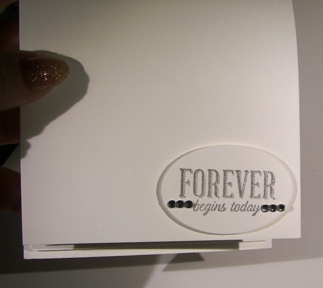
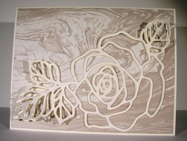
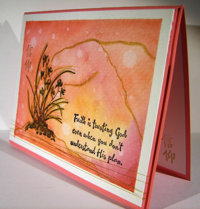
New stamps, new stamps, new stamps!  I love having new stamps!  This particular one caught my eye right away on my first browse through this seasons catalog.  I could easily get lost exploring the possibilities, there are so many.

6-17

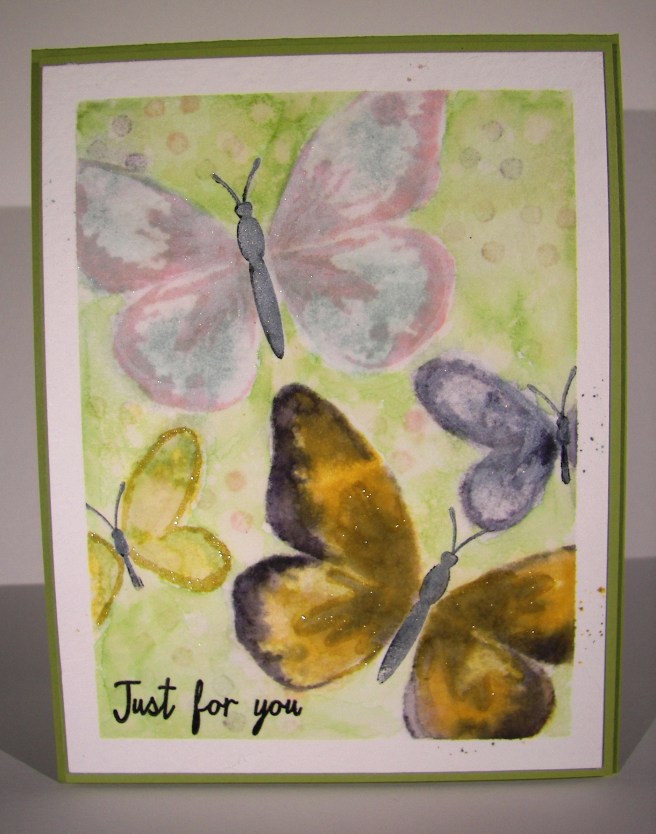
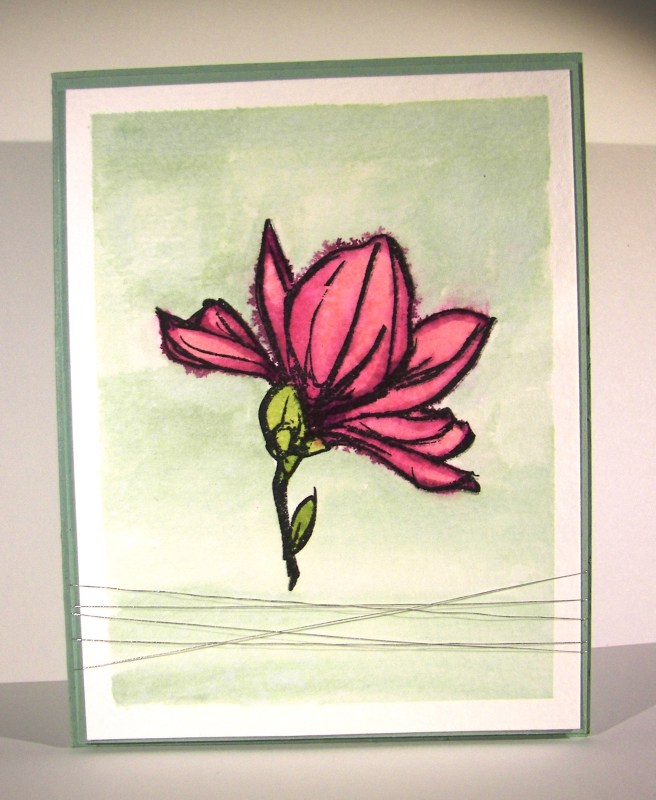
But, I am totally in the mood for water coloring, so what else would I turn to just now?  I thought some of the new in-colors combined with gold would compliment the Asian feel of the stamp set.  And, I absolutely agree with myself.  Good thing too…

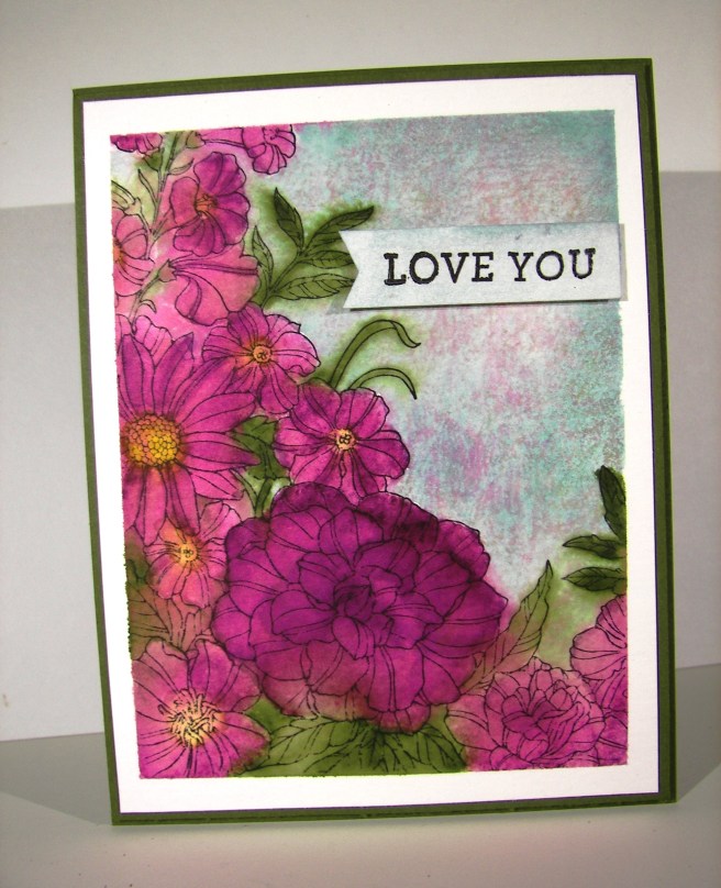
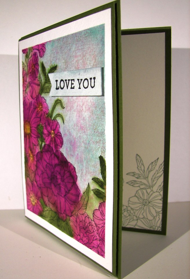
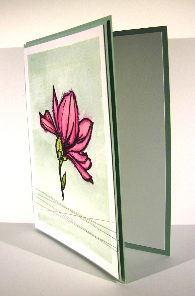
Flirty flamingo is the card base and the main color I painted with.  These colors go so very well together.  I used a lot of water and kept the color light building the intensity but not overdoing it.  Experimenting with this kind of painting is really something you just need to sit down and do it.  I have learned some things that work better for me, and of course there are tons of very talented people online that generously share their techniques to learn from.

I did stamp over the floral image again with both flirty flamingo and gold encore ink.  I wasn’t looking for a particular effect, just more of the image itself.  Then I hit it pretty hard with the gold wink of stella brush pen.  I accented the image quite a bit then followed along some of the water mark lines.  They ended up giving me a bit of a mound for the plant to rest on and maybe an interesting mountain or two in the background?  That wasn’t the intention, but I keep seeing that when I look at it.  Judge for yourself.

6-17 (1)

Have a creative day!

Moana

I Do…

This is one huge, and most wonderful wedding card.  I think it is to the grandest scale I have done so far.  Must be because we are only a week away from our sons big day!  I think that I just might use this one for myself. I will have to think long and hard about what to write…

5-27

This card measures 11 1/4 x 3 3/4″, how about that!  I used a sheet of 12 x 12 to put this one together.  The front is layered with a large piece of dazzling diamond glimmer paper with a special water color panel for the card front.  The lettering was done with the Larger Than Life Alphabet & Number stamp set.  It is, sad to say, retiring.  Along with this beautiful Lost Lagoon color.

I spent quite a bit of time moving ink along this piece.  Painting, distressing, drying, and then repeating all of that until I liked what I saw.  The stamping was simple.  The first layer was done with lost lagoon and then again with silver encore ink.  The result gave a shadow look, but it is still two dimensional and flat as can be.  The flowers aren’t of course, and I love the look.  Kind of like blossoms traveling in the wind.  It will be interesting to try and create an envelope for this one, maybe it is too beautiful to put it in one. Hmmm….

5-27 (1)

Have a creative day!

Moana

Farewell Swallowtail

I have loved this stamp for so long.  It is sad to say that it will retire at the end of this month.  However, there is a stash of stash of retired stamps that I cannot part with.  This is definitely going to join those.  Other retired ones I sell off, but ones that are just too wonderful get to stay out with the current product.  Kind of like a wise old tree.

5-25

The butterfly was stamped on a piece of masked water color paper in black stazon.  The color pallet was different, but intentional.  I picked colors that would create interesting blends with the idea that none of the original painting would  stay to true color.  A lot of blending went on here.  I painted coordinating sections first without blending.  After I added crushed curry I kept with that color and used it to begin blending the edges the color sections.  I just did that until I was happy.

The background was painted in mint macaron, darker to one side trying to create a bit of a shadow.  Distressing had to happen here and boy did it.  I flicked water, dabbed it up, and repeated that process again until I was satisfied.  Then the gold wink of stella pen went to work in a few areas.  Again, hard to see, but it is there.  Use your imagination, where would you have painted light lines of gold glitter?

5-25 (1)

Have a creative day!

Moana

Happy Mother’s Day All Around

This to me is the ultimate way to celebrate Mother’s Day, when your children are doing wonderful things.  Like getting married to an amazing woman.  Our family is more than excited for the big day, just under one month now!

5-6

They didn’t want hand made invitations, and I have to say I was relieved.  I would have of course, but what a bunch of work!  I did decide to make a Mother’s Day card for my own mother though.  She loves to take my cards and place them around her house like little pieces of art.  This one is going to stay out for a long time. How fun.

5-6 (1)

Have a creative day!

Moana

Corner Garden Bliss

As another catalog year comes to a close I have to be brave and say goodbye to the things that I have loved so much.  This card has so much of that in it.  The stamp, and three of the colors.  A very sad farewell indeed.

5-5

I masked a piece of water color paper and stamped the floral image in black stazon ink.  I have loved this stamp so much.  I do think it will stay with me even when it isn’t available to purchase.  The only color I wanted for the flower petals was blackberry bliss.  So, that meant some had more color than others and they all got special treatment to make them look unique but coordinated.

Before I painted the leafs and stems I applied the soft sky background.  I knew that mossy meadow would cover easily and I still wanted to allow it to blend out a bit.  It worked like a charm.  The flower centers were painted in hello honey and allowed to blend out a bit into the flower.  After the painting was done I  just stared at it wondering how I wanted to distress it.  I didn’t want splatters or spots, but didn’t want to leave it either.

I decided to use a spritzer and water.  Several sprays later I started to like what I was seeing. I did some sponging with a paper towel to lift off some color, then a neat thing happened. I took my damp, inky paper towel and sponged from the bottom to the top which brought a very light amount of blackberry bliss with it.  It looked pretty great so I went with it.  I bet I couldn’t recreate it though, but I will most certainly try.

5-5 (1)

Have a creative day!

Moana

Bermuda Bay Flourishes

I was wondering how it would look to stamp on water color paper with one of my favorite stamps and then spritz it with some water.  Would I like the effect?  Would it keep enough of the images to be recognizable, or just turn into swirls of color.  It turned out somewhere in between and I like it.

5-2 (2)

I stamped a few times with the largest flourish from the set and then a few more with the smallest one.  Then, I just spritzed about four times and watched the ink swirl a bit then dried it the rest of the way with my heat tool.  I think it will be a fun go to technique for background paper.

The butterfly punches were used to make a bunch of decorative elements for the card front and a couple for the inside.  All of the butterflies were raised up on dimensionals, sponged and curled some with a bone folder.  Pearls were used on all of the butterflies and the smallest pearls were placed all over the card front.  Those tiny details make the difference.

5-2 (1)

Have a creative day!

Moana

Crazy About You at First Sight

Today has started no differently than many other Saturday’s, but I was not going to let another one go by without sharing a project.  I have let my weekends get carried away and it just bugs me that I don’t keep this blog current daily.  Sharing creative projects is my favorite thing and it really keeps me balanced.  So here we go!

101_1302

I get to attend a bridal shower today, how fun right?  Well, I have gotten into giving thank you cards as my bridal shower gift.  I think it is most appropriate, since the bride is going to need plenty of these.  Sometimes though, a special thank you is in order, when someone has really been kind or extra wonderful to you.  That is what these are for.

101_1300

The steps aren’t too complicated, you can really see them from just looking at the project.  I am really bad about tracking how I score my bags and boxes.  I make them different each time because you don’t always need the same size.  I love to say that I don’t have to toss my first attempt too often, almost never.  I do tell my classes that there are never mistakes, just opportunities, so there is always something you can work out.

I embossed my card base and the bag fronts with the same fluttering embossing folder.  The blushing bride glimmer paper is everywhere.  And yes, my desk is very sparkly just now. Good thing I love glitter.  The bag fronts are raised up on dimensionals, but the card fronts are adhered down flat.  I used liquid glue to place the ‘thanks’ phrase in the middle of the card.  The ‘so much’ phrase was stamped on a 1/2″ strip of very vanilla, punched on one end with the bitty banner punch and raised up on dimensionals again.  The bitty butterflies are placed with glue dots.

The card bases and bag base were made with pink pirouette, not blushing bride.  I honestly liked how it looked together rather than blushing bride to match the glimmer paper.  Hard to tell sometimes why I like what I do, but that is how it worked out.  The bag handle was made with a bunch of satin ribbon, so very elegant.  And there you have it.

101_1298

Have a creative day!

Moana

Birthday Blooms with Blackberry Bliss

And a happy good morning to everyone!  I do love a Friday that is full of promise and enthusiasm.  The only problem is that I usually have my goals too high and get frustrated when I fall short.  Either way, I love Friday and the fun evening often in store.

4-15 (3)

This little thank you is so adorable, yet lovely.  I used a half sheet of very vanilla for the box, scoring at 2″, 4″, 6″, and 8″.  Then turning one quarter turn, portrait now, to score at 2″ for the bottom.  I used a companion piece of very vanilla for the stamped and embossed layers. The piece is cut first at 3 1/2″ so the stamping could be done.  I just used the large floral image to create a pattern.  Then the second cuts came at 1 3/4″ each, needing four of these all together.

4-15 (1)

Before they were attached I embossed them with the fluttering embossing folder.  Such a nice result.  I layered them up with dimensionals and thought about leaving it just the way it was, but continued on with the plan.

I made the tag from the scrap left over from stamping and punched it with the extra-large oval punch.  A added a ribbon handle and attached the tag to the under side of the ribbon tail.  A few butterflies later and a smidge of pearls and I was ready to add my treats.  So much fun, just so much fun.  Now to deliver!

4-15 (2)

Have a creative day!

Moana

A Very Special Invitation

I know I used a bunch of retired product, but I still love it too!  The wonderful thing about tools is that you can use them again and again no matter how long you have them.  This stamp set and coordinating embossing folder are retired Christmas product.  I think they are still beautiful and perfectly wonderful for this project.  So there, use the product you have and love!

3-21

These were special handouts for a Sunday church lesson I taught to a group of 14 & 15 year old girls.  They are so dear to my heart, I can’t help myself but make them something special every time I teach.

I embossed my card front after I did my stamping.  The stamp is photopolymer, so exact placement was super easy.  Then I centered my folder just where I wanted it to be.  I traveled through my framelit collection to find one that had the shape to match the background stamp and my sentiment stamp.  Of course it was the last one I looked at.  But it was a perfect fit.  A touch of sponging on the diecut piece and it was done.

I did get the cording out and do a few loops of it behind my card front.  After I had placed my dimensionals behind my diecut, I looped the cording and set it on the exposed sticky side.  I added a couple of glue dots over the top and stuck it down on the card front.  No problems there!  The cording wants to loop because it is stored on a spool.  Even better!]

3-21 (1)

Have a creative day!

Moana

Watercolor Wings Just for You

Saturday mornings are usually busy with everything under the sun and then some.  I had the opportunity to chat with my oldest daughter while she got ready for work.  We put each other on speaker phone so we could keep moving along.  This is what I did during our chat.

3-12

With all of the excitement of Sale-a-bration products and the wonderful spring catalog, it is easy to put aside all of the great product in the annual catalog.  This set, Watercolor Wings, has been a favorite since it came out.  I hadn’t had it put to use lately and thought that was long overdue.

I stamped my ink layers onto watercolor paper this time not quite sure how it would all turn out.  The initial stamping was a bit too detailed for the effect I was going for, but I remained patient and kept going.  I moved in with the aqua painter and began blending, but still wasn’t satisfied.  Perhaps because I had stamped off to get the tones I wanted the ink didn’t want to move around too much.

I thought things were a bit stark still so I came in with pear pizzazz for my background. That really helped out a lot.  But the butterflies still weren’t what I wanted.  I got a spritzer out and put more water on.  Which led to dabbing water off, spraying again, and moving along to the heat tool and doing it all over again.  I did finally get a result I liked, but decided to bring out the wink of stella pens, both the clear and gold glitter ones, and put in finishing details.  I think it all worked out, but I wasn’t sure for a while.  Sometimes watercolors can be that way.

3-12 (1)

Have a creative day!

Moana

Forever Begins Today

Inspiration came from an unusual place this time.  I was pretty tired after a full day and looked through the events and chatted with my daughter a bit.  She didn’t have much either.  However, we had just gotten our nails done that afternoon and I went with her nail choice.  They were done white with a few pretty jewels tucked around the base of her ring finger nails.  I thought it was lovely.  So, here it went into the card.  This turned into one stunning card fit for any wedding or very special occasion.

3-11 (1)

Of course weddings are on my mind like crazy.  Not only is my son getting married this summer, but my niece, my good friends daughter, and another few to boot.  It is a really busy wedding season for sure.  I will need wonderful cards like this for sure.

3-11 (4)

The layers are very simple.  Just quarter inch two times over with the front layer embossed with the elegant dots embossing folder.  I tucked small basic rhinestones in each of the small ovals and it was wonderful.  Yes, that is a lot of bling, but wedding cards always deserve special attention.  This is the kind of card I could see a bride keeping in her memory book.  So exciting!

I had intended on putting the sentiment on the front of the card, but hated to interrupt the beautiful symmetry going on.  So I tucked in inside because it made it wonderful.  Without that particular sentiment the card could become all occasion, but special occasions for sure.

The sentiment was stamped in silver encore ink.  I wanted a bit more shine so I sprinkled clear embossing powder over the top and set it with my heat tool.  It took it up a notch and made me very happy.  I can see more of these coming together to help celebrate the many wonderful events coming up this year.

3-11 (3)

Have a creative day.

Moana

Picture Perfect Hummingbird

Is it possible to be defeated by a stamp set?  It was surely happening with this project.  I decided to tackle a four step stamp, yes, this innocent looking hummingbird.  I took a photo of my study series, or my path of frustration to say the least.

2-27 (1)

I am much more used to sitting down, getting out whatever I want, and having it turn out pretty darn amazing.  This was not to be the case.  However, if I was to come across 3-D glasses, I might have had more fun.  My first two attempts obviously were poor color choices.  The hummingbird I had in mind was not going to come together.

I changed to monochromatic thinking that might help.  It did some, and I improved, but was still unhappy.  Keeping this guy all lined up, even being able to see through the stamp, was proving harder than anticipated.  I switched to water color paper and played some more.  I gave it one more try, with elegant eggplant, night of navy, gold, and black stazon.

Stamp one was in elegant eggplant, stamp two in gold (the little neck), stamp three was done in night of navy, and the final stamp (which included the beak) was done in black stazon.  I got to work with my aqua painter for the background wash, in soft sky, and then added coloring to the bird.  It got out of control fairly quick and I thought I was done for sure.  I was being so careful, so I thought.  I ended up putting a thick layer of paper towels over the image to seep up the crazy color mess.  When I peeled it away I got a little hope, it didn’t look so impossible.

When I had finished I fell in love with it.  I am not sure if I could duplicate it, because of all of the water color layering effects, but I won’t be scared to try.  It is such a pretty image and I love it in water color.  Especially with the gold ink and the wink of stella added in.

2-27 (2)

Have a creative day!

Moana

Wink of Stella Rose Garden

I have wanted to use this thinlit for some time, but didn’t want to go traditional.  It is obvious that it is a rose, but what if I didn’t want it to look too realistic.  I do love the matching stamp set and have water colored that one plenty, but I wanted this to be different.

2-16

Different in a good way though.  I think I like it, but am not quite sure.  However, when I start something I just stick with it through the end.  The positives?  No additional postage required.  There is dimension without too much layering.  It is delicate and masculine at the same time.  And, it is definitely different than how I have seen it used.

What is my hangup then?  I honestly don’t know how I feel about the designer paper showing through without the flower being a solid color, or an obvious floral color.  Personal hangup I guess, but still, there it is.

2-16 (3)

I painted the surface of the flower and leaves with the white glitter wink of stella brush.  I love how easy it is to add a lovely glitter look.  And it is almost even goof proof.  I wasn’t too focused on the detail when I painted and it was already adhered when I did.  But it was easier to paint it on the card than trying to hold it at different spots while I got it done.

I normally have my card base heavier to support all of the goodies I layer on, but I really wanted a very vanilla card.  So I gave the inside a little extra layering to keep it strong enough to stand up.  All good here, it worked like a charm.

2-16 (1)

Have a creative day.

Moana

Remarkable You

It is so nice to have a day off from school and work, but it does put things off more than a bit.  I seem to be having more and more of that as of late, but I do keep trying to get it back in the right gear.  Now I have wedding reception plans to toss into the mix.  Exciting!

2-15

I pulled a few ink colors that I wondered about going together.  Blackberry bliss is such a strong color I hesitate sometimes to put it with others.  This pastel grouping compliments it nicely though.  I don’t think I have watercolored with it yet either.  That was fun for sure.  I used a basic card front made from cold pressed water color paper, masked a quarter inch border off and got to work.  This project was one of the times I just let it happen without too much planning or thought.  I find that less stressful because you don’t have an exact finish in mind, just simple imagery and colors.  Works well for me.

I layered my front on a backgroun of mint macaron with a narrow 1/8″ border, and then placed it again on the card base.  I didn’t do any inside stamping this time.  Just a simple and clean piece of whisper white waiting to be written on.  I think that was all it called for.

2-15 (2)

Have a creative day.

Moana

Bloomin Hearts Everywhere!

Springtime sure does bring a lot of beauty, especially love.  It is so much fun to hear about new engagements and wedding plans.  There are three this spring and early summer that are pretty darn exciting, one in particular, my son’s.

2-11

I was getting a little misty eyed and created a couple of cards with their wedding colors so I could write them each a personal note of congratulations.  I really had fun just taking my time and enjoying the process.  I did have a brief thought that these could be a lovely wedding invitation front.  Then I thought about having to make 400 or so and quickly decided that would be a lot of time spent that could be better spent otherwise.

2-11 (4)

The detail on this framelit is just so wonderful.  It makes such a pretty piece of art you don’t need anything else on the front.  I did do a little more, but just embellishments. Two varieties of pearls, one with the added framelit flowers, each with a different embossed background, and both finished off with very vanilla satin ribbon.  What an elegant look.

They are very similar, but also uniquely different.  Just like the two people I was thinking about when I made them.  This weekend we are hosting an engagement party for them. It should be so much fun!  I am new to this part of life, but I am definitely up for it.

2-11 (2)

Have a creative day!

Moana

Make 16 Shine

Turning 16 can be exciting, or overrated, take your pick.  I know a young lady who is excited for lots of reasons, but hesitant as well.  She worries a bit much sometimes.  She loves gray and it is so beautiful on her.  Just like 16 will be.  This card is for her.

2-2

I masked a piece of cold press water color paper and did a wet wash using smokey slate and basic gray.  I just kept adding color until I was happy.  Patience wasn’t on my side, so  the heat gun got to work to dry it.  I wanted a few distress areas so I dripped some water on, let it activate the color, let it run a bit and daubed it up.  Just right.

The new Large Numbers Framelits Dies are so fantastic.  They are huge!  Sparkle was necessary, so silver glimmer paper was the perfect choice.  Before placing the numbers, I wrapped some silver metallic thread several times around the card front for just a touch of ribbon.  I wasn’t some, but not a distraction from the huge 16 just shining there.  The edges of the dimensional sheets fit perfectly behind the numbers so I didn’t have to get all tricky with cutting just the right size.  How great is that!  Of course the card front was attached with a bunch of dimensionals as well.

2-2 (2)

Have a creative day!

Moana

Flowering Flourishes

I think this will wrap up my adventures with this particular bridal shower invitation sample set.  I think I just might like this one the best.  I like the layers and different inks used with the added layer of embossing.

1-28 (1)

New stamps come out all of the time, but sometimes it is nice to go back to your favorites.  This set, Flowering Flourishes, is definitely one of my go to sets.  The detail is just beautiful and they layer so nicely together.  The simple elegance of it is so striking.  Just a one layer card today, even though the stamping has a bit of extra to it.  I did add a little extra sparkle here and there, sparkle is a must for this soon to be bride.

1-28 (3)

Have a creative day!

Moana

Bloomin’ Love

I do enjoy making something special by request.  It isn’t always easy to start, but once you do, the ideas just begin flowing.  This is my first go at a bridal shower invite.

1-25

The brides colors are a blush pink and navy blue.  My blue looks a bit royal purple here, but it is a deep navy.  How about this lovely framelit die cut?  I thought I might go a bit bonkers trying to get it all detailed out, but I managed.  I am not always the most patient one, but this die requires it.  I had to put it through the big shot back and forth several times to get all of the cuts done.  It was worth the fussing though.  The detail is amazing.

1-25 (1)

I might have gotten a bit carried away on the inside stamping.  I was chatting while I stamped and before I knew it, it had gotten pretty busy.  If this one ends up being the choice, we might have to print the details on velum to be an overlay.  That would be pretty though too.  Love is definitely in the air.

1-25 (2)

Have a creative day!

Moana

Thank You Friend

Last Christmas my stamping group had our own holiday party.  Part of that adventure was a crafty themed gift exchange.  Not going out and buying new necessarily, but cleaning out old product that you don’t use anymore and making a gift of it.

1-17 (3)

Today I have made this special handout for a Sunday lesson I am teaching and I was able to use some of the fun gift I received.  The embossing folder and lovely sequin trim to be specific.  I sure had fun experimenting.  The paper I embossed on is a heavy water color paper and I thought I would be doing something with a dark blue wash.  It didn’t look like I wanted, so it stayed clean.  I think it turned out rather nice.

I made an extra for a different friend.  She always posts these super inspiring quotes on Facebook that bring me so much joy and hope.  I thought I would share back my way.  I love good friends, I truly do.  We all have a greater purpose and I hope the young women I am teaching today can find a way to theirs.

1-17

Have a creative day!

Moana

Perfectly Artistic Gift Box

Sometimes you just need a big box to fill with treats.  I have found that if I keep treats on hand to put in my blog projects, I just eat the treats.  So this guy is on display empty, but I imagines it with Lindt truffles, the white chocolate ones that come in a white and silver wrapping.  Wouldn’t that be lovely?  Thought so too.

Perfectly Artistic Gift Box

I did use a whole sheet of paper for this project.  But when it is a free paper pack, love that Sale-a-bration, it is easier to do that.   I had to fight the urge to tack down my banners so the sentiment was easier to read.  I will need to remove the ribbon to fill it up for gifting, so I  had to just let them dangle.  I do like how they look with the ribbon tails though, so I am good with it.

After I did my scoring and folding I ran the paper, folded in half and half again, through the big shot all at once with my oval framelit.  I know they are designed to be used with one layer of paper at a time.  I have found that when the design is simple, they do great with more than one layer.  I would be cautious with cardstock, but the dsp worked like a charm.  That way my oval windows were all exactly the same placement.  And that makes me very happy.

Perfectly Artistic Gift Box

Have a creative day!

Moana