Woodland Scene

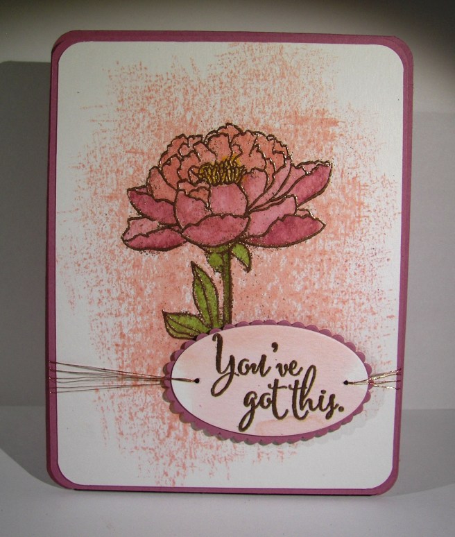
The awesome techniques used in making this card certainly aren’t new, but I finally got around to trying it myself.  I have always wanted to, and last weekend I had the perfect opportunity.  Interestingly enough, I spend enough time preparing to teach others, I often neglect teaching myself.  Thank you YouTube!  And of course all of those terribly creative crafters who share their videos.

101_1826

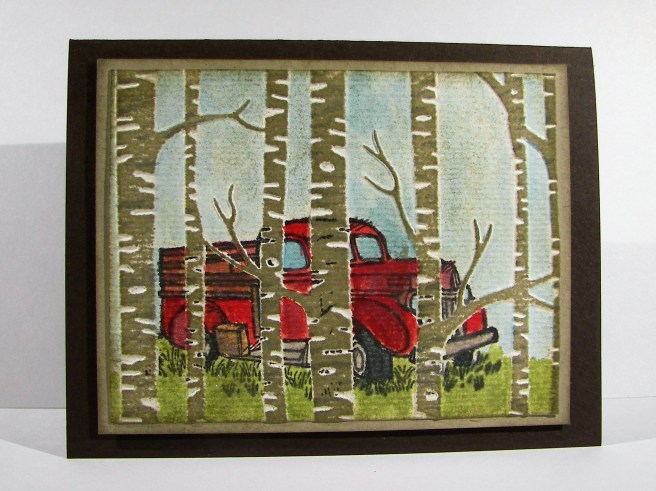
This project didn’t take too long to create in its basic form, but I did spend a good amount of time water coloring it.  The truck stamp was stamped with versafine ink on the recessed side of the embossing folder.  Then the paper was placed and those pieces were run through the big shot machine.  This gave me the embossed trees and the stamped truck. A brayer was inked up with crumb cake and gently rolled over the embossed trees. That is how they became colored so tidily.

After that, it all came down to painting.  Some parts went quickly, like the sky and grass, but I took my time on the truck.  I went over areas several times to get the tones I liked and fix the creative moments I might not have wanted to happen.  When I finished the painting it looked a bit too crisp for the setting, so I sponged over all the the card front and then heavily around the edges.  That worked.

101_1827

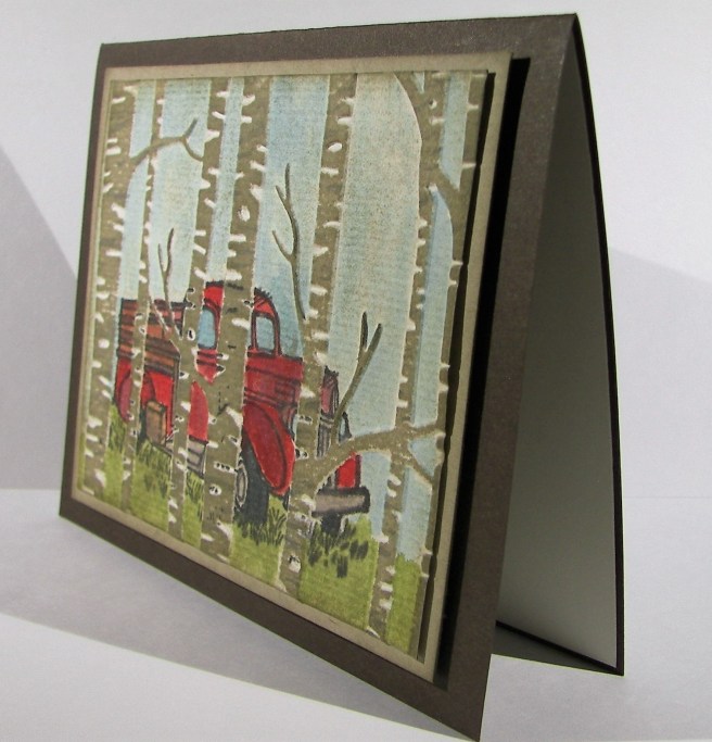
I did make a tag with the stitched framelits that says happy birthday.  I just couldn’t bring myself to place it on the front.  I didn’t want to cover up any of the picture.  It ended up being placed inside.  It isn’t like me to have a layered sentiment inside of a card, but today ended up being that day.

Have a creative day!

Moana

Open Me Already!

These two guys do nothing but make me grin!  I haven’t used them together before, but here they are in all their glory.  Also, I changed up the big monster by turning his closed eyes into eyebrows and giving him some google eyes as well.  Thought that was cute.

4-4

This kit was a birthday card and I think this one could work for that as well.  But any type of celebration could enjoy a project like this.  The hexagon dynamic texture embossing folder got to work in a different way.  I used the debossed side, the normal version has the hexagons raised up instead of recessed.  To bring in a little color I lightly sponged over the top of the embossed paper and look what happened!  What a great effect.  Also, I couldn’t wait to get my chicken stamps back out and use this background like it was chicken wire.  What a fun find.

4-4 (2)

The confetti image from the balloon adventures stamp set really got some work.  It was used on the sentiment tag, the card front as well as the inside.  Pretty darn fun if you ask me.  I have another one of these kits left, I think I will get that put together pretty quick.

Have a creative day!

Moana

Just Keep Swimming!

I don’t know, these fish look cool, elegant and creepy all at the same time. The color choices have created a neat look, but almost skeletal.  Well, you get the idea, right?

3-28a

To get the water color I simply pulled open my drawer of distress inks and grabbed four colors making sure they were dark to light.  I did a wet on wet water color technique to blend the ink together putting dark at the bottom and going up to the lightest color.  I came back in with a brown for the sandy bottom and stamped the stones in the same color.  Having some sunshine at the top peeking in was a great idea, but with my blue choice I got more of an algae look, but it looks good too.

The fish were stamped in black stazon to allow me to water color all around without ruining the image.  I knew I was going to go back with gold, so I didn’t worry about how dark they looked.  Guess I should have.  The sea weed or plant guys were stamped in green tones all around the fish and spritzed with water to soften the images.  The stamp set also came with these cute little bubbles, for the fishies of course.  So they were stamped in the darkest blue I used for the water.  I also used a splatter image from the Touch of Texture stamp set to give the water some dimension.  Even with all the color it looked kind of flat.

Then it was time for the gold guilding flakes.  The second layer of the fish set was stamped in glue and the flakes were pressed over that.  I let it set for just a moment before I started rubbing around with my finger then a bristle brush to remove the excess.  The gold sure does shine.  Different than embossing, but still exciting.  I tried to glue on some googly eyes, but it made the card look too silly, another time for those.  So I just drew some little dot eyes with a white gel pen.  Maybe a bit too creepy, but I left it.

3-28 (1)

The sentiment was stamped in versafine black ink on velum cardstock.  While it was still moist I sprinkled iridescent ice powder over the top and heated it in place.  So sparkley and pretty.  I had some fun threads that matched and down they went.  A fun, but interestingly elegant card.  I sure had fun making it though.

Have a creative day!

Moana

Out of Limitations Come Creativity

When a couple of friends get together to explore a few techniques, really cool things can happen.  The sentiment reads, Out of Limitations Comes Creativity.  Sometimes the limitations are our own minds, not finding new things to try, or new ways to try the things we already have.  Great example below if I do say so myself.

3-27

We wanted to try a technique Jennifer McGuire recently shared using versamark ink and perfect pearls.  That was a lot of fun.  My beginning samples are fun to look at, and might turn into a project, but might not.  I still have them at my desk, but they led me to this project.  The sentiment was created with this technique.  It was neat though, how the perfect pearls clung to areas of the water color paper that weren’t all the way dry.  A neat accident that really adds to the look.  I also gave distress crayons a go.  Those are pretty darn cool.  I bought a set that came with the stamps I used here as well as a basic technique booklet.  Those techniques were put together and actually turned into this project.

Literally, we sat down with several products, a technique idea, and some great conversation. That was so much fun!  So, maybe I should have a sentiment stamp that says something like, Good Company Sets Free Creativity, or something much more poetic, but you get the idea.  Can’t wait til our next time together. Creative friends are so much fun!

3-27 (1)

Have a creative day!

Moana

Dream

Blending colors can be just too much fun.  What a great set of vibrant colors here, right? I started with four and ended up with eight.  I literally had to tell myself to stop, before the colors went too far, leaving me with a brown mud card.  This project is so alive, I love it!

3-10

The ink was applied to a lightly wet surface.  I wanted the color to flow, but not all over the place.  I left intentional gaps in between colors to allow for blending, trying not to make too specific a pattern.  My projects often lean toward stripes, and why not, they are great!

The vision for the die cut was different to begin with, but it did not work out as planned.  No problem, I love it in black as well.  It makes the card look a bit more elegant.  My original thought was to die cut a wide section of adhesive tape and brush it with black glitter. The release paper cut fine, but the adhesive did not want to work with all the detail pieces.  I ended up having to totally clean the die of sticky adhesive before I could use it again.  Live and learn I guess.  But I still want to to make that happen somehow.  Maybe just glitter paper next time?

3-10 (1)

I wanted a bit of interest on the colors, so I opted to add a light flower stamp.  The color is a light neutral, sahara sand.  I thought that would not distract too much from the colors and keep the tone well.  It worked nicely.  I added some droplets of water to distress the background somewhat and called it done.  Such a fun card.

Have a creative day!

Moana

Blooms & Wishes Gone Wild

Using a stamp set different than intended can lead to some lovely results.  The main image here is a flower base and the sentiment does come from the same set.  However, when you change it up some, and maybe create a silly creature instead, that same sentiment remains tender, but also very silly.  That kind of sums me up I guess.

3-9

The background took some time, and I nearly tossed it when I was sure it was wrecked. Since I make myself walk away sometimes and return with a new perspective, I kept on. The colors came together nicely and I wish I could repeat it.  Sadly, I think this will be a one of a kind for sure.

The flower creature was stamped in black, leaving plenty of room for those little legs. He got a heavy brushing with gold wink of stella and a couple of google eyes.  I tried a mouth, kind of, but let it go.  It will just have to remain a mystery.

3-9 (1)

The inside got some echo stamping with a smaller flower from the same set and that was all it needed. What an adorable card if I do say so myself, and I do.

Have a creative day!

Moana

Celebrate

A simple card can look quite complicated at the same time.  That is definitely the case with this project.  It is all about color, and only a few for the front.  That is the beauty of color blending, you always get more than you started with.

3-8 (3)

I grabbed a few distress markers from my stash that I liked together, a purple and two pinks.  I just scribbled them on a pallet and used an aqua painter to start painting wet on wet.  The purple was at the left, a bright pink in the middle with the lightest at the right.  I kept adding layers to each colors until they were vibrant enough and then began to blend. It was so fun to watch the pretty colors come together.

I had planned this card to be a shaker card with the candle border punch as a focus.  The inside color needed to contrast, so I chose green.  I tried to measure my coloring to have green candles with a yellow flame.  At certain angles you can see it, but not very easily. The acetate sheet distracts it, especially in the photos. I used liquid metal green and gold to give them a little extra sparkle.  Since the gold looked so nice I decided to do a quick overlay to give a lot of sparkle.  It worked wonderfully.

3-8 (1)

The shaker frame went just around the candle punch area and was filled with a small amount of sequins.  I think it turned out great.  I ended up stamping a birthday sentiment on the inside of the card because I couldn’t bring myself to add anything that would distract from the front.  With the candles there, it could be any kind of celebration card, I happened to make it a birthday card.

Have a creative day!

Moana


Golden Garden in Bloom

Distracted, distracted, distracted.  That would be my theme for the last several days. Sometimes we complain when we get stuck in a run, other times we stress out looking for that comfortable rut.  I think mine was on another planet all together.  Still looking, but getting closer for sure.  This lovely project has waited on my desk for four days to be shared. Worth it though, it is so pretty.

3-7

I sat down, picked out five different colors and began a water color background. That has to be one of my favorite activities, just making soft blending colors.  Almost soothing. When it was dried I added the huge floral stamp from the garden in bloom set. Some images were stamped full strength and others stamped off once. I wasn’t quite happy there, so I took it up a notch. I have these awesome guilding flakes that give a really cool embossed look. You brush on glue from a pen, set them on the glue and swirl a stipple brush over that to get rid of the excess.  This time I brushed the glue directly on the stamp, stamped a glue image and then put the flakes on.  It worked out so great!  Can’t wait to do it again.

The tag was simply created with water color paper.  I stamped the image, rounded the corners and sponged the edges.  It was a bit stark so I took a light wash of color right over the top.  It blurred the sentiment a bit, but not too much.  A touch of ribbon on the side anchored with metallic thread and I was ready to go.

3-7 (1)

The inside got a bit of echo stamping of course. I nearly always put that in place.  It just ties it all together so nicely.

Have a creative day!

Moana

Nailed It!

How about a tiny tool kit for a gift bag?  These tool framelits are so fantastic, they really just make me giggle. This set is a little more elegant than others, but I still found myself playing with them before I put them in place.  I realized this photo makes it look like it could be a card, but it is a gift bag made from half a sheet of cardstock.  The tools were die cut from a piece of water color paper that had been painted with several ink colors and some liquid metal colors as well.  Love that look!

3-2

I tried to keep the whole hexagon theme going on here and it turned out nice. The paper is so great it speaks for itself.  What a great set of paper, really.  This piece is foiled and heavier than the others.  After I die cut the large hexagon piece, using a die from the same set, I embossed it for another layer of dimension.  The sentiment background was cut from another piece from the same set.  The classic label punch worked pretty great for the actual sentiment and kind of nestled as well.

A bit of ribbon for the handle was all it took.  I was trying to give it the look of a bucket handle.  Not sure if that happened, but it looked pretty good. The large hexagon was placed before the tools, raised up on a couple of dimensionals.  Then I just started wedging the tools in place and squished some tombo glue underneath to keep them in place.  Fun!

Have a creative day!

Moana

You’ve Got This

A simple floral card really speaks to me.  Like so often happens, I had started in a different direction with this project, but it took its own way.  I love how it turned out, but I don’t know if I can make it happen like this again.

2-23

The background stamp came from the same set as the flower and sentiment, You’ve Got This. It is supposed to look a little more water colored, or even just painted.  Well, I believe my water color paper acted a bit more like a resist than intended.  I thought about spritzing it to have the color spread more, but decided to leave it until it was time to color the flower.

The flower and sentiment were both stamped with versamark ink and embossed with copper embossing powder.  With the flower I forgot to use a static resist tool and it was very obvious.  I cleaned it up as well as I could without destroying the image, but it still showed my mess.  The sentiment, I remembered and it is super clean.  I did water color the background of the sentiment, but very lightly.

I painted the flower with sweet sugarplum, blushing bride and old olive.  It turned out really lovely.  The odd messy dots of extra embossing really add to it.  That is what I meant by trying to re-create it somehow.  Accidents aren’t always easy to control a second time.

2-23-1

Either way, it turned out quite lovely.  A sweet inspirational card is wonderful to make, but even better to give away.

Have a creative day!

Moana

You’re How Old?!

This was an experiment all the way around.  The only thing I hadn’t used yet was the paper. The color burst powder is some crazy cool stuff, but new to me.  That was an adventure. Well, the brushing of color, adding and removing, stamping, spritzing and general mess making left me with this. I wasn’t quite happy with it, but let it be shared anyway. It is so silly after all.

2-22

I began the adventure with some of the color powder on a pallet, added water and began to apply to the background area.  It was actually very dark purple to start with. The blue came second, and then both were lightened tremendously.  Then I tried tapping bits of powder here and there on the piece and spritzing with water.  A cool, and very different look happened then.  That is where it looks like sprinkles of color.

It ended up making my wording look very muddled and hard to read.  I had to outline the stamping with a pen and chose a brush tip just too wide.  That is why it looks so very wonky. Like I said, I stuck with it.  I painted the adorable little bird and was getting pleased again.  Then I went too far and applied wink of stella to that bird.  The gold wasn’t a problem, it was the white area.  It got onto the stamp lines and instead of stamping over again, because I would have had to use my stamp-a-majig, and I didn’t feel that adventurous.  My mistake, because my pen drawing over the goofed edges really didn’t do the stamp justice at all.  Like I said, mistakes were made, products were experimented with, and I still thought I wouldn’t get judged too much on the final product.

My card base was made with pacific point card stock and layered with basic black. Nothing was layered up, just adhered heavily with fast fuse to keep that paper under control. It really got a proper working over. I do want to try again though.

2-22-1

Have a creative day!

Moana

Elegant Botanicals

I started this lovely project yesterday, but got distracted by a shopping adventure with my mother-in-law and two sister-in-laws.  The weather was terrible, but the company was great, and who doesn’t need a shopping adventure once in a while!  This was waiting for me though, and I couldn’t wait to finish it.

2-21

On Sunday I created some favor handouts for a church lesson I taught and they were so cool. Nothing like this card, but the paper I painted for the die cuts had left overs I knew I could use again.  That is where all of these flowers came from.  Yes, a scrap pile.  You never know what those scraps could turn into.

I created a simple background with three liquid metal colors wet on dry.  They were too stark, so I gave a water wash over the top and was much happier.  I had some accidental splotches happen, so I gave a bunch more to disguise them and called it good.  Then the placement of all of these flowers.  Phew, it took some time.

I first layered the flowers together with different sized floral pieces and began my arrangement.  After I was done I began to adhere them down.  Since they were die cut from water color paper they were more pliable, even kind of molded.  The leaves really looked great with some curling and bending.  Little by little the arrangement came together.  Some pieces were adhered with dimensional foam, some with glue dots and several with tombo liquid glue.  Again, no worries because of the weight of the paper.  So very liberating!

I layered the front on another piece of water color paper and repeated the choice again for the card base itself.  It looks so clean and elegant.  It isn’t always easy to capture the different elements on camera, but this didn’t turn out too bad.  Just look at all of that metallic shine.  It took a bit of time, but was absolutely worth it!

2-21-1

Have a creative day!

Moana

Thanks For Always Building Me Up

I love tiny things, also terribly over sized things, but tiny things are my favorite.  Die cutting these tiny tools, painting them, and placing them in a tiny jar really made me giggle. Making a masculine card usually doesn’t elicit giggles, but this one sure did.

2-19

The tools were stamped on water color paper, painted and then die cut.  I tried to keep the tools in color scheme similar to real ones which was really kind of boring.  The screwdriver is my favorite. The tiny screws and nuts are so adorable though.  I used foil paper for those and thought they looked great. They all got a bit of sponging with soft suede to kind of grunge them up a bit.

The background paper got a light water coloring with the same colors I painted the tools with, sponged as well and then I ran it through the big shot using the hexagon dynamic texture embossing folder.  So very cool, love that folder.

The jar was stamped on water color paper and lightly painted with a very light blue.  I then die cut it as well as a piece of velum card stock.  Some of the screws and nuts were glued to the bottom and the tools placed on as well.  I glued the velum jar over the top to make the glass look happen.  I hid some adhesive under the tag, allowed some to show on the screws at the bottom, then reinforced the top wrapping it in gold metallic thread. Good deal!

2-19-1

Have a creative day!

Moana

Balloon Adventures

This is how things look when I am feeling creative, but not sure just which direction to go. No sentiment, hardly a stamp in sight, just pretty flowing color.  That is really so satisfying. This could be for a birthday, but really any celebration would be a good fit.  Balloons are so happy after all.

2-18

The project began with water color paper being masked to a board and spritzed with water lightly.  The rich razzleberry went down first in the bottom corner pretty heavy.  Pacific point was the blue I chose for the opposite corner.  The center section got crushed curry, but I didn’t blend just yet.  I wanted it to kind of mix with the help of water, not my brush so much.  It was nice, but I did push some of the color around to make the green show up more. I would have like a bit more orange to have mixed, but the green kind of took over and I didn’t want the infamous brown to appear.

The balloon bouquet punch and the balloons inside the balloon pop-up thinlits set match perfectly.  I painted a couple of swatches, punched them out and layered them under the thinlit cut balloons.  A bit of layered fun there.  I wanted to go with velum cardstock, but didn’t feel up to the adhesive hiding game.  The glimmer paper is always pretty though.

2-18-1

I used the metallic thread for the balloon strings and loved it!  It was a bit tricky since it isn’t the easiest stuff to work with.  But how it looked wrapped around the bottom of the balloons was too great to not.  There it is!

Have a creative day!

Moana


Avant Garden

My daughter has this cute little app that allows her to ‘grow’ flowers and then ‘send’ them to someone.  I had a lovely bouquet this morning and I thought I would make a card like it. Her flowers actually had orange and yellow together, almost striped like an orchid.  This is what I came up with.  What a fun kind of game, right?

2-15

I used a piece of water color paper to stamp these little flowers.  The set I used is actually a free one with a $50 order during Stampin’Up! Sale-a-bration event.  The flowers went in first, tangerine tango then on to the crushed curry.  The stems were added in next followed by a smattering of leaves.  The stamen were added last using cherry cobbler on the tangerine tango flowers and cajun craze on the crushed curry ones.  I decided to soften the look with a healthy spritzing of water.  It was a slow process because I didn’t want the images to go all wobbly, just soften.  When the paper started to get pretty wet the edges started to blur a bit and I stopped.  This particular paper can hold a lot of water.  So, I had to use my heat tool for a while to get it all dry.  There was a bit of warping, but I liked it.

2-15-1
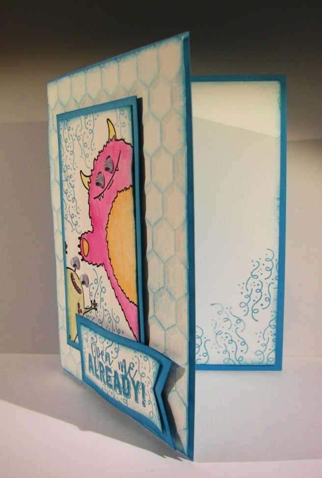
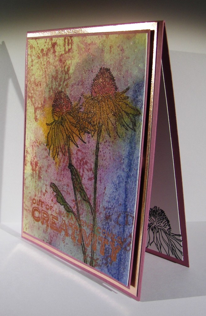
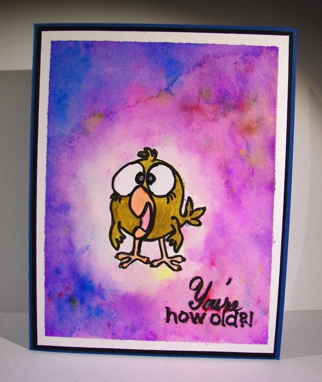
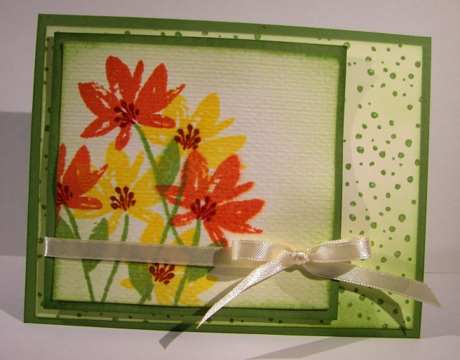
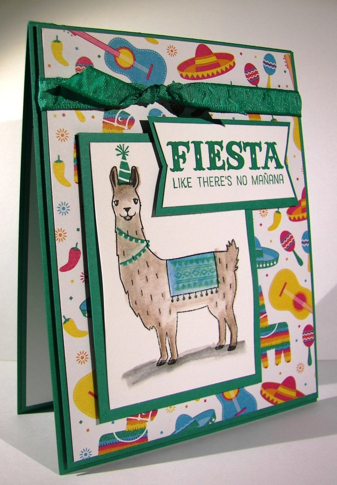
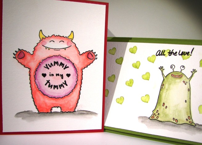
The background, and a bit on the inside, was stamped with the spotted stamp from the same set.  It is random, but has a defined shape to allow filling in the entire space without looking repetitive.  Very nice, very nice indeed.  The front piece was wrapped in some very vanilla satin ribbon and layered up on dimensionals.  The sentiment was left off completely allowing this to be an all occasion card ready to go.
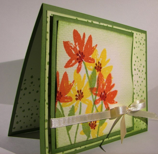
Have a creative day!

Moana

You’re My Person

Doesn’t this guy just make you smile?  I really can’t get enough of him.  My current favorites are directly between this fuzzy monster and the fluffy headed chicken from the set Hey Chick.  For all of the elegant floral creations I surround myself in, when I need a smile I go directly to whimsy.  And I guess the odd kind.  Works for me!

2-14

This was actually made for my husband for Valentine’s Day.  I spent plenty of time here for sure.  I masked off the rounded tummy outline on the stamp and stamped him in the lower portion of the paper.  The frame is 8 x 10, so you can see how much larger this is than my traditional greeting card pieces.  I wanted to create the radiating feeling of love and almost a heart image.  Not bad if you ask me.  But, I couldn’t leave it too smooth, so I moved into distressing the inks further with a water brush for those cool water lines and additional droplets of water all over the place.  This was not intended to be super in line and perfect, very loose indeed.

Hope you have a creative day!

Moana

We Might as Well Dance

When things get crazy it always helps me to have a creative outlet. I think the theme of my projects this last weeks speaks volumes.  Good thing I have a way to share that really brings me joy as well as peace.  Just yummy.

2-9

This is my kind of card.  Lots of layers, a bit of interest, a touch of water color and a lovely sentiment.  Not to mention wonderful designer series paper as a background. This one has to be a workshop project for sure.  So great!

The layers were simple and all of the corners rounded. I even found tag framelits that would also carry the rounded corner.  The card base was cut normally measuring 4 1/4 x 11″, scored at 5 1/2″.  There is an additional score to fold the front back on itself perfectly in half.  That half folded front became the base for the decorative front to be place.  A little different, but not too much.

The water color pencils don’t come in all of the classic ink colors just yet, but the colors I chose match really well.  I used bermuda bay, daffodil delight, pacific point and calypso coral.  It worked out fantastic.  Light coloring and even lighter water coloring with the aqua painter.

To complete it I wrapped some of this years Sale-a-bration free ribbon.  Metallic ribbon often is a bit stiff and not fun to work with.  Not this, I love how soft and pliable it is. I would love it if this became a regular product carried in the annual catalog.  Fingers crossed!

2-9-1

Truly a wonderful project today.  I couldn’t be more pleased, hope you enjoyed and better yet, try one out for yourself!

Have a creative day!

Moana

Fiesta Like There’s No Manana

I haven’t made a card and bag set for a while, but today called for it.  A special birthday for a special someone.  When a birthday isn’t looked forward to what do you do?  Find an adorable llama stamp set and put it to work.  Mission accomplished.

2-2

This bag was made in a particular size for a special gift.  It only needed one piece of cardstock, but I fiddled with the measurements until it was just the right size.  There are two bars of home made soap inside and they fit perfectly.  It also had to be made from card stock instead of designer series paper, which might have been a bit more festive, but I needed it to be stronger for the weight of the soap.

2-2-1

I mixed my coloring a bit here to put color to the llama image. He was stamped on the heavy weight whisper white card stock so I could have a smooth stamp and water color a bit too.  The stamping was done in black stazon, accented in emerald envy with the rope and blanket.  I colored some with the water color pencils and brushed the color around.

Where did that little hat come from?  I dug into the No Bones About It set, the ones with the dinosaurs and so funny sentiments, and there it was.  The perfect size for the perfect llama. And now he is ready to party, as much as a llama can.  How adorable, right?

2-2-2

Have a creative day!

Moana

First Time I Saw You

Too adorable for words.  How can you make a masculine card adorable?  Just like this.  The catalog shows this product more in line with Father’s Day, but I seriously couldn’t wait.  I felt like making the die cut pieces and just playing with them, how silly.

1-27

The background paper was stamped with the saw image in delightful dijon in a random but still kind of organized way.  I then layered that piece on a slightly larger piece of coordinating card stock.

The saw and sentiment were stamped on water color paper so I could paint on them without warping.  I used the same delightful dijon on the saw blade and went with a wash of early espresso for the handle.  I did go over the screws on both the saw and the sentiment with gold wink of stella.  Subtle, yet just enough.  You can’t do too much on a masculine card, kind of defeats the purpose.

1-27-1

I touched each side of the sentiment tag in the ink to give a strong edge and still washed the rest of it in yellow.  It worked out nicely.  I tried to stamp the sentiment in early espresso, but my water coloring over made it too light.  I went back to my standby of black stazon. That is just my favorite!

Have a creative day!

Moana

Yummy in My Tummy

What a busy day yesterday!  I started this set early yesterday morning, but couldn’t finish before I had to leave for the day.  So I finished them this morning and shared them together instead of different days.  They come from the same stamp set, and they look adorable together, so why not!

1-26-2

These were stamped in black stazon on water color paper then colored with water color pencils.  After I put the color down I wanted I moved it around with the aqua painter.  That has got to be the easiest way to water color ever, outside of having someone else do it for you. Seriously, it is shockingly easy.

I had to add some hearts around this little green guy.  The clean and simple look really appeals to me, but  I had to have something.  Green hearts seemed to work nicely, but stamped alone they looked to different from the painting.  I went over each stamped heart with the aqua painter and it instantly made it look like I had somehow painted all these perfect hearts.  No way!

1-26-1

Big red just had to be alone.  Seriously, how adorable.  I couldn’t add anything else around him.  Little rosy cheeks and a stamp on his belly.  Giggles and grins all day!  I wanted a little sentiment to go with my green guy, but decided to put my own on.  My marker choice was a bit too stark for my taste, but live and learn, right?

1-26

Have a creative day!

Moana